Articles in Design
by Nate Croft in Design,
Tutorials
You don’t know it yet, but you’re about to learn one of my favorite and most used Photoshop tricks. You’ve seen this everywhere but might not know it. It has, in some form or fashion, saved more lifeless photos than anything else. What is this awesomeness I speak of? I speak of the CBOO. But that’s Mr. CBOO to you.
No, I haven’t lost my mind. I just had to think of something to call “thing that I do.” CBOO stands for: Copy, Blur, Overlay, Opacity.
Here’s an example of a photo that could benefit from some CBOO:

Keep Reading
by Jonathan Longnecker in Design
 I was just informed by a Google Alert this morning that Smashing Magazine has listed us in their latest article, “Retro and Vintage in Modern Web Design. Awesome! Not only did they list us, but they used our site for two of their 15 examples of common graphic elements. Gotta say, guys we’re honored you would list us with so many other amazing designs. Thanks for the mentions! There really is a ton of great stuff in the article, so go check it out!
Keep Reading
by Jonathan Longnecker in Design
 In case you hadn’t noticed, we’ve recently completed a couple of projects for Cherokee Mills. They’ve been a great client to work with and they’ve given us the opportunity to do some amazing design work for them (check out the website, pocket folder and logo).
I wanted to take a few minutes and give you a glimpse into the process of designing the logo. Like we’ve said before, design is all about solving problems and communicating your client’s needs in a way that is elegant, simple and straightforward. Not to mention kick-awesome!
So first up, a little research. The building and property we’re designing the logo for are right around a hundred years old. It’s original name was actually Cherokee Mills because it was a textile mill back in the early 1900’s. It was also a potato chip factory for Tom’s Potato Chips in the 1950’s and even housed an Atlantic Mills department store which many consider to be the predecessor to mega-stores like Wal-Mart and Target today. So lots of history here. Much of the original brick and hardwood floors are being used while combining with current technologies like solar panels and energy efficient hvac systems. You can check out their website if you want to learn more; it’s actually pretty cool.
It’s already pretty established that we’re looking at a mix of retro and modern; a call back to the building’s history and looking forward to it’s future.
Keep Reading
by Jonathan Longnecker in Design,
Business,
Personal
 Well, in case you hadn’t noticed there’s an election coming up pretty soon. A pretty big one, actually. So in the spirit of all that is “true” in these crazy times, we want to share a small project with everyone.
It’s called USATaxDollars.com. Just put in your annual salary and you see every last dollar that the government takes out of your paycheck; and what they spend it on. Guess what? I’m giving the government more money each month than my house payment! Now that’s depressing.
Keep Reading
by Nate Croft in Design
Being a designer changes the way you look at the world. You pay attention to details. You notice things. You notice the freaky toys inside the claw game at your local grocery store. Ok, well I notice them anyhow.
On may way out, I happened to glance at the claw game. Some part of me wants to play them every time I see one, but I never do. That doesn’t stop me from checking out the forbidden treasures behind the plexiglas! Um, I mean, studying the product design of the silly little children’s toys.  This time I didn’t even need to actually stop and look, because this thing caught my attention from a good ten feet out:
Keep Reading
by Jonathan Longnecker in Design,
Business,
Personal
Yeah we know. It’s been way too quiet around here. Not many new portfolio entries; not many blog posts. We’re slackers, I tell you! Well, maybe not 
First, we have been doing a TON of work. Web app design, social network design, interface design. Except none of it’s live to the public yet. The backend guys are still doing their thing. And in the past two weeks we just pushed through about 3 or 4 major front-end design projects that should be live shortly. Plus, we’ve done several for other agencies that you can only guess that we did by their awesomeness cause they won’t let us put it in our portfolio. But such is the way of the wayward web designer.
Keep Reading
by Jonathan Longnecker in Design,
Business
So I had a short conversation with a client of ours today and it went something like this: “Hey you guys make some great looking sites; why don’t you design some templates and sell them. You’d make a ton of money!” Naturally I had to agree that we make pretty decent looking sites, but that was beside the point (insert deadpan look here).
From a business perspective this makes perfect sense, and it’s been done quite a few times before. But here’s the problem. That’s not who we are. Money’s all fine and good, but at the end of the day we all have to remember who we are and what we believe in.
Keep Reading
by Nate Croft in Design
If you have ever had to submit anything creative to the review of a committee, this is for you.
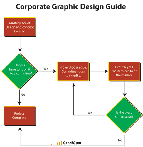
Via Graph Jam.
Keep Reading
by Nate Croft in Design,
Tutorials
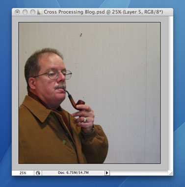
I love having a digital camera, but it is definitely lacking in the vibe department. Old school film camera’s like the Holga and the Diana have a great feel to them, especially when they are cross processed. So I’m going to show you some ways to fake the funk and give your digital images a healthy dose of awesome sauce. (I’ve been listening to Fundamental Elements and I blame them for making me say things like “Fake the funk” and “awesome sauce.”)
Let’s start with a picture I took of Mr. James.
Keep Reading
by Jonathan Longnecker in Design
 Web Designer Wall has a great collection of web design trends for 2008, and we just happened to make the cut! Actually the 47m site and the EdgePoint Church site are both listed. So we’re pretty psyched, to say the least. It’s been a whirlwind of a year so far, and it just keeps getting more amazing everyday.
Keep Reading
by Jonathan Longnecker in Design,
Business,
Personal
 I will readily admit that I am a total nerd. I was totally psyched about the new Indiana Jones movie that came out a few weeks ago. I went out and bought the first three and watched them in like two days. Watched all the extra stuff on the DVD’s. I can’t even tell you how many childhood memories those movies brought back. It was great!
But when I finally went to see the new one, I found myself a bit disappointed. Some of the scenes were so ridiculous that I just couldn’t get past the impossibility of them. The atomic refrigerator? The monkey vine-swinging thing? Three ginormous waterfalls? I mean, seriously! Yeah I knew the first three had implausible moments, too but not like this! Or were they?
Keep Reading
by Nate Croft in Design
I’ve been looking for a higher quality alternative to YouTube, and have really been digging Vimeo. So while I was there, I did like any other self respecting web designer/developer would and had a look at the source code.
It was there that I found this:
Keep Reading
by Jonathan Longnecker in Design,
Business,
Tutorials,
ExpressionEngine
Non-profit organizations have a special place in our hearts here at FortySeven Media. We love it when people decide to change their world for the better, and do our best to help them however we can. Several months ago we completed the Knoxville Leadership Foundation's new website. Shortly there after Dan Myers, the Director of Communications and Operations at KLF, asked us to be part of a seminar for non-profit organizations to better equip them to use their websites. The following is a condensed version of that session. We had a grand time chatting with everyone there and hope you enjoy the information! The slides of the presentation and the handout companion are available in PDF format at the end of the article.
1. Evaluate Your Current Website
Before we jump too far into this, let's take a moment to think about your current website. Are you excited about it? Do you tell people about it or do you try to not bring it up? When was it last updated? These are great indicators of the current condition of your site. Most organizations can answer these questions instantly. The short version for most, is “No, we aren't excited about our site, it's awful!” The good news is that it doesn't have to stay that way. Let's look at a few ways to get your website tuned up and working for you.
Keep Reading
by Jonathan Longnecker in Design,
Business,
Personal
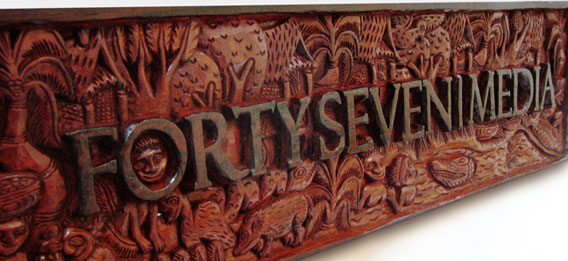
Ever wanted your logo hand carved from a massive piece of wood by natives of Papua New Guinea? Ok, so maybe it wasn’t the first thing on your list, but dang it’s cool. My wife’s sister and her husband are missionaries in New Guinea and are back in the states to make the rounds to all their supporters and show them what they’ve been up to. Too many “and’s” in that last sentence? Probably. Regardless, we just got this in yesterday and had to share.
Keep Reading
by Nate Croft in Design
The following is a true story.
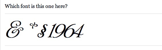
I had picked up Thrice’s new album and we had been listening to it yesterday while we were working. It is one of those albums that you immediately know is good, but need need a few more listens to really grasp its depth. So when I left a little early to move a piano, Jon decided that he would borrow it and return it today, which is totally fine by me. But what really struck me was the note he left. Well, not really the note itself, but its typeface. Instead of the completely dull and lifeless default font that Stickies uses, I saw this:
Keep Reading
by Nate Croft in Design
If any of you good people out there don’t read the insightful Daring Fireball, you might have missed The Rather Difficult Font Game, which is aptly named. I normally consider my type-fu to be excellent, but I too was humbled. 33 out of 34 for this type ninja.
Keep Reading
by Nate Croft in Design
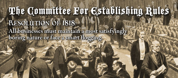 I don’t know when The Committee For Establishing Rules sat down to dictate that businesses must be staunchly boring and devoid of personality, but I’m glad to see that Veer missed the memo on that one. They are one of a few a larger companies we do business with that have managed to keep their charm. More than that, they know how to have fun.
Keep Reading
by Jonathan Longnecker in Design
Thought we’d share just a few tips we’ve come across as we design each day. Seth Godin says lists are cool so I’m going to try one.
1. Think like a website. Try to keep in mind the limitations and strengths of the web when designing. For example, look for backgrounds that can repeat easily, or avoid designs that have a lot of overlapping transparency (at least until IE6 isn’t on so many computers).
2. Web typography. Your web typography will set your design apart from other studios. Study optimum line heights, widths and look for inventive ways to guide the viewer through your layout only using CSS rules. There’s something refreshing about only having 3 or 4 good fonts to work with. Flash replacement (sIFR) is alright, but don’t overuse it.
Keep Reading
by Nate Croft in Design
Fadtastic.net has put out their “HOT TIPS for Your Website in 2008.” Remember the date here friends.
Anyhow, check out the Universal IE Hack, it’s the CSS I wish I could put into every site we code. Just kidding; we love you IE6. Except we’d rather gouge our eyes out with a spoon than “fix” another site for you ever again
Keep Reading
by Jonathan Longnecker in Design
I was just informed that Smashing Magazine is using the EdgePoint Church site as an example of great grid based design. Awesome! Kudos to EdgePoint for giving us the freedom to give a church such a kick awesome design. We’re honored that Smashing magazine would include us as one of only 3 case studies. Kind words, for sure: “The grid is escaped with the use of angles and placement of the illustrations and photography that surround the layout. The header has a free flow design that opens up the top as a creative space.” Thanks, guys!
Keep Reading