The Depths of Our Typography Nerdliness
The following is a true story.
I had picked up Thrice’s new album and we had been listening to it yesterday while we were working. It is one of those albums that you immediately know is good, but need need a few more listens to really grasp its depth. So when I left a little early to move a piano, Jon decided that he would borrow it and return it today, which is totally fine by me. But what really struck me was the note he left. Well, not really the note itself, but its typeface. Instead of the completely dull and lifeless default font that Stickies uses, I saw this:
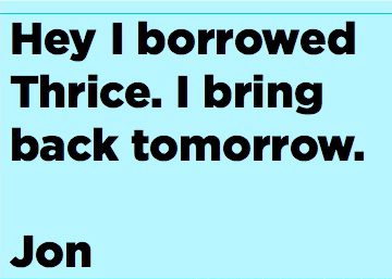
Yes, friends, that is the excellent Gotham Black which we have recently picked up from type masters Hoefler & Frere-Jones. It is a gorgeous typeface and we have been trying out best not to over-use it. And no, using Gotham for a sticky note is not over using it.
Comments
1
Laptoper - May 06, 2008
2
Full Color Printing - May 29, 2008
3
Abejundio - Jun 16, 2008
4
piano lessons - Aug 21, 2008
5
Andrea - GirlGeek - Oct 09, 2008