Articles in Design
by Jonathan Longnecker in Design,
ExpressionEngine,
Apple
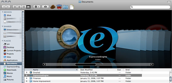
Here’s a little goodie for you ExpressionEngine developers on Leopard. A pretty folder icon to put all your plugins, modules, extensions, etc… in.
Quick rundown for those who don’t know how to change folder icons:
Keep Reading
by Jonathan Longnecker in Design
 I meant to post this earlier, but we were nominated for the month of March by Unique CSS. Basically, they pick only 8 of the best sites they find and let people vote for the winner each month. Now, I know we’re halfway through March, but there’s still time! We need your help to win this thing. Do I sound like a politician yet?
Keep Reading
by Jonathan Longnecker in Design
 Well, our boys over at Less Everything have done it again. They’ve just released an open source social networking program called Lovd By Less. Frankly, I’m not sure how they manage to write app so fast, let alone make them this good. They must be eating their Wheaties. If you’ve been looking to put together some kind of social networking site and want to save some time developing, you should definitely check it out. Keep in mind that this is built with Ruby on Rails, so you’ll need to have some experience there. Here’s a list of features:
Keep Reading
by Jonathan Longnecker in Design
Microsoft has listened to the web community and reversed its decision to make IE 8 behave like IE 7 unless specifically told to do so. As I’m sure most of you have heard, there was much debate over this, with some big names in the web community actually backing Microsoft on this one. It never made sense to me, so I’m glad to see common sense won out this time. I just want my time back from all the things I’ve had to “fix” to make display properly in IE 6. You listening, Redmond? Eh, I didn’t think so.
Keep Reading
by Jonathan Longnecker in Design,
Business
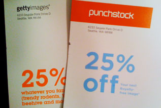 So I got these in the mail the other day (see picture). They were both roughly the same size, had big weird pictures on the front and were supposed to be cool, I guess. I glanced at them and noticed they both had the exact same offer. 25% off! That’s kind of strange. Oh wait, apparently Getty Images and Punchstock are located in the same building! Same return address! What do you know? I think someone is trying to pull a fast one on me!
Keep Reading
by Jonathan Longnecker in Design,
Business

We’ve all probably used Google Docs or Zoho Writer. The new crop of AJAX based online word processing applications surely have Microsoft scrambling over in Redmond. Not to say any of those options is bad; in fact most of them are quite nice. But I found something completely different. BuzzWord.
Keep Reading
by Nate Croft in Design,
Tutorials
Every designer knows that at some point during a project there will screenshots, and lots of them. Third party applications often get this job, but if you are a Mac user (10.3 and later), you have another option built right into the OS. That option comes in the form of key commands, and the key commands come in three flavors:
Keep Reading
by Jonathan Longnecker in Design
 Ok, why haven’t I heard of this until now? Apparently
 Google Dean Edwards has put up a javascript library that makes IE behave like a normal, standards compliant browser. Add a link to the file in your header, and BOOM, you code like you would normally. Except no hacking for IE! You can view the entire list of fixes over at the Google Code page for the project. Naturally, this is in beta, so don’t expect everything to work perfectly yet.
Keep Reading
by Jonathan Longnecker in Design
I’ve noticed a trend lately among websites I’ve visited that seem to win all kinds of design awards and such. First of all, they look beautiful. Web design has come a long way in the past few years. But I get this nagging suspicion that the designers kind of stop once they get the shell of the site designed. Then, when they get the content from the client, they copy, paste and call it day.
So what’s the big deal? Well, I’ll tell you what the big deal is! Content is important! In fact it’s probably more important than your design. I tell my clients all the time, “I don’t care how pretty we make it, if your content isn’t compelling; if it doesn’t reach out and grab the user, they’re not going to stay on the site.” And it’s true. Don’t get me wrong, it works both ways…I mean, if you’ve got great content, but your site is ugly as crap I’m not going to trust you simply because you didn’t put the effort to be professional.
Keep Reading
by Jonathan Longnecker in Design,
Business
 We are honored to have been listed on Stylegala’s gallery this month. In addition to seeking out the raddest designs, Sylegala also has a nice newsfeed with relevant and useful info for web designers. Kick awesome for sure. Ty Gossman wrote a very nice review on the new 47m site, and people are giving us pretty darn good ratings. We are super excited to be so well received by the web design community. Check it out if you get a chance via the link below.
Keep Reading
by Nate Croft in Design

Objectivity is often like a dog’s head on a car ride, it goes right out the window. It can be easy to lose sight of your goal sometimes. Keeping your efforts focused on creating the right response is key to a successful design. Let’s take a look at designing to evoke a positive response.
When you boil it down, a designer’s job is to communicate. If we can create a work of art as well, that’s great, but not at the expense of the message. Start with the two most important questions before beginning a design: “Who is this for?” and “What is it intended to do?” As a designer, sometimes it’s easy to just start designing something. Resist that urge! Take a moment to wrap your head around it.
Keep Reading
by Jonathan Longnecker in Design,
Tutorials
One problem I run into pretty frequently when coding a site in to XHTML and CSS is making my footer dock to the bottom of the screen. It’s especially annoying if you have a page that’s short on content and the footer, which happens to be a different color that the body background doesn’t stay at the bottom of the browser window. I can hear you say, “But why don’t you just do a fixed position on it. That’s easy enough.” True, but if you do that then it’s always at the bottom of the screen no matter how tall the window is. So if I have a page with a lot of content that footer shouldn’t show up until the content is done. How do we fix this? Let me show you. Here’s what the problem looks like:

This tutorial assumes a few things: 1. That you know basic HTML formatting, and 2. That you have a pretty good understanding of CSS.
So first we need to make sure that everything except the footer is inside a container div. So your code would look something like this:
Keep Reading
![]()
 I meant to post this earlier, but we were nominated for the month of March by Unique CSS. Basically, they pick only 8 of the best sites they find and let people vote for the winner each month. Now, I know we’re halfway through March, but there’s still time! We need your help to win this thing. Do I sound like a politician yet?
 Well, our boys over at
  So I got these in the mail the other day (see picture). They were both roughly the same size, had big weird pictures on the front and were supposed to be cool, I guess. I glanced at them and noticed they both had the exact same offer. 25% off! That’s kind of strange. Oh wait, apparently Getty Images and Punchstock are located in the same building! Same return address! What do you know? I think someone is trying to pull a fast one on me!
 Ok, why haven’t I heard of this until now? Apparently
  We are honored to have been listed on Stylegala’s gallery this month. In addition to seeking out the raddest designs, Sylegala also has a nice newsfeed with relevant and useful info for web designers. Kick awesome for sure. Ty Gossman wrote a very nice review on the new 47m site, and people are giving us pretty darn good ratings. We are super excited to be so well received by the web design community. Check it out if you get a chance via the link below.
