1New Brand + Cohesive Design
FortySeven Media + Food Blogger Pro have a long history together. Bjork & Lindsay reached out many years ago to ask about how we had created our own membership site, and we helped them setup a bare bones version of their own. Since the design and architecture was based on ours, it was a cost effective way to get them up and running.
We tweaked a few things over the years, but as their community has grown, it was time to re-think some things and create a design that was all their own.
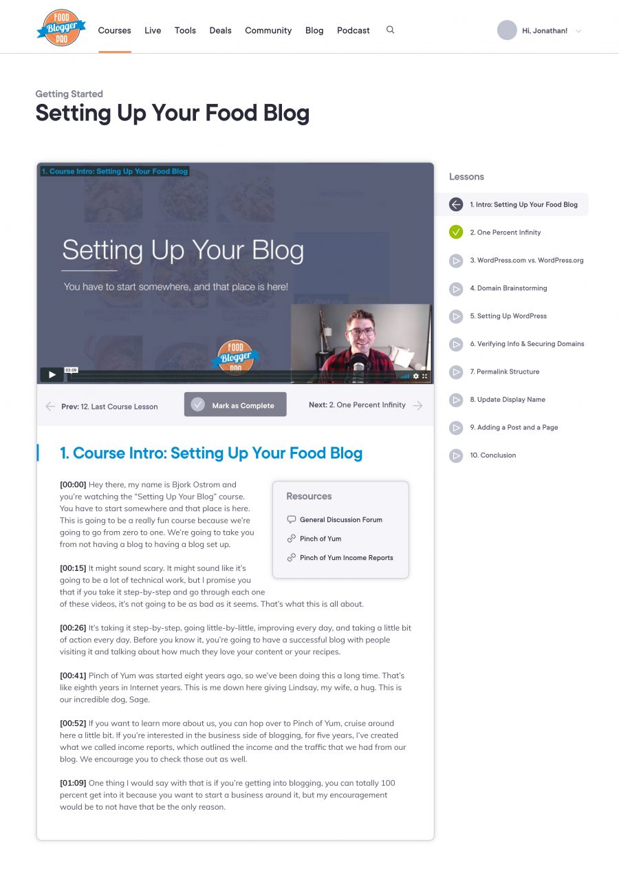
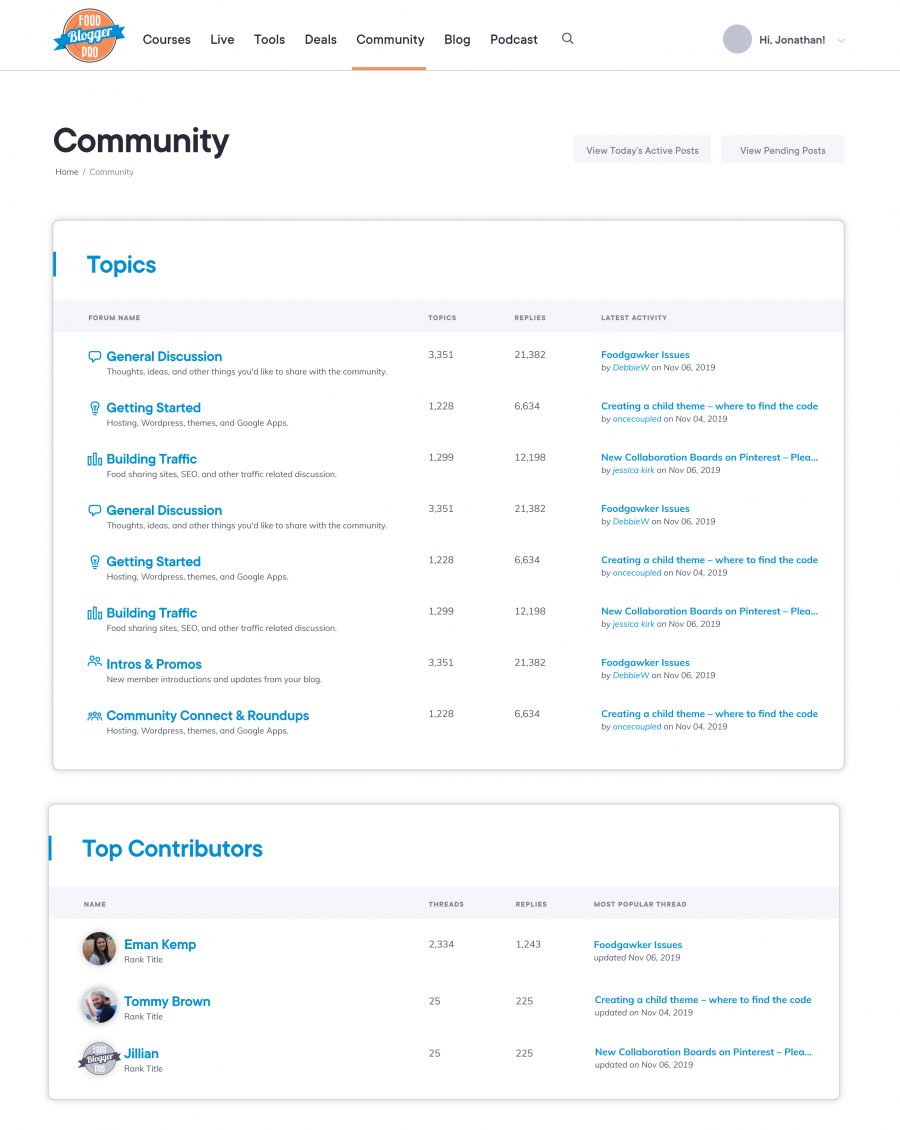
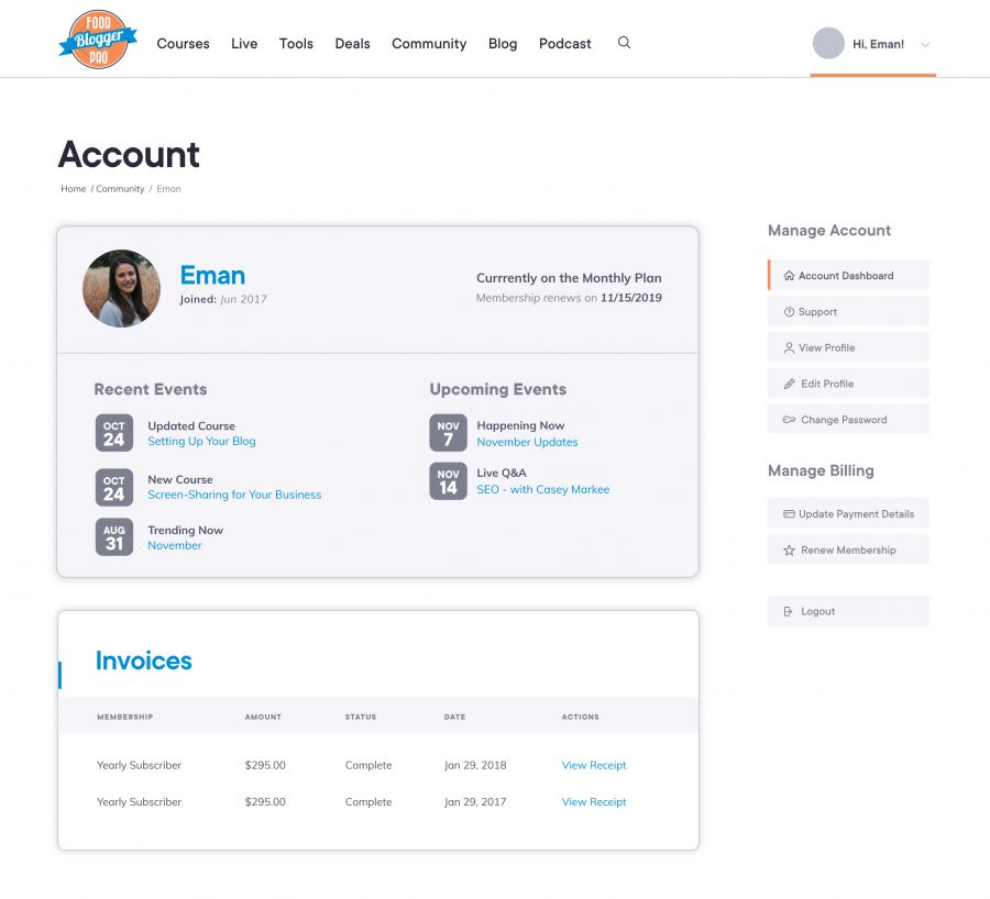
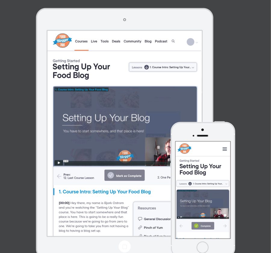
The goal with this design was to create a fresh new visual brand without going back to the drawing board. We kept their logo and core colors, tweaking them just a bit to be brighter and friendlier. Where the real change came in was typography, icons, and styling.
It was important that this new look and feel translated across all aspects of the site - from the marketing and sales pages to the membership area, courses, and forum. And that the entire site felt like a cohesive whole, not just a bunch of separate areas pieced together.
This meant thinking through site architecture, navigation, user flows, and visual cues so the user always knows where they're at and what to do next.
Working with FBP was so much fun. They listened to all my crazy ideas for re-organization, gave incredible feedback, and worked closely with me to make sure everything turned out just right.


