Photoshop Tutorial - CBOO (What is that?!)
You don’t know it yet, but you’re about to learn one of my favorite and most used Photoshop tricks. You’ve seen this everywhere but might not know it. It has, in some form or fashion, saved more lifeless photos than anything else. What is this awesomeness I speak of? I speak of the CBOO. But that’s Mr. CBOO to you.
No, I haven’t lost my mind. I just had to think of something to call “thing that I do.” CBOO stands for: Copy, Blur, Overlay, Opacity.
Here’s an example of a photo that could benefit from some CBOO:
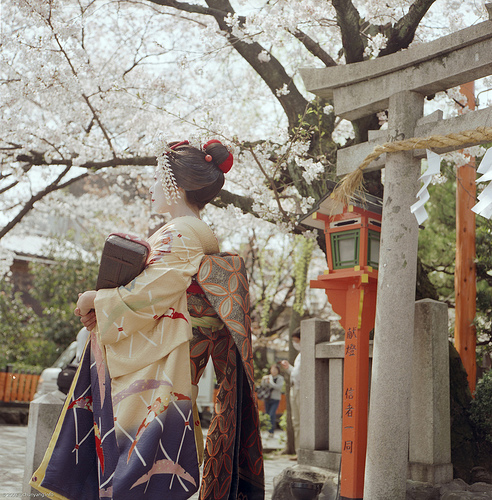
This is a really nice picture by Solar Ikon. It has an interesting composition, but the colors are a bit muted. We could crank up the saturation and run some curves adjustments and such, but that’s not really what I’m going for here.
With CBOO we can get a really dreamy kind of look that is just perfect when you want something that’s a little on the far side of reality.
Enough talking. Let’s get to it!
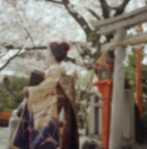
Make a copy of the image so that you have two layers of exactly the same thing. Select the duplicate layer you’ve just made, and go to the filters menu and choose Gaussian Blur. Then adjust the blur until you lose all the details along the edges and it looks like the camera is out of focus. For this image, we’re looking for something like this:
Nice and blurry! Alright, now we are on to the double o’s of CBOO which are Overlay and Opacity. If you are familiar with Photoshop you’ll know exactly what I’m talking about. If not, slide on over to your layers palette and have a look at the top of the palette and look for a drop down menu that should currently say “Normal.” The opacity is directly to the right and these are where the double o’s live. Click on the blending mode drop down (the one that says normal) and select overlay.
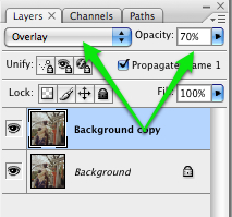 Woah! That’s some serious saturation! And just have a look at what it did to the edges of your image! There’s still definition, but everything looks a bit surreal. Ok, this is probably a bit much at full blast so let’s bring the opacity down a few notches. I’ve chosen 70% Opacity for this image.
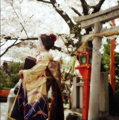
Here is what our final image looks like:

Now you too can wield the power of CBOO! Or at least make a picture look really cool. Just remember not to over do it. I think of it like hot sauce. Used to much, that’s all you taste. Use just enough and it adds a little something extra and give your images some kick!
Photo by Solar Ikon.
Comments