Articles in Design
by Nate Croft in Design
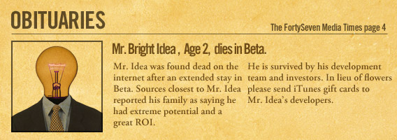
I was having lunch with my wife a few weeks ago and during the meal I was observing the other diners. There was one man in particular that caught my attention. He was a middle aged fellow in a button-up shirt and slacks reading the paper. He seemed to be lost in his reading, mindlessly chewing the same bite for longer than usual.
As we finished up , we gathered our trash and headed towards the car. It was then that I noticed what had captured his attention. The obituaries.
Keep Reading
by Jonathan Longnecker in Design,
Business,
Design Hope,
ExpressionEngine
Design Hope is ramping up pretty quickly, and we’re excited to announce quite a few huge partnerships. This has grown from an idea I had laying in bed the other night to an internationally supported endeavor from some of the top names in the design business. I am truly blown away by the generosity of all these companies and excited to share them with you. Check it out!
Sponsors
ExpressionEngine

ExpressionEngine is the only CMS we use, period. It’s incredibly flexible and powerful while using a syntax that even I can understand. We’ve tried everything else, and nothing comes close! In addition to providing an EE license, EllisLab has also offered a Forum Module and Multiple Site Manager Expansion if you need it. That’s potentially $500 worth of software for free!
Keep Reading
by Nate Croft in Design
If you are a designer, you probably are one because you wanted to be. Design isn’t exactly one of those fields most people happen to fall into. Most of us do this because we love it, or at least really liked it at one point.
But what happens when when passion no longer fuels the production? I don’t know about you, but for me, it means that there is a severe of lack of kick-awesome. If you have been reading this blog for any length of time, you know that “kick-awesome” is how we describe something that is even better than we could have imagined it. And lacking that means that it’s just a regular project. The client is happy with it, other people think it’s nice enough, but I know it could be better. That’s a place I don’t like to be.
Do you know what kills passion for creatives? Monotony.
Keep Reading
by Jonathan Longnecker in Design,
Business,
Design Hope
So we’ve been thinking a lot about how the economy is affecting businesses and individuals. What I find truly inspiring is hearing stories of really brave people giving up all that is safe, embracing the unknown and starting a new business in the face of an economic downturn. We know what it’s like to start a business from scratch, but I wonder if we would have the balls to do it in these uncertain times. The more I think about these people who are risking all they have in search of creating something revolutionary and forging a better life for themselves and their families, the more I want to help them out.
And that’s exactly what we’re going to do. We’re going to design and build one lucky new business’ website for FREE. Yep, for free. Not only that, but we’re going to put the whole design process up on this blog as we go and get feedback from the community.
Keep Reading
by Jonathan Longnecker in Design,
Tutorials
We recently had the pleasure of working with CD Baby creator Derek Sivers on a new project called MusicThoughts. It’s a great collection of quotes from musicians on everything from the music industry to life in general. In short, pretty kick-awesome! Go check it out already!
This was a challenging project from start to finish. First of all, we couldn’t modify the HTML at all, only the CSS. And second was the support for multiple languages. 10 to be exact! This had several ramifications:
Keep Reading
by Jonathan Longnecker in Design,
Tutorials
 I just found a simple solution to a bug in IE7 and wanted to share it. I hadn’t run into this problem before, but apparently IE7 doesn’t usually show a bottom-border attribute on text links. No reason, it just doesn’t feel like it. Insert rant about Internet Explorer here if you wish, but I’m just here to provide solutions, baby.
Keep Reading
by Nate Croft in Design
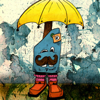 Apparently, my inner child is alive and well and has found himself some crayons. I have always liked to doodle and draw silly things and creatures with all manner of objects coming out of their heads, but lately I have taken this pastime and mixed in a little of the ol’ graphic design creative juice and have found my own special blend of little monster love. I call them Little Tings.
These Little Tings started to come to life in the little notebook I keep on my desk, scooted over just to the right of my mouse. This notebook was originally a way for me to stop using the mail and little slivers of paper to write important things on, but it has come to contain all manner of ideas. If I were a mad scientist, this would be my secret notebook that holds all my plans to take over the world!
Keep Reading
by Jonathan Longnecker in Design,
Business
 I got a most surprising email in my inbox the other day; a request for an interview! Wait, someone wants to interview us? I have to say, we’re pretty flattered that anyone would actually ask us questions and then post them to their own blog. I mean, you never know what we’re going to say! But hey, PixelApnea looks to be the first one to take the plunge, and hopefully in the process is building up some solid content in the land of web design. Actually they have lots of good content; I just hope we didn’t soil it
  .
.
Keep Reading
by Jonathan Longnecker in Design
 Seems like everyone is dropping support for IE6 these days. Apple with MobileMe, 37Signals with Basecamp; even Google with Gmail. What gives? Well, it’s 7 years old for starters. In technology years, that’s like 247 years old! It’s much less secure than the other major browsers. It’s javascript support is wonky at best. And it’s CSS (layout) support? The stuff of horrible, kill-you-in-your-sleep legend.
Keep Reading
by Jonathan Longnecker in Design,
Business
 We’re happy to report that Web Designer Wall has listed our site in the Current Web Design Trends for 2009! Looks like we’re under the “multi-column layout” section. We’re honored to be among the company of the others chosen; every single one is just amazing. If you haven’t already, go check out Nick La’s amazing resource site for web designers.
Keep Reading
by Jonathan Longnecker in Design,
Business,
Personal
 Ever wanted to find friends based on the books they love? Then Bookmesh is the place for you. We’re incredibly excited to announce that it’s finally ready for some beta testers, and you’re invited.
Keep Reading
by Jonathan Longnecker in Design,
Business,
ExpressionEngine
Raise your hand if you can’t believe it’s almost 2009 already. Yep I’ve got mine up! It’s amazing how fast time flies when you’re having fun. The last year has definitely been an interesting one, and we’re looking forward to this next year with great expectation and excitement. I can honestly say that God has blessed us with the best jobs and families in the world. What more can a guy ask for?
I thought about writing some sort of “resolution” or goals post for the new year, but instead I think sometimes it’s good to reflect on what you’ve done. You might even amaze yourself. Looking back over all of our projects this past year, I was surprised at just how much we’d done with a small two man shop. Apparently we’ve been busy  .
.
For those of you who just recently found us, here’s a quick recap of our favorite projects this past year. Hope you enjoy!
Web Design Projects
EdgePoint Church

No surprise this was one of our favorites. It came together very quickly and got a ton of attention from Smashing Magazine, Web Designer Wall, Collide Magazine and Godbit. Links: Portfolio | Live Site
Keep Reading
by Jonathan Longnecker in Design
 We meant to post this a little earlier, but we’re happy to report that Web Designer Wall has listed our site in the Top 50 best CSS designs of 2008! We’re honored to be among the company of the others chosen; every single one is just amazing. If you haven’t already, go check out Nick La’s amazing resource site for web designers.
Keep Reading
by Nate Croft in Design
Sometimes I just get stuck when I’m trying to develop colour schemes. I just can’t seem to find the right complement of tones to work with. It’s at these moments when I start to look for some inspiration.
It can be the view from my window, a great photo I’ve seen, the weathered buildings of the aging community centers around, or the left over milk from a bowl of Lucky Charms®. The point is not to miss out on a spark of imagination from the world around you. I’ve recently moved so there are many new things to inspire me, but on one particular occasion I still needed some help. And whilst taking an RSS break I came across this picture:
Keep Reading
by Nate Croft in Design
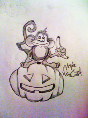 After seeing such a title, I imagine you might be wondering how I’m going to pull this together into some kind of amazing post to inspire you and provide you with more awesomeness than before you read this. Instead, I recommend abandoning such thoughts and embrace the sheer simplicity of the primate-gourd form. Monkey. Pumpkin. Together.
Keep Reading
by Troy McNeil in Design,
Business

So the other day my wife and I spent the afternoon at Dollywood. We had just finished a roller coaster when I saw this huge machine, that had this huge claw, that housed these sweet little care bears looking at the claw in terror (particularly the yellow bears). I had never seen such a huge claw game in all my life.
It was no surprise to see it though because it seems that “Super Sized” is the cool thing to do now days. Just go to any fast food joint and order a combo and they will hand what used to be a 32 oz extra large cup to you as your combo drink. Now there is nothing wrong with wanting a little bang for your buck, especially if you really really dig mountain dew. There comes a point though where “SUPER SIZE” does not necessarily equal Kick Awesome. So what’s a designer to do in this age of jumbo everything?
Keep Reading
by Jonathan Longnecker in Design,
Business,
Personal
Efficiency. The word that strikes fear in the heart of designers everywhere. Somehow along the way to becoming our artsy selves, we’ve managed to throw all structure out the window. “We’re above that sort of thing; we’re creatives!” we say.
It’s ok, we’ve all been there. I know it started with good intentions: we knew if we had a little more time or a change of scenery, it could make the difference between something good and something amazing. But then somehow it turned into an excuse to take longer to finish things. And an excuse to take longer breaks more often. And before you know it, we’re taking twice as long to finish projects, but they’re not anymore awesome than before. What happened!?
Keep Reading
by Nate Croft in Design
 If you have been following us for some time or had a look through the portfolio section of the website, you might have noticed that our media section is mysteriously blank. This isn’t an error or some server malfunction. It is, however, a place holder for some of our longer running media projects. Over the next couple of months you’re going to see some things start to pop up there. What kind of stuff?
I’m glad you asked.
Keep Reading
by Jonathan Longnecker in Design,
Tutorials
We’ve done our fair share of web app designs here, but often don’t get to share them for NDA reasons or the simple fact that the developers are still working on them somewhere! No worries, fair reader. For we shall approach these diplomatically as to protect the innocent. Behold, the top 10 list of yore!
1. Text Text Text
Web apps are huge, complicated beasts, even if you try to keep them simple. There are dashboards and login pages and edit profile pages and who knows what else. So do me a favor and keep everything text. Navigation, headers, everything. Because I guarantee you the developers are going to have to setup more pages once you’re done and they shouldn’t have to jump in photoshop to change your cool looking buttons (note, see this post about accessible, good looking buttons) or re-do the entire navigation.
Keep Reading
by Jonathan Longnecker in Design,
Tutorials
 Buttons. They’re those little things that people really like to click and push. I personally think they’re pretty important to help guide a user through the actions they need to perform. But I’ll be the first to admit I’ve made my fair share of image buttons. Totally inaccessible; just an image with some alt text. Now depending on your site design and the type of site, that might be ok. For instance, if you’re dealing with a simple marketing site that’s kind of grungy; you’ll probably need to make that button look like it fits.
But there’s a problem if you’re dealing with a site or web application that will have 50 or 100+ buttons that all say different things. Now you’re looking at maintaining a ton of images and a lot of manual linking everywhere….not very ideal!
Keep Reading


 I just found a simple solution to a bug in IE7 and wanted to share it. I hadn’t run into this problem before, but apparently IE7 doesn’t usually show a bottom-border attribute on text links. No reason, it just doesn’t feel like it. Insert rant about Internet Explorer here if you wish, but I’m just here to provide solutions, baby.
 Apparently, my inner child is alive and well and has found himself some crayons. I have always liked to doodle and draw silly things and creatures with all manner of objects coming out of their heads, but lately I have taken this pastime and mixed in a little of the ol’ graphic design creative juice and have found my own special blend of little monster love. I call them Little Tings.
 I got a most surprising email in my inbox the other day; a request for an interview! Wait, someone wants to interview us? I have to say, we’re pretty flattered that anyone would actually ask us questions and then post them to their own blog. I mean, you never know what we’re going to say! But hey,
  Seems like everyone is dropping support for IE6 these days. Apple with
  We’re happy to report that Web Designer Wall has listed our site in the
  Ever wanted to find friends based on the books they love? Then Bookmesh is the place for you. We’re incredibly excited to announce that it’s finally ready for some beta testers, and you’re invited.
 After seeing such a title, I imagine you might be wondering how I’m going to pull this together into some kind of amazing post to inspire you and provide you with more awesomeness than before you read this. Instead, I recommend abandoning such thoughts and embrace the sheer simplicity of the primate-gourd form. Monkey. Pumpkin. Together.
 If you have been following us for some time or had a look through the portfolio section of the website, you might have noticed that our media section is mysteriously blank. This isn’t an error or some server malfunction. It is, however, a place holder for some of our longer running media projects. Over the next couple of months you’re going to see some things start to pop up there. What kind of stuff?
 Buttons. They’re those little things that people really like to click and push. I personally think they’re pretty important to help guide a user through the actions they need to perform. But I’ll be the first to admit I’ve made my fair share of image buttons. Totally inaccessible; just an image with some alt text. Now depending on your site design and the type of site, that might be ok. For instance, if you’re dealing with a simple marketing site that’s kind of grungy; you’ll probably need to make that button look like it fits.