Articles in Design
by Nate Croft in Design,
Design Hope
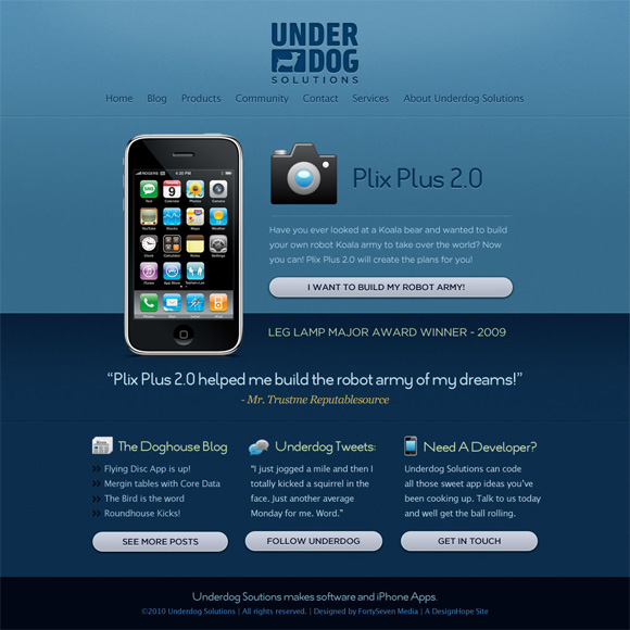
Now that we’ve finally have a logo, it’s time to get to the fun part, the design! Scott had given us a solid direction for the look and feel. He wanted a clean, simple design that showcased a current app and also provided a few more options for people to jump into the different content areas of the site. We went with a mono color scheme in order to really showcase the app and make the different headers and content launch points stand out more readily.
Keep Reading
by Jonathan Longnecker in Design,
Tutorials,
ExpressionEngine
I recently had a reader ask about the pop-up contact forms and lightbox scripts we’ve used on some of our client sites - were they built into ExpressionEngine and how did we get them to work? Well the answer to the first question is generally no. EE lets you setup whatever js effects with whatever libraries you want. So can choose exactly how you use it. It really is a different way of thinking about putting together dynamic websites, especially if you’re used to most of the other CMS’s out there.
So for this example I’m going to show you how to create a “Tell a Friend” box that fades in and auto populates with the page you’re currently on. It’s a bit of HTML & CSS, a bit of jQuery, and a bit of ExpressionEngine. Ready to get started? Let’s go!
Keep Reading
by Jonathan Longnecker in Design,
Business,
Personal
I fired one of our first clients last week. It was messy and no fun for everyone involved. I also managed to get a lecture from the president of that company on how to run my business and better serve the needs of my clients.
While the initial reaction for any of us would probably be thoughts of a Chuck Norris roundhouse to the face (in slow motion, of course), the whole incident made me think hard about what 47m is at it’s core, and what it truly means to serve a client. I think there are two ways to serve a client:
Scenario 1: Blind Serving
In blind serving, you’re always making the logo bigger or adding starbursts because the client says so. Not because it’s better for them, but simply because they demand it. A lot of companies won’t fight this because they’re just trying to make a living. And that’s ok. I think everyone starts out serving blindly. Get the job done ? client happy ? get paycheck.
But at some point, you come to a crossroads. At some point, your experience will tickle the back of your brain and say “That’s a bad idea!” So what happens then?
Keep Reading
by Jonathan Longnecker in Design
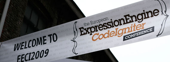
Hello from the Netherlands! The EECI2009 conf is in full swing, and we’re having a great time! This entry is more of a companion piece to my presentation (you can check the slides out below). So if some things don’t make sense, read through it. Someday when I have time I hope to write a more detailed version, but for now this is what we’ve got! For those on the fast track, this is how we setup EE and “package” it so it’s ready to go for each new site we do. Go read up on Structure and try it out. You’ll thank me later.
The more ExpressionEngine sites we develop, we began to see a faster, more efficient way of doing things. The advent of 3rd Part Addons like Structure and Field Frame are opening up a whole new world of rapid development.
Keep Reading
by Jonathan Longnecker in Design,
Business,
Design Hope
Keep Reading
by Jonathan Longnecker in Design,
Business,
Personal
I would wager that the majority of web designers end up doing work for small to medium-sized businesses. And I’m sure we all have a fantastic story of how ludicrous they can be sometimes. After a few “interesting” experiences, I’ve had this one rolling around in me for a while. Small business people; we love you, but pay attention, alright?
We Understand it’s Your Baby
If anyone can sympathize with a small business owner it’s a small web design shop. We know you busted your tail, working night and day to get this off the ground. So did we. We know you’ve had to wear so many hats it’s not even funny. Salesman, bookkeeper, account manager, marketing guy, the list goes on and on. We do it all, too. It’s exhausting. And so when you bring someone else in to help you visually define what you are; it’s like we’re messing with a part of you. Here’s the thing, though. You’re too close. You need someone with a neutral perspective to help you make decisions for the better. My favorite saying goes, “You can’t read the label when you’re inside the bottle.” You’re so close to the details and emotional attachments that it’s hard to see the big picture.
Keep Reading
by Jonathan Longnecker in Design,
Business,
ExpressionEngine,
Personal
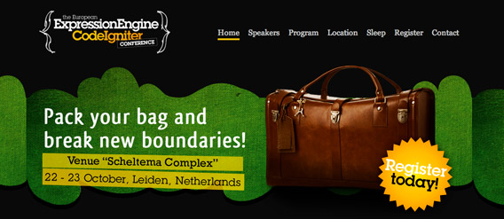
I’m pleased to announce that I’ll be doing a workshop at the ExpressionEngine and CodeIgniter Conference in Leiden, Netherlands October 22-23, 2009. I’m really excited about this trip because 1.) I’ve never been out of the country and 2.) The group of people at this conference are amazing. Honestly, I’m quite humbled by the lineup. How did I get to be invited again? I can’t even list them all here, but include household names like Leslie Camacho of EllisLab, Veerle Pieters of Duoh!, Brandon Kelly of LEVEL Studios, Leevi Graham of Newism and Ryan Irelan of Happy Cog. Like Veerle laments, I’m not much of an EE coder compared to everyone else, so here’s to hoping I can bring something good to the table. In fact, I’ll be talking about how we take our static HTML/CSS pages and speed up development putting it into EE first and then building out real links and content.
Keep Reading
by Jonathan Longnecker in Design,
Design Hope
Welcome back everybody! I have a good feeling about this round. Like we might just have a winner. Lots of great input from everyone on the last round. Except for that one guy. Sigh. There’s always one isn’t there? Thanks to those of you sticking up for us and keeping things positive. Moving on!
Keep Reading
by Jonathan Longnecker in Design,
Design Hope
First of all, I’d like to thank everyone for their input on the last round of logos. While I’m not usually a fan of designing by committee (as in I’d rather impale myself on a pumpkin), the observations and general consensus were positive, well thought out and very helpful. Bravo! Version No. 2 was the resounding winner, but still needed a little love. As such, I’ve re-worked the dog head a bit so it looks more like a “G.” Although I’m not too concerned about it. The name and connotation will do the job just fine (anyone ever seen the Guitar Center logo?). We got some good ideas from Scott and a few other people, but most of them ended up being too complex visually.
Keep Reading
by Jonathan Longnecker in Design,
Business,
Apple,
Personal
So this little blog popped up a couple of weeks ago called Minimal Mac. Yeah, yeah Macs are minimal; we all know that right? Steve Jobs hates buttons, blah blah blah. Ok, but how about when you’re using them day to day?
As we’ve become more involved in the community I’ve been finding myself more and more distracted as of late. I’m trying to work, but there’s a new RSS feed I need to read. Or a new email that just came in. Twitter just never stops. Ever. There’s something about new stuff that gets us all excited and makes us feel like we need to see it now.
Keep Reading
by Jonathan Longnecker in Design,
Business,
ExpressionEngine

Well, Nate and I made it back from our trek to the sunny St. Petersburg, FL and the Front-End Design Conference where I was a speaker. Let me tell you right now; we both had a great time. Dan Denney (@webdesignfanboy) went all out for his first event and went out of his way to make us feel welcome. From the coffee cups with our cartoon characters printed on it to the swank afterparty, we felt like nerds just might rule the world. We also got to meet a ton of new people and twitter friends face to face; not to mention talk about the things like HTML and CSS without getting the “look.” If you don’t know what that means, you’re probably not married or in a relationship!
Keep Reading
by Jonathan Longnecker in Design,
Business,
Design Hope
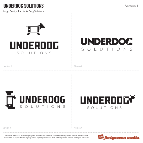
Just as we promised, we’re putting this whole design process out for feedback (good and bad!). For those us you just finding us, Scott Schuster of Underdog Solutions, a startup iPhone development shop, won the contest a few months ago. Here’s the list of what he’s winning, but for now we’re finally jumping off here with some initial logo designs.
Scott had talked quite a bit about his dogs, and even went so far to reference them in his company name, so we thought that was a great place to start with his identity. We also tried to put in some references to the iPhone in a fun way. The goal was to make something simple and professional, but with a bit of character. We have a soft spot for the 8-bit version as well 
Keep Reading
by Jonathan Longnecker in Design,
Business

Fixoutlook.org is a fabulous initiative from our Design Hope sponsors Campaign Monitor and Newism. It sucked bad enough when Microsoft decided to use Word to render HTML emails in Outlook 2007. With one fell swoop they took email designs back 7 years. Now they’re saying Outlook 2010 will do the same. In fact they’re not even going to change the rendering engine at all. It *barely* supports tables, no CSS position and has mounds of bugs and quirks. All to say, if you thought Internet Explorer was the bane of your existence, you haven’t tried designing and coding an HTML email for Outlook. IE’s a walk in the park compared to this. Need a visual?
Keep Reading
by Jonathan Longnecker in Design,
Business,
ExpressionEngine

Just another reason to come to the Front-End Design Conference this year: ExpressionEngine will be giving away 5 EE Packages at my session on “Why ExpressionEngine is Great for Designers.” Each package includes:
Keep Reading
by Jonathan Longnecker in Design,
ExpressionEngine
We just finished up a particularly fun project, Casillas, Inc. They’re an amazing custom furniture maker in California. In an odd turn of events, we actually did very little design for the site and became the “backend guys” if you will. As we got into how we wanted the site to be structured we realized that because of the product names (all numbers) we needed to use the category that the product was part of in the URL structure. So for example it would read:
Keep Reading
by Jonathan Longnecker in Design,
Tutorials
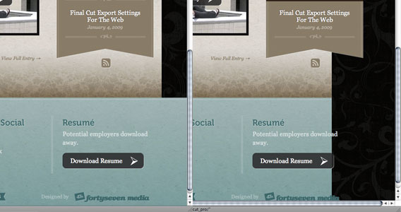
One of our astute readers discovered a flaw in our footer design implementations recently and I thought I’d share it with you. Turns out that we have a penchant for using a background image repeating on a 100% wide footer. Also turns out that when you squash your browser window down to anything smaller than the content and then scroll over to the right that background image stops repeating! See what I mean here:
Keep Reading
by Nate Croft in Design,
Business,
Design Hope
It’s crunch time for anyone that wants to submit their new small business for Design Hope! Come May 22, that’s all she wrote!
Be sure to tell any and every new small business owner you know that they could possible get a free website package worth $15,000!
Keep Reading
by Nate Croft in Design
 We do logos on a regular basis, but few are of the illustrated variety. So when I was contacted to illustrate the logo for “The Car Fairy,” I have to admit that I got a bit excited.
While I take great joy in crafting a great website from scratch, there is something uniquely satisfying about illustration. I found my trusty black notebook and cheap-o Paper Mate pen and began to sketch out some roughs to give our client a few variations. Originally, they wanted a redneck mechanic type of fellow with a tutu. Being from The South, I am quite familiar with this sort of friendly backyard car enthusiast. I knocked out a few different looks and came up with these three fellas.
Keep Reading
by Jonathan Longnecker in Design,
Business,
Personal
 It’s official! Mr. Dan Denny (aka webdesignfanboy) is putting together the Front-End Design Conference, a single day event with a focus on content, presentation and behavior.
Keep Reading
by Jonathan Longnecker in Design
When you’re working on a new design for a client, good communication is key. Just recently we’ve run into a situation where an agency keeps having us change little things to try to get the design right for them without stepping back and addressing the larger direction of the whole thing. Granted, it should have been their job to say, “Hey this is way too modern” or “We were really thinking of using some kind of weathered, worn look instead” instead of “the radius of the rounded corner doesn’t look right,” but the reality is most clients don’t know how to communicate this kind of stuff to you. Apparently even some design agencies. They just know it doesn’t feel right, and then they try to fix it with nitpicks (see Nate’s article here).
Keep Reading


 We do logos on a regular basis, but few are of the illustrated variety. So when I was contacted to illustrate the logo for “The Car Fairy,” I have to admit that I got a bit excited.
 It’s official! Mr. Dan Denny (aka