As long time client Food Blogger Pro has grown, they reached out to 47m to craft a new look, feel, and flow to better reflect their amazing community. The result is fresh, cohesive experience focused on their users.

The new Visit Minnesota logo sports a clean and simple look with a touch of old-school adventure. Vintage and modern collide!

With a beautiful new brand and a powerful custom e-commerce site, Grit Nutrition is ready to take orders.
Their meticulous attention to detail and thought process behind our project was 1st. class on every level.
Cory Redding, Sr. / Owner / Redd's Barbershop

FortySeven Media re-designed Unlimited Peformance's logo, crafted some excellent product packaging, and built a beautiful, lean single page e-commerce site.

Coming to us with a beautiful new design already in place and an important mission, Iterators needed a clean, modern site build with an easy way to make updates themselves.

Sporting a fresh new look and attitude, the new Amtrav site takes risks that payoff in both attention and clarity.

A quick offer to design a logo for a good friend turned into an amazing opportunity to meet some amazing people and create some space.

Mattison came to us with an exciting project - they were renaming and rebranding their company! Fresh starts are always so much fun, and we loved having the opportunity to help them shape their new look and feel.

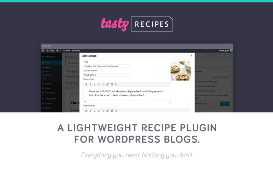
Our friends at Food Blogger Pro built their own WordPress plugin to help other food bloggers manage their recipes. We helped them create a simple brand and landing page for the new company and product.

After years of "just being a blog" it was time for Tiny Shiny Home to step it up. They needed a real homepage to guide visitors to the content they were looking for. They needed a better way to engage readers. And they needed to start making money. Here's what we did to help.

We helped the Nomadventure Shop build a curated adventure brand with a site that is beautiful, clean and easy to update.

With a new website design already in place, Glanbia was ready to start building. We jumped in, coded a responsive front-end and hooked it into a content management system for easy manageability and deep functionality.
