by Jonathan Longnecker in Design,
Business,
Tutorials,
ExpressionEngine
Non-profit organizations have a special place in our hearts here at FortySeven Media. We love it when people decide to change their world for the better, and do our best to help them however we can. Several months ago we completed the Knoxville Leadership Foundation's new website. Shortly there after Dan Myers, the Director of Communications and Operations at KLF, asked us to be part of a seminar for non-profit organizations to better equip them to use their websites. The following is a condensed version of that session. We had a grand time chatting with everyone there and hope you enjoy the information! The slides of the presentation and the handout companion are available in PDF format at the end of the article.
1. Evaluate Your Current Website
Before we jump too far into this, let's take a moment to think about your current website. Are you excited about it? Do you tell people about it or do you try to not bring it up? When was it last updated? These are great indicators of the current condition of your site. Most organizations can answer these questions instantly. The short version for most, is “No, we aren't excited about our site, it's awful!” The good news is that it doesn't have to stay that way. Let's look at a few ways to get your website tuned up and working for you.
Keep Reading
by Jonathan Longnecker in Design,
Business,
Personal
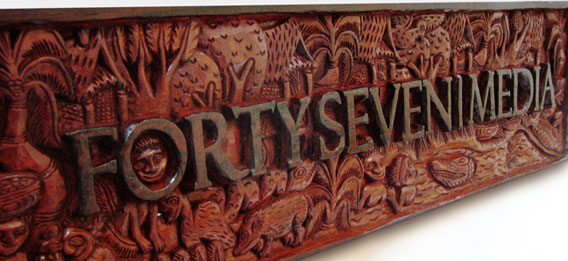
Ever wanted your logo hand carved from a massive piece of wood by natives of Papua New Guinea? Ok, so maybe it wasn’t the first thing on your list, but dang it’s cool. My wife’s sister and her husband are missionaries in New Guinea and are back in the states to make the rounds to all their supporters and show them what they’ve been up to. Too many “and’s” in that last sentence? Probably. Regardless, we just got this in yesterday and had to share.
Keep Reading
by Nate Croft in Design
The following is a true story.
I had picked up Thrice’s new album and we had been listening to it yesterday while we were working. It is one of those albums that you immediately know is good, but need need a few more listens to really grasp its depth. So when I left a little early to move a piano, Jon decided that he would borrow it and return it today, which is totally fine by me. But what really struck me was the note he left. Well, not really the note itself, but its typeface. Instead of the completely dull and lifeless default font that Stickies uses, I saw this:
Keep Reading
by Jonathan Longnecker in Business
 Recently I had an encounter with a company that had a website, but didn’t understand the web. I promised them in an oh so nice email that I would write a blog post on the whole thing, so enjoy
  .
.
So my wife has a site that talks about the benefits of cloth diapers over disposable. She became a member of the Real Diaper Association (no I’m not going to dignify them with a link) who provides members with some very nice researched information to back up the above claims. Things like the chemicals used cause cancer, they take 200-500 years to decompose, scary stuff like that.
To make a long story short, we used their reasons, clearly citing them as the authors and giving them a prominent link back to their site. And then we got this email:
Keep Reading
by Nate Croft in Design

If any of you good people out there don’t read the insightful Daring Fireball, you might have missed The Rather Difficult Font Game, which is aptly named. I normally consider my type-fu to be excellent, but I too was humbled. 33 out of 34 for this type ninja.
Keep Reading
by Nate Croft in Design
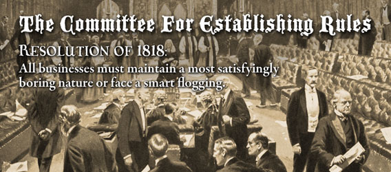 I don’t know when The Committee For Establishing Rules sat down to dictate that businesses must be staunchly boring and devoid of personality, but I’m glad to see that Veer missed the memo on that one. They are one of a few a larger companies we do business with that have managed to keep their charm. More than that, they know how to have fun.
Keep Reading
by Jonathan Longnecker in Design
Thought we’d share just a few tips we’ve come across as we design each day. Seth Godin says lists are cool so I’m going to try one.
1. Think like a website. Try to keep in mind the limitations and strengths of the web when designing. For example, look for backgrounds that can repeat easily, or avoid designs that have a lot of overlapping transparency (at least until IE6 isn’t on so many computers).
2. Web typography. Your web typography will set your design apart from other studios. Study optimum line heights, widths and look for inventive ways to guide the viewer through your layout only using CSS rules. There’s something refreshing about only having 3 or 4 good fonts to work with. Flash replacement (sIFR) is alright, but don’t overuse it.
Keep Reading
by Nate Croft in Business

There is a company very close to my house. I drive by it on an almost daily basis. I don’t know the name of this company. I don’t know what they do. All that I know is that they do not want me to ask for pallets.
As you can see in the picture above, this sign (and the two or three more just like it) are posted on the chain link fence surrounding their property. It’s the only signage you can see from the road and it isn’t a necessarily friendly welcome, you know?
Keep Reading
by Nate Croft in Design
Fadtastic.net has put out their “HOT TIPS for Your Website in 2008.” Remember the date here friends. 
Anyhow, check out the Universal IE Hack, it’s the CSS I wish I could put into every site we code. Just kidding; we love you IE6. Except we’d rather gouge our eyes out with a spoon than “fix” another site for you ever again 
Keep Reading
by Jonathan Longnecker in Design
 I was just informed that Smashing Magazine is using the EdgePoint Church site as an example of great grid based design. Awesome! Kudos to EdgePoint for giving us the freedom to give a church such a kick awesome design. We’re honored that Smashing magazine would include us as one of only 3 case studies. Kind words, for sure: “The grid is escaped with the use of angles and placement of the illustrations and photography that surround the layout. The header has a free flow design that opens up the top as a creative space.” Thanks, guys!
Keep Reading
by Jonathan Longnecker in Design,
ExpressionEngine,
Apple
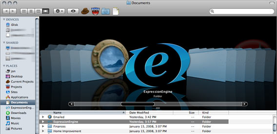
Here’s a little goodie for you ExpressionEngine developers on Leopard. A pretty folder icon to put all your plugins, modules, extensions, etc… in.
Quick rundown for those who don’t know how to change folder icons:
Keep Reading
by Jonathan Longnecker in Business,
Apple,
Personal

So the other night the wife and I were at the Apple store looking for Time Capsules for 47m. Happened to see the new AppleTV setup while we were there, and the HD movies looked incredible. I mean, jaw droppingly good. Yeah, I know BlueRay is better, but seeing Transformers in “almost” HD compared to the standard def movies I was used to; I was hooked. No more trips to Blockbuster, I nudged the wife (Gently nudged, of course)!
Keep Reading
by Jonathan Longnecker in Design
 I meant to post this earlier, but we were nominated for the month of March by Unique CSS. Basically, they pick only 8 of the best sites they find and let people vote for the winner each month. Now, I know we’re halfway through March, but there’s still time! We need your help to win this thing. Do I sound like a politician yet?
Keep Reading
by Jonathan Longnecker in Business,
Personal
Hey everybody, sorry we’ve been kind of quiet around here lately! Since we launched the new site in January we’ve had a flood of job requests come in and thus our free time has diminished a bit.
In addition, Nate and I are both helping to start new churches. Nate is running sound over at Turkey Creek Church (no, we didn’t do the website…don’t know why) and I’m leading worship and handling web duties at EdgePoint Church.
Keep Reading
by Jonathan Longnecker in Design
 Well, our boys over at Less Everything have done it again. They’ve just released an open source social networking program called Lovd By Less. Frankly, I’m not sure how they manage to write app so fast, let alone make them this good. They must be eating their Wheaties. If you’ve been looking to put together some kind of social networking site and want to save some time developing, you should definitely check it out. Keep in mind that this is built with Ruby on Rails, so you’ll need to have some experience there. Here’s a list of features:
Keep Reading
by Jonathan Longnecker in Design
Microsoft has listened to the web community and reversed its decision to make IE 8 behave like IE 7 unless specifically told to do so. As I’m sure most of you have heard, there was much debate over this, with some big names in the web community actually backing Microsoft on this one. It never made sense to me, so I’m glad to see common sense won out this time. I just want my time back from all the things I’ve had to “fix” to make display properly in IE 6. You listening, Redmond? Eh, I didn’t think so.
Keep Reading
by Jonathan Longnecker in Design,
Business
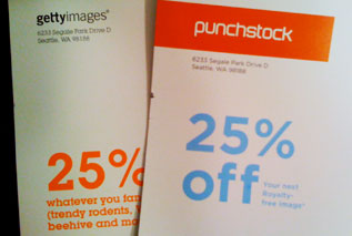 So I got these in the mail the other day (see picture). They were both roughly the same size, had big weird pictures on the front and were supposed to be cool, I guess. I glanced at them and noticed they both had the exact same offer. 25% off! That’s kind of strange. Oh wait, apparently Getty Images and Punchstock are located in the same building! Same return address! What do you know? I think someone is trying to pull a fast one on me!
Keep Reading
by Jonathan Longnecker in Design,
Business

We’ve all probably used Google Docs or Zoho Writer. The new crop of AJAX based online word processing applications surely have Microsoft scrambling over in Redmond. Not to say any of those options is bad; in fact most of them are quite nice. But I found something completely different. BuzzWord.
Keep Reading
by Nate Croft in Design,
Tutorials
Every designer knows that at some point during a project there will screenshots, and lots of them. Third party applications often get this job, but if you are a Mac user (10.3 and later), you have another option built right into the OS. That option comes in the form of key commands, and the key commands come in three flavors:
Keep Reading
by Jonathan Longnecker in Tutorials,
ExpressionEngine
So here’s a quick tip for you ExpressionEngine users. EE will automatically encode any email addresses that are generated by itself. For example, when you leave a comment on this blog and put in your email address, EE will turn it into a mess of javascript nonsense in the code so that those nasty spiders don’t pick up your email and send you dirty emails.
Sometimes you’ve got to manually encode it, though and that’s where this quick tutorial comes in.
Keep Reading

 Recently I had an encounter with a company that had a website, but didn’t understand the web. I promised them in an oh so nice email that I would write a blog post on the whole thing, so enjoy
 I don’t know when The Committee For Establishing Rules sat down to dictate that businesses must be staunchly boring and devoid of personality, but I’m glad to see that
 I was just informed that Smashing Magazine is using the
 I meant to post this earlier, but we were nominated for the month of March by Unique CSS. Basically, they pick only 8 of the best sites they find and let people vote for the winner each month. Now, I know we’re halfway through March, but there’s still time! We need your help to win this thing. Do I sound like a politician yet?
 Well, our boys over at
  So I got these in the mail the other day (see picture). They were both roughly the same size, had big weird pictures on the front and were supposed to be cool, I guess. I glanced at them and noticed they both had the exact same offer. 25% off! That’s kind of strange. Oh wait, apparently Getty Images and Punchstock are located in the same building! Same return address! What do you know? I think someone is trying to pull a fast one on me!
