by Jonathan Longnecker in Design
 Seems like everyone is dropping support for IE6 these days. Apple with MobileMe, 37Signals with Basecamp; even Google with Gmail. What gives? Well, it’s 7 years old for starters. In technology years, that’s like 247 years old! It’s much less secure than the other major browsers. It’s javascript support is wonky at best. And it’s CSS (layout) support? The stuff of horrible, kill-you-in-your-sleep legend.
Keep Reading
by Jonathan Longnecker in Design,
Business
 We’re happy to report that Web Designer Wall has listed our site in the Current Web Design Trends for 2009! Looks like we’re under the “multi-column layout” section. We’re honored to be among the company of the others chosen; every single one is just amazing. If you haven’t already, go check out Nick La’s amazing resource site for web designers.
Keep Reading
by Jonathan Longnecker in Tutorials
I love sIFR, but man, their documentation is really difficult to figure out. There’s multiple synatxes you can use and all kinds of hidden variables they just expect you to know. I’m just saying for us who don’t live and breath Javascript, it could be a little easier right?
So I’ve been working on a site where I want to use the drop shadow as an effect to make the text look inset. Just a 1px white highlight on the bottom right. Problem is, the drop shadow filter in Flash defaults to a nice, smooth fade. Well, that’s not usually a problem, but it’s not what I wanted. For some reason I spent hours looking for this and finally ran across the syntax in case anyone else was wondering.

Here’s how. Just take the regular syntax in your sifr-config.js file:
Keep Reading
by Jonathan Longnecker in Personal
Just a quick thought. I’m in the middle of a rather nasty family emergency where one person has been mind-bogglingly selfish. Like he is the only person in the world selfish. It’s really bad.
Keep Reading
by Jonathan Longnecker in Design,
Business,
Personal
 Ever wanted to find friends based on the books they love? Then Bookmesh is the place for you. We’re incredibly excited to announce that it’s finally ready for some beta testers, and you’re invited.
Keep Reading
by Jonathan Longnecker in Design,
Business,
ExpressionEngine
Raise your hand if you can’t believe it’s almost 2009 already. Yep I’ve got mine up! It’s amazing how fast time flies when you’re having fun. The last year has definitely been an interesting one, and we’re looking forward to this next year with great expectation and excitement. I can honestly say that God has blessed us with the best jobs and families in the world. What more can a guy ask for?
I thought about writing some sort of “resolution” or goals post for the new year, but instead I think sometimes it’s good to reflect on what you’ve done. You might even amaze yourself. Looking back over all of our projects this past year, I was surprised at just how much we’d done with a small two man shop. Apparently we’ve been busy  .
.
For those of you who just recently found us, here’s a quick recap of our favorite projects this past year. Hope you enjoy!
Web Design Projects
EdgePoint Church

No surprise this was one of our favorites. It came together very quickly and got a ton of attention from Smashing Magazine, Web Designer Wall, Collide Magazine and Godbit. Links: Portfolio | Live Site
Keep Reading
by Nate Croft in Music

Up until a few days ago, you probably only knew FortySeven Media as those guys that make kick-awesome websites. But before there was a FortySeven Media, there was rock! (Insert Jack Black-like air guitar solo here.)
You see, back before Jon and I started FortySeven Media, we started a band with a couple of our friends. We wrote lots of songs, played more shows than we could keep track of, and didn’t record nearly enough. In fact, only one full length album and one EP was all that existed of our years of hard work. But in 2004, we decided to fix that.
Keep Reading
by Jonathan Longnecker in Tutorials,
ExpressionEngine
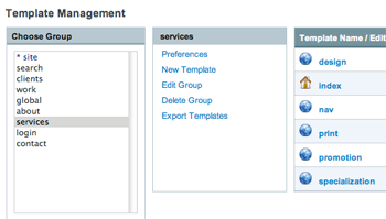 Continuing in our series of how we use ExpressionEngine, I thought it would be cool to show you the power and flexibility of the templates in conjunction with global variables.
One of the main reasons we started using EE was it's flexibility. Other CMS's make you cram your design into their pre-defined templates and make you dig around in huge PHP files. Not so with EE! We code every site from scratch by hand, first creating a static version that we can test in multiple browsers. Then we chop it up into our own templates on our own terms inside EE.
Keep Reading
by Jonathan Longnecker in Business,
Music
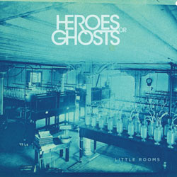 It’s been one crazy year here at 47m, and we’re doing our best to go out with a bang! It may come as a surprise to you, but we do more than design cool websites. We also make the rock and roll. And we finally have some of the rock and roll to share with you. Now between the two of us, I’m not the engineer so I’ll leave the gory technical details to Nate, but I can honestly say it sounds pretty awesome. The two of us wrote and recorded everything, not to mention playing almost every instrument on the album. Needless to say it’s taken a while. Like 5 years. And that’s another story entirely. But it’s finally done!
So in the spirit of Christmas, we would like to give you one of these songs and let you listen to a few others. We sincerely hope you love it.
Keep Reading
by Jonathan Longnecker in Design
 We meant to post this a little earlier, but we’re happy to report that Web Designer Wall has listed our site in the Top 50 best CSS designs of 2008! We’re honored to be among the company of the others chosen; every single one is just amazing. If you haven’t already, go check out Nick La’s amazing resource site for web designers.
Keep Reading
by Nate Croft in Design
Sometimes I just get stuck when I’m trying to develop colour schemes. I just can’t seem to find the right complement of tones to work with. It’s at these moments when I start to look for some inspiration.
It can be the view from my window, a great photo I’ve seen, the weathered buildings of the aging community centers around, or the left over milk from a bowl of Lucky Charms®. The point is not to miss out on a spark of imagination from the world around you. I’ve recently moved so there are many new things to inspire me, but on one particular occasion I still needed some help. And whilst taking an RSS break I came across this picture:
Keep Reading
by Jonathan Longnecker in ExpressionEngine
 In case you hadn’t noticed, we love ExpressionEngine. Some may consider it an unnatural love, but we don’t care. The flexibility and plain english programming is head and shoulders above everything else.
Lately we’ve been coming across some awesome plugins, extensions and modules that extend the functionality of EE even farther, and we had to share them with you. Most of these are free, but I know many of the developers take donations. If you find these useful, consider helping them continue development with a little word of mouth or some moolah! Cause everybody loves moolah.
1. Freeform
Author: Solspace | Download (Requires free membership) Freeform gets installed for every single site we do. EE’s contact forms are a little weak and Freeform adds a ton of functionality and customization for any kind of form you need to make. Create custom fields, custom email templates and store all the entries in a database to be searched, sorted or exported later.
Keep Reading
by Jonathan Longnecker in Business,
Personal
We’re coming up on our second year of calling 47m our full time job so I thought I’d share some things we’ve learned along the way. I’m attempting to shorten my Top 10 lists…not by number but by content. Otherwise it wouldn’t be a Top 10 list now would it? So without further ado, the slimmer Top 10!
1. Don’t Go in Debt
Ten years ago you needed a detailed business plan and a hefty loan from a bank to start a business. But web based businesses have changed everything. You don’t need a office or a fancy new desk. You don’t need a company car. You really don’t need much of anything except a computer and some software. I’m happy to say that we slogged it out for two years working full time jobs and doing 47m on the side until we built up enough cash inflow to make it our day jobs. Not only does it make you more responsible, but in this economy debt is like poison. Get rid of it now!
Keep Reading
by Nate Croft in Music
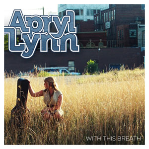 If you’ve been reading the blog, you might remember us posting about some of our top secret media projects. Apryl Lynn’s With This Breath is the first of those projects that we are releasing out into the wild.
Apryl isn’t your average singer/song writer. She avoids the whiny artist who complains over a couple of chords stereo type, and gets straight to into the soaring rock choruses. Or was that electro-disco-rock beats? She isn’t afraid to give the song what it asks for. And we were more than happy to oblige. This is FortySeven Media’s first venture into the realm of artist development and record production, and we have to say, we like it. Taking a great barebones song to a fully fleshed out arrangement that just won’t get out of your head is truly rewarding, and even more so is taking a chance on a local talent and giving her the shot she deserves.
Keep Reading
by Nate Croft in Design
 After seeing such a title, I imagine you might be wondering how I’m going to pull this together into some kind of amazing post to inspire you and provide you with more awesomeness than before you read this. Instead, I recommend abandoning such thoughts and embrace the sheer simplicity of the primate-gourd form. Monkey. Pumpkin. Together.
Keep Reading
by Jonathan Longnecker in Business,
Personal
I went to Food City to buy some groceries today, tried to slip through the self-checkout because I was in a hurry and guess what they don’t accept there? Their own gift cards. Seriously? So I have to cancel my order and walk 5 steps to a register with a person behind it. And then guess what? I use the exact same credit card processing machine and the cashier never touches my card!
Keep Reading
by Troy McNeil in Design,
Business

So the other day my wife and I spent the afternoon at Dollywood. We had just finished a roller coaster when I saw this huge machine, that had this huge claw, that housed these sweet little care bears looking at the claw in terror (particularly the yellow bears). I had never seen such a huge claw game in all my life.
It was no surprise to see it though because it seems that “Super Sized” is the cool thing to do now days. Just go to any fast food joint and order a combo and they will hand what used to be a 32 oz extra large cup to you as your combo drink. Now there is nothing wrong with wanting a little bang for your buck, especially if you really really dig mountain dew. There comes a point though where “SUPER SIZE” does not necessarily equal Kick Awesome. So what’s a designer to do in this age of jumbo everything?
Keep Reading
by Jonathan Longnecker in Design,
Business,
Personal
Efficiency. The word that strikes fear in the heart of designers everywhere. Somehow along the way to becoming our artsy selves, we’ve managed to throw all structure out the window. “We’re above that sort of thing; we’re creatives!” we say.
It’s ok, we’ve all been there. I know it started with good intentions: we knew if we had a little more time or a change of scenery, it could make the difference between something good and something amazing. But then somehow it turned into an excuse to take longer to finish things. And an excuse to take longer breaks more often. And before you know it, we’re taking twice as long to finish projects, but they’re not anymore awesome than before. What happened!?
Keep Reading
by Nate Croft in Design
 If you have been following us for some time or had a look through the portfolio section of the website, you might have noticed that our media section is mysteriously blank. This isn’t an error or some server malfunction. It is, however, a place holder for some of our longer running media projects. Over the next couple of months you’re going to see some things start to pop up there. What kind of stuff?
I’m glad you asked.
Keep Reading
by Jonathan Longnecker in Design,
Tutorials

We’ve done our fair share of web app designs here, but often don’t get to share them for NDA reasons or the simple fact that the developers are still working on them somewhere! No worries, fair reader. For we shall approach these diplomatically as to protect the innocent. Behold, the top 10 list of yore!
1. Text Text Text
Web apps are huge, complicated beasts, even if you try to keep them simple. There are dashboards and login pages and edit profile pages and who knows what else. So do me a favor and keep everything text. Navigation, headers, everything. Because I guarantee you the developers are going to have to setup more pages once you’re done and they shouldn’t have to jump in photoshop to change your cool looking buttons (note, see this post about accessible, good looking buttons) or re-do the entire navigation.
Keep Reading
 Seems like everyone is dropping support for IE6 these days. Apple with MobileMe, 37Signals with Basecamp; even Google with Gmail. What gives? Well, it’s 7 years old for starters. In technology years, that’s like 247 years old! It’s much less secure than the other major browsers. It’s javascript support is wonky at best. And it’s CSS (layout) support? The stuff of horrible, kill-you-in-your-sleep legend.
 We’re happy to report that Web Designer Wall has listed our site in the
 Ever wanted to find friends based on the books they love? Then Bookmesh is the place for you. We’re incredibly excited to announce that it’s finally ready for some beta testers, and you’re invited.

 Continuing in our series of how we use
  It’s been one crazy year here at 47m, and we’re doing our best to go out with a bang! It may come as a surprise to you, but we do more than design cool websites. We also make the rock and roll. And we finally have some of the rock and roll to share with you. Now between the two of us, I’m not the engineer so I’ll leave the gory technical details to Nate, but I can honestly say it sounds pretty awesome. The two of us wrote and recorded everything, not to mention playing almost every instrument on the album. Needless to say it’s taken a while. Like 5 years. And that’s another story entirely. But it’s finally done!
 In case you hadn’t noticed, we love
  If you’ve been reading the blog, you might remember us posting about some of our top secret media projects. Apryl Lynn’s With This Breath is the first of those projects that we are releasing out into the wild.
 After seeing such a title, I imagine you might be wondering how I’m going to pull this together into some kind of amazing post to inspire you and provide you with more awesomeness than before you read this. Instead, I recommend abandoning such thoughts and embrace the sheer simplicity of the primate-gourd form. Monkey. Pumpkin. Together.
 If you have been following us for some time or had a look through the portfolio section of the website, you might have noticed that our media section is mysteriously blank. This isn’t an error or some server malfunction. It is, however, a place holder for some of our longer running media projects. Over the next couple of months you’re going to see some things start to pop up there. What kind of stuff?