Web Designers, Design Your Content!
I’ve noticed a trend lately among websites I’ve visited that seem to win all kinds of design awards and such. First of all, they look beautiful. Web design has come a long way in the past few years. But I get this nagging suspicion that the designers kind of stop once they get the shell of the site designed. Then, when they get the content from the client, they copy, paste and call it day.
So what’s the big deal? Well, I’ll tell you what the big deal is! Content is important! In fact it’s probably more important than your design. I tell my clients all the time, “I don’t care how pretty we make it, if your content isn’t compelling; if it doesn’t reach out and grab the user, they’re not going to stay on the site.” And it’s true. Don’t get me wrong, it works both ways…I mean, if you’ve got great content, but your site is ugly as crap I’m not going to trust you simply because you didn’t put the effort to be professional.
But wait! What if the design and the content were both great? No, I don’t mean what if they were great on their own, but they actually integrated?
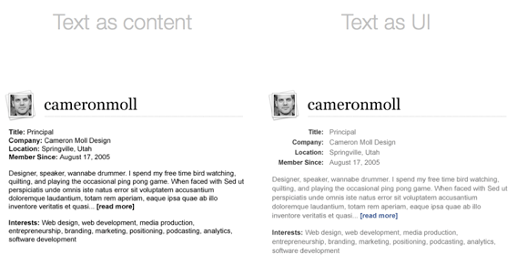
But wait! What if the design and the content were both great? No, I don’t mean what if they were great on their own, but they actually integrated? What if the content was designed as well as the rest of the site? What if it was treated as a User Interface by itself? Too often I see a lack of effort put into designing the part of the site that the user will be interacting the most with: yeah, the content (if you hadn’t guessed by now!).
Cameron Moll has a great example of treating your content as a User Interface:

I think one of the greatest challenges of web design is communicating your content with the 3 or 4 standard fonts available. It makes you dig deep and look for colors, spacing and subtle but effective ways to guide the user through your content.
It’s all about the details, guys (and girls). Take the extra time to make that block of text something easy to read through. Make the web a better place!
Comments
1
Adaptiv Media - Mar 01, 2008
2
Haiming - Apr 10, 2008
3
Spammyboy - May 16, 2008
4
soft bucuresti - May 18, 2008
Jonathan Longnecker - May 19, 2008