The Car Fairy - Design Process
 We do logos on a regular basis, but few are of the illustrated variety. So when I was contacted to illustrate the logo for “The Car Fairy,” I have to admit that I got a bit excited.
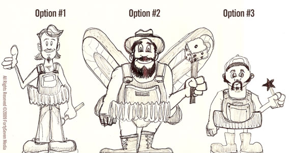
While I take great joy in crafting a great website from scratch, there is something uniquely satisfying about illustration. I found my trusty black notebook and cheap-o Paper Mate pen and began to sketch out some roughs to give our client a few variations. Originally, they wanted a redneck mechanic type of fellow with a tutu. Being from The South, I am quite familiar with this sort of friendly backyard car enthusiast. I knocked out a few different looks and came up with these three fellas.

Overalls and wands aren’t normally something you’d see together, so you can quickly tell that the end product was going to be some quite memorable. Our client really liked these preliminary sketches, but had decided since we last spoke that they now wanted to steer away from the redneck persona to avoid having to provide background in their advertising. Back to the notebook!
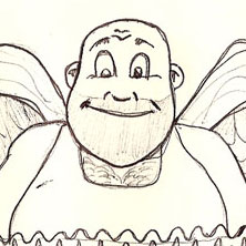
 Since the southern influence was out I opted to go with a regular tutu setup for the clothing. Great, I’ve got the clothes. That was easy. It’s classic, funny, and readily recognizable. Now, what about the character himself? The face I kept thinking of was a cross between a plumber and a boxer. I gave it a whirl and it really fit the part. You can see him to the right.
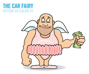
This sketch got the go ahead for color treatment so I broke it down vector stylee and got our boy all colored up. I placed the scan in Illustrator and traced him up by body part, each main feature getting its own layer. This brand will heavily rely on the character so they needed a full body version as well as the logo treatment. This is the full body color version to show how the character would stand. Like so:

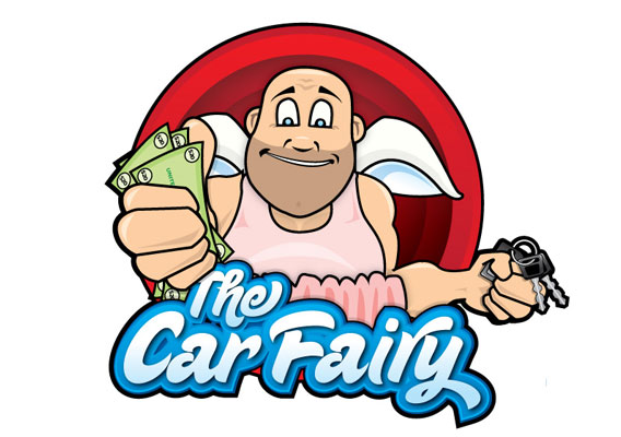
It was green lighted for the full logo treatment so I began auditioning different type faces. Sugar Pie had the right amount of whimsical flair and won out in the end. From there, it was gradients and several layers of offset paths to give it the right amount of depth and visual weight. Now comes that subtle “I’m conveying a message” part of the logo. Since The Car Fairy gives you cash for your car, it was important to convey that transaction with the character. You’ll notice that the cash is in the hand closest to you and the keys in the hand furthest away. You get an idea of what they do just from a glance at the logo. This was one of those rare occasions where we could be very literal with the message without it becoming cluttered or too heavy-handed. From there, we added to that an old style cartoon frame to pop out of and we had ourselves a logo.

Our client loved it and we were pretty pleased with it as well. The big lug is now representing his company and we look forward to seeing him pop up around the web and other advertising soon.
Comments
1
Jeph Kryzak - May 04, 2009
Jonathan Longnecker - May 04, 2009
Nate Croft - May 04, 2009
4
Rex Stevens - May 05, 2009
5
Eriuqs Spires - May 08, 2009
6
ty (Crssp) - May 12, 2009
7
Ty - May 12, 2009
Nate Croft - May 13, 2009
9
Erik - May 19, 2009
10
fenell - Jun 24, 2009
11
Michale - Sep 08, 2009
12
Broad - Sep 08, 2009