Design Hope: Logo Design Round 2

by Jonathan Longnecker

First of all, I’d like to thank everyone for their input on the last round of logos. While I’m not usually a fan of designing by committee (as in I’d rather impale myself on a pumpkin), the observations and general consensus were positive, well thought out and very helpful. Bravo! Version No. 2 was the resounding winner, but still needed a little love. As such, I’ve re-worked the dog head a bit so it looks more like a “G.” Although I’m not too concerned about it. The name and connotation will do the job just fine (anyone ever seen the Guitar Center logo?). We got some good ideas from Scott and a few other people, but most of them ended up being too complex visually.

So what did we do? We kept it simple! That became the mantra for the new design. Since Scott was worried he might change development platforms we removed all references to the iPhone and focused heavily on typography. The dog still made it’s way into this one because I think it just works. There’s no simple way to show “someone coming from behind” and most of his ideas even involved dogs so the dog imagery made it through to the second round with some modifications and new silhouette ( I call him Plucky, he seems like an Underdog, methinks).

Underdog Logos 2

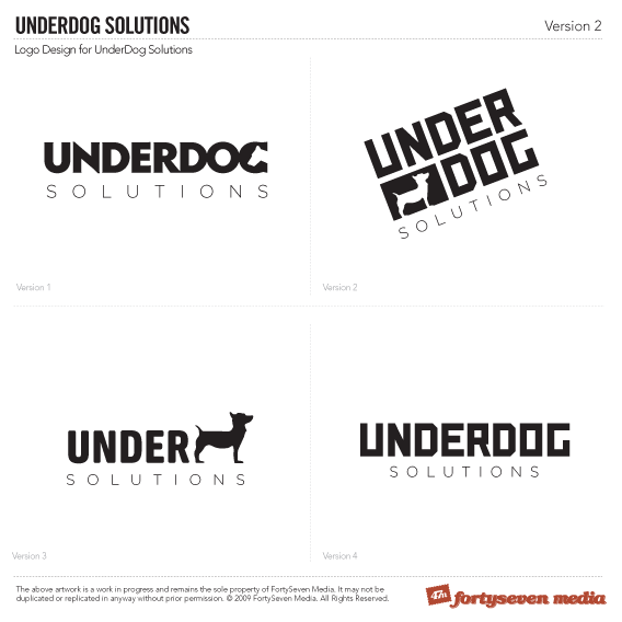
I personally think any of these would look great on an iPhone splash screen, but we’re favoring 1 and 4. 2 is pretty interesting, too though.

Comments are below. You know what to do.

August 21, 2009

Design, Design Hope

Comments

  1. Number one is definitely my favourite. The letter N is getting a little more focus then the other letters because of its geometrical shape. Maybe you could do something with that due to the syllable ending there; uNderdog.

    Two is interesting, three maybe only works on this presentation because we ‘know ’ the whole thing reads underdog. Fourth one I find to bland…

    Thanks for reposting this to ‘the committee’ again wink

  2. As of June 2008, all logos are required to use H&FJ; Gotham exclusively.

    Otherwise, they look great!

  3. I reckon number 1 is the go, but with a slight mod.

    Think ‘under’ should be stacked on top of ‘dog’ (which would be clever because the ‘dog’ would be under the ‘under’) smile

    Like so: http://emberapp.com/waydomatic/images/underdog-solutions

  4. Loving number 1.  I agree the N looks a little out of place, its too sharp compared to the other letters, the N from number 2 would look good.

  5. Nice revision there guys… If ever i want to contribute some ideas, can i just send an image or post it here? i mean the link?... if ever ? :D

  6. I think #1 is great! I also enjoy #2 as well though, especially if the “UNDER” was the same font as used in #1 for “underdog”... maybe you’ve tried and it would look bad though…

    Great work!

  7. I’m really liking #1 and #2. I do agree with Nick that #2 might look a bit more attractive with a different font, but I like the general idea. As far as #1 is concerned, I definitely see an improvement to the G in this version w/ the rework of the dogs head, so great job on that! I’m also not really too concerned with how the N looks even though I do see what you guys are saying in regards to it sticking out a bit… but it doesn’t really annoy me or anything. Even if it did, I think using a different font for the N would annoy me more.  Anyway, the only other thing I wanted to say is that I think Wayde’s idea of how to modify logo #1 is a neat one and that he might be on to something with that. But yeah, #1 and #2 are really shaping up! smile

  8. man i just wonder about the working days or hour to get from version 1 to version 2
    don’t you think it take tooooo long ?!!!!
    i mean if i’m a customer and i need a logo should i wait for lets say one month

  9. @Moahammed - I don’t want to speak for them, but I am sure that they are doing the best they can. Remember that this is a give-a-way site. Someone won this and is paying nothing for all this awesome work (Congrats!). 47m also has a lot of other clients as well I’m sure. So what is “too long” for a free service valued at thousands of dollars?  ...well that is up to 47m and Underdog Solutions.

  10. #1 is great.  Don’t change the N…it makes the mark unique.  Plus it makes me want to say “uNNNNN-derdog,” which is kick-awesome. Looks credible, masculine, and disciplined.

  11. I like #1!  You guys rock!

  12. @Mohammed If you don’t have any constructive thoughts on the actual logo, please don’t post here. We’re trying to do something positive for Scott; let’s keep it that way.

    @Nick Well said sir! Thanks for the backup wink

    @Matt I agree. The “N” in that font was what drew me to it initially. It adds character and wouldn’t be nearly as interesting modified to “fit.” It’s the little things, you know?

    @Wayde I will definitely try some stackage; good idea.

    Keep ‘em coming!

  13. @Mohammed Nick has already done a fine job pointing out how awesome it is for 47m to do what they are doing with this contest, but as the winner I thought it would be worth throwing my two cents into the fray. As Nick already pointed out, 47m is providing me with an awesome service absolutely free, so I think it is unfair to harshly criticize the pace at which this project moves along. Furthermore, I’m very grateful for this opportunity and so the last thing I would want is for these guys to neglect their paying clients to speed things up a bit. Likewise, and a little selfishly I must admit, I don’t think either 47m, their sponsors, or my company would really benefit in the long run if they just rush this project along to get it over with and as a result end up with a less than stellar final product.

    At any rate, I’m a firm believer in quality over quantity and as such I see the Design Hope contest as being not only a great way for 47m, their sponsors, and even underdog solutions to interact with the design community, but also as a way to gain some positive exposure in addition to re-enforcing the quality of our products.

    Moral of the story: Slow and Steady wins the race smile

  14. Fantastic work, Love the whole Idea of this project - really admire you guys for taking this on and following it through so well. It’s really nice to see and is definitely something I’m going to have to consider doing.

    I really love the version 3. Don’t get me wrong any of them would be good, and it seems people seem to prefer #1. But I like the fact that #3 doesn’t have the word dog in.

    The stance of the dog also works very well, he’s standing very proud and I think it really captures the spirit of what you are going for.

    Very nice work, and once again congrats for taking on a fabulous project and sharing the progress here with us.

  15. @liam Thanks for the kind words, man! We’ve actually moved on to round 3 and “Plucky” the Underdog did make it through. Check it here http://tinyurl.com/lhedge

Behold our Amazing Portfolio

Check it Out