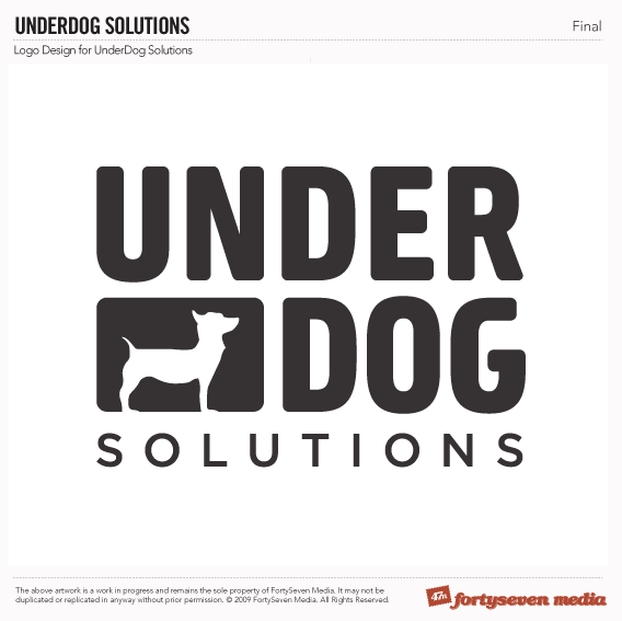
Design Hope: Final Logo

Folks, we have a winner! Scott has officially declared the final logo to be Number 3 from the last round minus the tilting. Though not apparently obvious, this version was completely redone, ensuring spacing and alignment was perfect and optimized where necessary. The Solutions font was beefed up a bit, too. Good call on that one, loyal readers! Not much else to say here, really. Since we’re starting from the ground up and have such a strong and simple mark, I’m going to tackle color alongside the website design. A little unorthodox, perhaps? Yeah, we were never the normal ones ![]() .
.
Thanks everyone for your input. We’re moving on to wireframing next.
Comments
1
Joshua Hays - Oct 08, 2009
2
John Schop - Oct 08, 2009
3
adam - Oct 09, 2009
4
Scott Schuster - Oct 09, 2009
5
Eric - Oct 11, 2009
6
Michael Hessling - Nov 04, 2009
Jonathan Longnecker - Nov 04, 2009
8
Michael Hessling - Nov 04, 2009
9
liam - Nov 12, 2009
10
Mehmet - Sep 30, 2012