Design Hope - Homepage Design
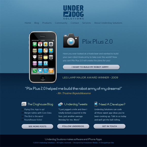
Now that we’ve finally have a logo, it’s time to get to the fun part, the design! Scott had given us a solid direction for the look and feel. He wanted a clean, simple design that showcased a current app and also provided a few more options for people to jump into the different content areas of the site. We went with a mono color scheme in order to really showcase the app and make the different headers and content launch points stand out more readily.
A good majority of the personality of this site comes from the content. Underdog’s first app is still in development and top secret intel for the moment so we’ve filled this layout with some fun filler content as it gives us a much better idea of what real content will look and feel like.
Comments
1
Ben - Dec 29, 2009
Nate Croft - Dec 29, 2009
3
Scott Schuster - Dec 30, 2009
4
rypaci - Jul 23, 2014