Search Results for (384)
by Nate Croft in Design
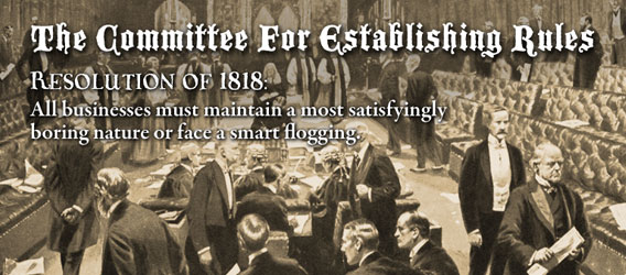 I don’t know when The Committee For Establishing Rules sat down to dictate that businesses must be staunchly boring and devoid of personality, but I’m glad to see that Veer missed the memo on that one. They are one of a few a larger companies we do business with that have managed to keep their charm. More than that, they know how to have fun.
Keep Reading
by Jonathan Longnecker in Design
Thought we’d share just a few tips we’ve come across as we design each day. Seth Godin says lists are cool so I’m going to try one.
1. Think like a website. Try to keep in mind the limitations and strengths of the web when designing. For example, look for backgrounds that can repeat easily, or avoid designs that have a lot of overlapping transparency (at least until IE6 isn’t on so many computers).
2. Web typography. Your web typography will set your design apart from other studios. Study optimum line heights, widths and look for inventive ways to guide the viewer through your layout only using CSS rules. There’s something refreshing about only having 3 or 4 good fonts to work with. Flash replacement (sIFR) is alright, but don’t overuse it.
Keep Reading
by Nate Croft in Business
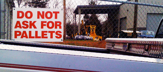
There is a company very close to my house. I drive by it on an almost daily basis. I don’t know the name of this company. I don’t know what they do. All that I know is that they do not want me to ask for pallets.
As you can see in the picture above, this sign (and the two or three more just like it) are posted on the chain link fence surrounding their property. It’s the only signage you can see from the road and it isn’t a necessarily friendly welcome, you know?
Keep Reading
by Nate Croft in Design
Fadtastic.net has put out their “HOT TIPS for Your Website in 2008.” Remember the date here friends. 
Anyhow, check out the Universal IE Hack, it’s the CSS I wish I could put into every site we code. Just kidding; we love you IE6. Except we’d rather gouge our eyes out with a spoon than “fix” another site for you ever again 
Keep Reading
by Jonathan Longnecker in Design
 I was just informed that Smashing Magazine is using the EdgePoint Church site as an example of great grid based design. Awesome! Kudos to EdgePoint for giving us the freedom to give a church such a kick awesome design. We’re honored that Smashing magazine would include us as one of only 3 case studies. Kind words, for sure: “The grid is escaped with the use of angles and placement of the illustrations and photography that surround the layout. The header has a free flow design that opens up the top as a creative space.” Thanks, guys!
Keep Reading