Search Results for (384)
by Jonathan Longnecker in Design,
Business,
Tutorials,
ExpressionEngine
Non-profit organizations have a special place in our hearts here at FortySeven Media. We love it when people decide to change their world for the better, and do our best to help them however we can. Several months ago we completed the Knoxville Leadership Foundation's new website. Shortly there after Dan Myers, the Director of Communications and Operations at KLF, asked us to be part of a seminar for non-profit organizations to better equip them to use their websites. The following is a condensed version of that session. We had a grand time chatting with everyone there and hope you enjoy the information! The slides of the presentation and the handout companion are available in PDF format at the end of the article.
1. Evaluate Your Current Website
Before we jump too far into this, let's take a moment to think about your current website. Are you excited about it? Do you tell people about it or do you try to not bring it up? When was it last updated? These are great indicators of the current condition of your site. Most organizations can answer these questions instantly. The short version for most, is “No, we aren't excited about our site, it's awful!” The good news is that it doesn't have to stay that way. Let's look at a few ways to get your website tuned up and working for you.
Keep Reading
by Jonathan Longnecker in Design,
Business,
Personal
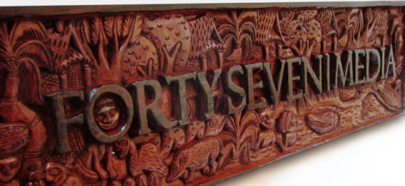
Ever wanted your logo hand carved from a massive piece of wood by natives of Papua New Guinea? Ok, so maybe it wasn’t the first thing on your list, but dang it’s cool. My wife’s sister and her husband are missionaries in New Guinea and are back in the states to make the rounds to all their supporters and show them what they’ve been up to. Too many “and’s” in that last sentence? Probably. Regardless, we just got this in yesterday and had to share.
Keep Reading
by Nate Croft in Design
The following is a true story.
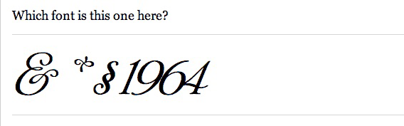
I had picked up Thrice’s new album and we had been listening to it yesterday while we were working. It is one of those albums that you immediately know is good, but need need a few more listens to really grasp its depth. So when I left a little early to move a piano, Jon decided that he would borrow it and return it today, which is totally fine by me. But what really struck me was the note he left. Well, not really the note itself, but its typeface. Instead of the completely dull and lifeless default font that Stickies uses, I saw this:
Keep Reading
by Jonathan Longnecker in Business
 Recently I had an encounter with a company that had a website, but didn’t understand the web. I promised them in an oh so nice email that I would write a blog post on the whole thing, so enjoy
  .
.
So my wife has a site that talks about the benefits of cloth diapers over disposable. She became a member of the Real Diaper Association (no I’m not going to dignify them with a link) who provides members with some very nice researched information to back up the above claims. Things like the chemicals used cause cancer, they take 200-500 years to decompose, scary stuff like that.
To make a long story short, we used their reasons, clearly citing them as the authors and giving them a prominent link back to their site. And then we got this email:
Keep Reading
by Nate Croft in Design
If any of you good people out there don’t read the insightful Daring Fireball, you might have missed The Rather Difficult Font Game, which is aptly named. I normally consider my type-fu to be excellent, but I too was humbled. 33 out of 34 for this type ninja.
Keep Reading