Amtrav Site Design 2017
Sporting a fresh new look and attitude, the new Amtrav site takes risks that payoff in both attention and clarity.

Having designed the previous Amtrav site, we were thrilled to get the call for a new version. And even more thrilled that they wanted to really take a chance and do something new and exciting.
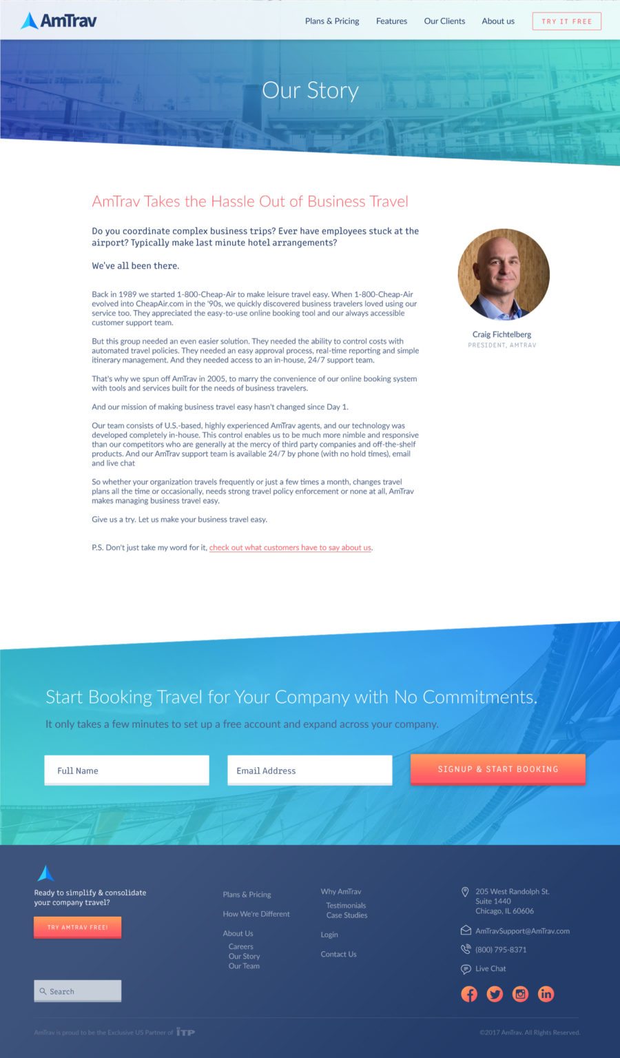
Stripping away the old corporate colors, we embraced a brighter and more modern palette, updating the typography and imagery along with eye catching angles to spice things up a bit. We also got to show off their newly designed application UI with lots of screenshots. Seeing the product is such a huge help for visualizing what you’re going to get.
We needed professional. We needed strategic. We needed a partner. We found all three in Jonathan at 47m.
Ted Perlstein / Vice President - Business Development / Amtrav

The new look translated well into secondary pages, keeping the unique and fun feel alive.

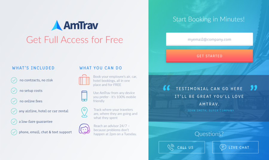
That part where people actually try to signup is pretty important, right? We worked to create a small popup that recapped all of Amtrav’s benefits while signing up for a free trial. We think it packs a strong punch.