1Homepage
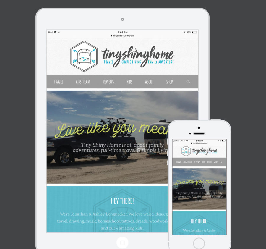
Tiny Shiny Home's general style was mostly there as we've helped them refine and re-align for several years. It's clean and simple with a mix of modern and retro typefaces. Up to this point they've mainly used gray and blue as their main colors, but we expanded and added a 3rd color so that things wouldn't get too repetitive.
The most important thing about this homepage, though was the content and flow. Tiny Shiny Home really wanted to make things more personal so we added images and a description at the top so people would know it's a family affair.
Recent articles are still important since they post often, but they also wanted a way to really call out their most popular and useful posts. A tabbed area near the bottom lets the visitor choose what kind of content they're looking for.
After that, a big call out for their Airstream renovation project and a call to action at the bottom for subscribers help grow their tribe.
Finally - and most importantly - they added a contact form with an official request for anyone that wants to work with them. This was a big step, but it's already paid off with a company offering to send a product for review. Sweet!


