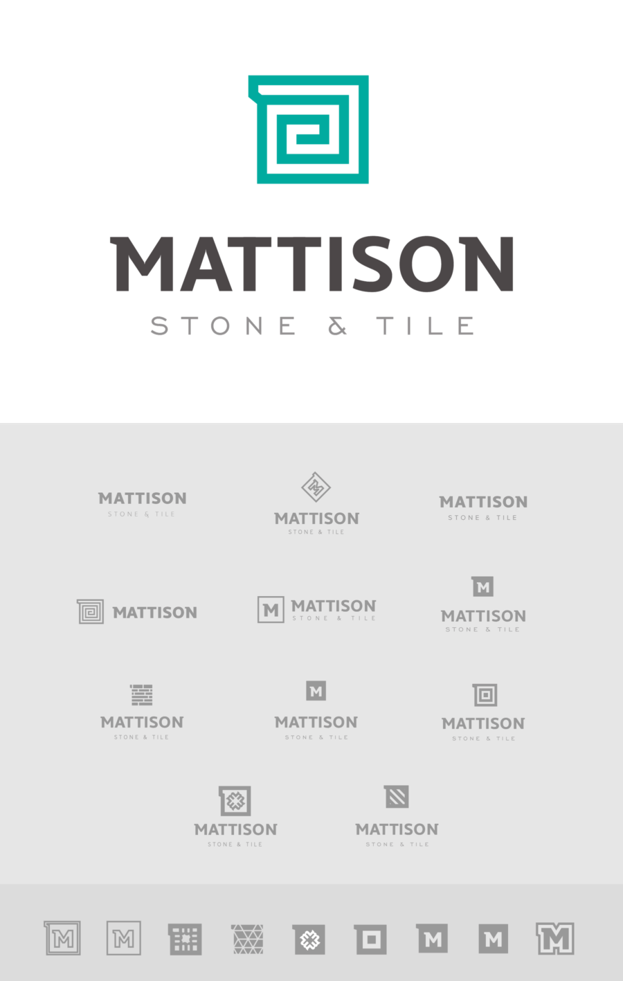
Mattison Stone & Tile Branding
Mattison came to us with an exciting project - they were renaming and rebranding their company! Fresh starts are always so much fun, and we loved having the opportunity to help them shape their new look and feel.

Being an established business and already having spent some time working on the logo themselves, Mattison came to us with some really great ideas as we got started. As usual, it’s a long and winding road to get to the finished product, though. Here’s just a few of the ideas we looked at.

After that we moved to a full on branding book, exploring type treatments, business cards, apparel and background patterns. Our goal was a look and feel that was modern, but with a sturdiness and reliability, tying into the stone and tile they provide. The colors were also carefully chosen to stand out in their market in Trinidad & Tobago.
The result is a bright, crisp brand with clean lines and classic, refined typography. We dig it.