National Partitions Web Design
National Partition's products have lead the industry for years. They brought 47m in to make sure their brand and website did the same.
Visit the Live Site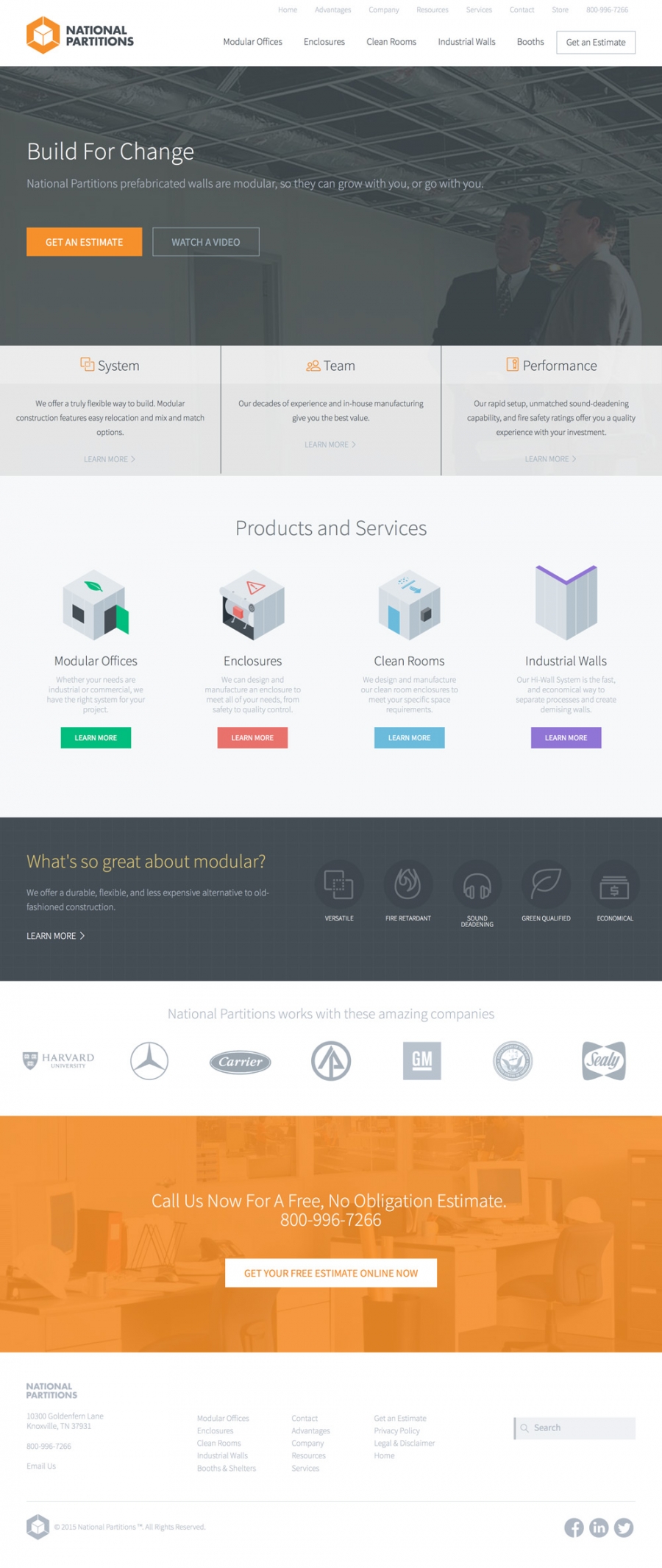
Even though National Partitions has been around for decades, they turned out to be more foward-thinking than some startups we've worked with.
We modernized their logo and brand, adding fresh new colors, typography and custom illustrations. The difference was like night and day. They already had the name recognition, reputation and products to back up the new look - and it turned a one-two punch that rocketed them light years ahead of the competition.
We needed a fresh and modern look to our website and company image. Jonathan helped us change our logo, colors, and branding. The new site is attractive, easy to navigate, and makes extensive use of icons, pictures and videos; our customers love it. We are now generating some of the best qualified leads we have ever had. We are very pleased with Jonathan's work and would highly recommend his services.
Tony D'Andrea / Owner
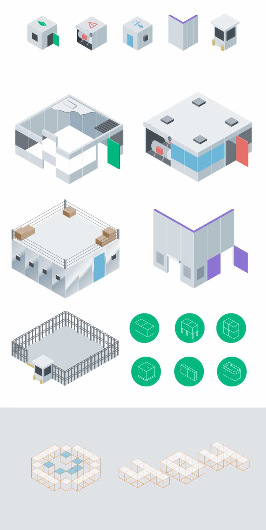
We also had loads of fun coming up with a unique visual identity system. Based on the 3/4 view of the 3d logo, we created illustrations and icons out of that same perspective, giving the brand a really fresh, consistent feel. Even the thank you pages and 404 pages got in on the action!

Some of the most important pages on the site, we spent extra time wireframing, discussing and designing the product pages. National Partitions was all about simplifying so these pages are a great example of a quick overview with deep embedded content delivered via modals and video.
Keep scrolling and you'll get a wealth of information in a visual, easy to understand format.
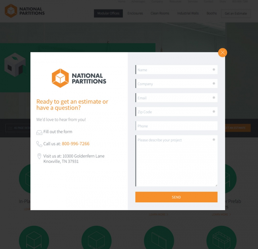
A pretty site is no good if it doesn't make money. Thankfully, National Partitions already knew this and is great at driving the right traffic to the site. And with the new launch upping the brand factor and making it easier to get in touch, they're getting better quality leads than ever before.

While our new base colors were orange and gray, we wanted a way to really differentiate between products and sections. So new colors were added as part of the brand to liven things up. We likey!
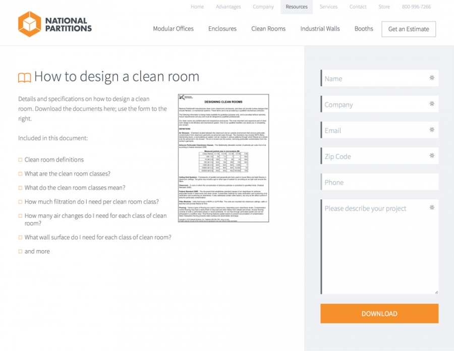
The National Partition's guys and girls are a tech-savvy bunch. They were running sans-content management system for years on their own. But now that the site is built into a proper CMS, creating and editing the site takes way less time and has much more predictable results. We've been able to add additional functionality within the system as well, continuing to iterate and adjust as they get more user feedback.
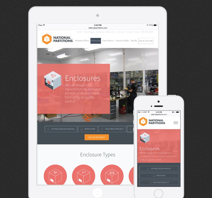
The importance of mobile doesn't need to be reiterated. It's quickly becoming a large percentage of everyone's traffic so it was imperative that this new site work on any device. We spent extra time keeping the assets to a minimum, the graphics retina sharp and everything nice and speedy for those on the go.