AmTrav Web Design
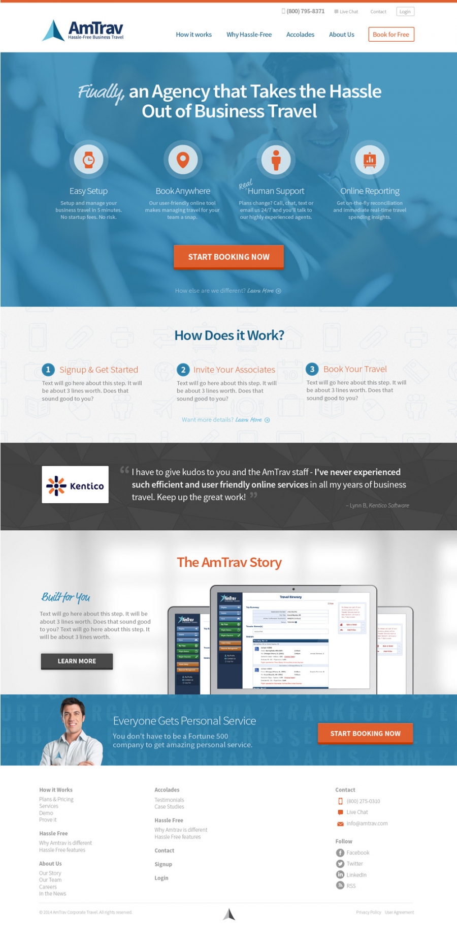
While in the middle of a rebranding, AmTrav called on 47m to give their site a facelift. Using the guidelines they had just created and adding some flair of our own, we gave them a kick-awesome design to work with.

AmTrav had just finshed a nice looking new logo, and it was our job to surround that with elements that would freshen up the brand, make them feel modern, approachable and professional.
We continued to use their main typeface (Source Sans Pro) and added in Market Pro + hand drawn elements for some extra personality. The UIFont icon set fit the feel nicely and included all the proper travel icons we needed.
Finally, we found some great repeating backgrounds to tie it all tie it all together.

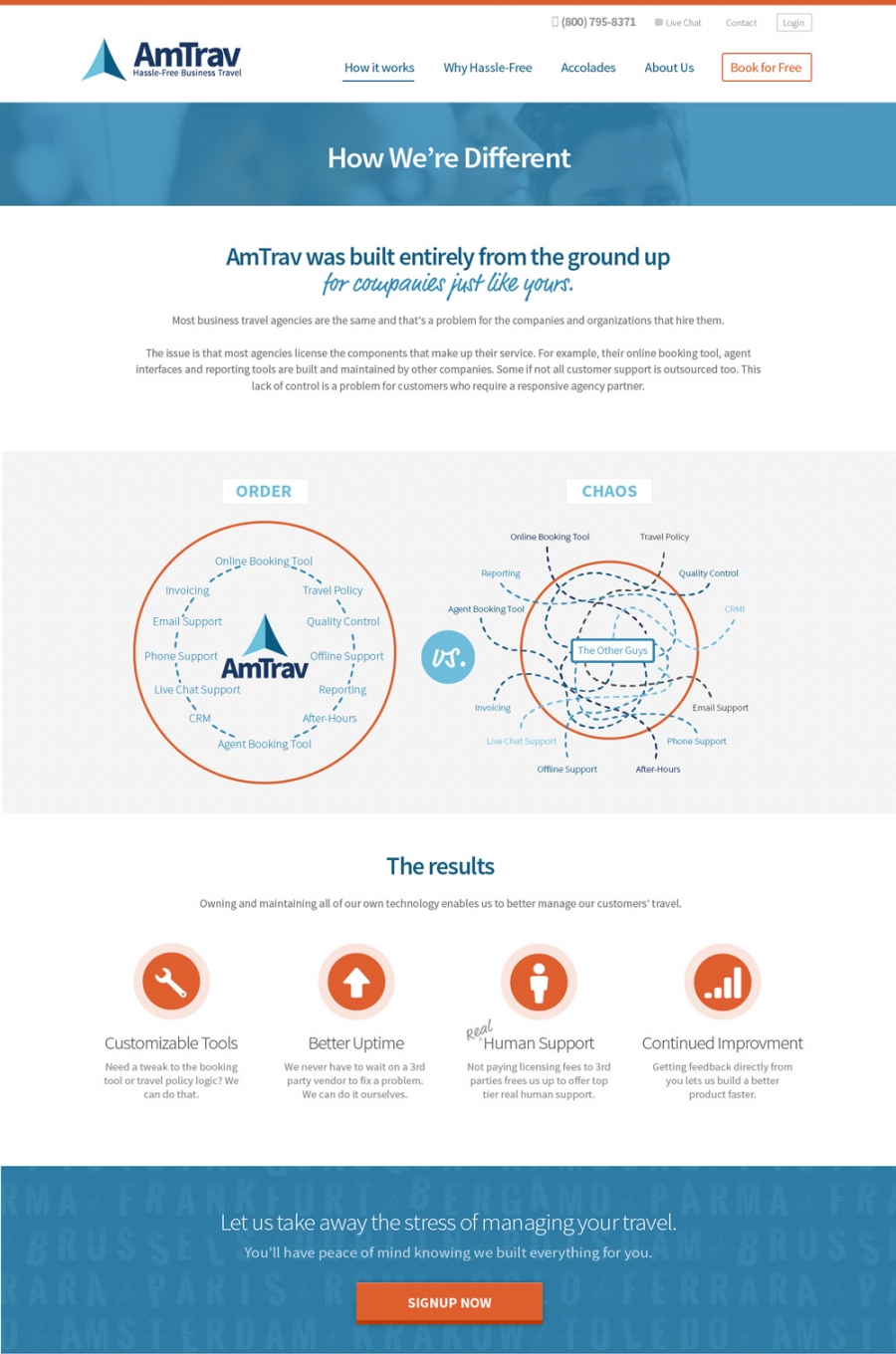
A big part of our process with AmTrav was working through the best way to present and talk about things so that users would pay attention, understand and care. Really, we do this with all our clients, but the "How We're Different" graphic on this page is probably the best culmination of those talks. It succinctly gets a whole lot of information and a big idea across really quickly. We're pretty proud of how it turned out.

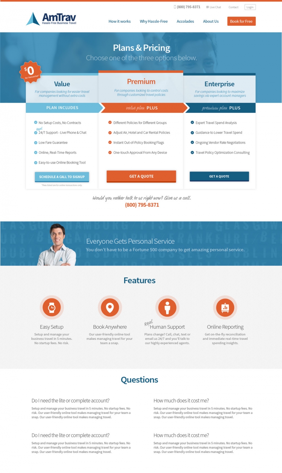
Arguable the most important page on the site, we went though many variations, trying to find the most clear and direct way to share the information.