Swipely Web Design
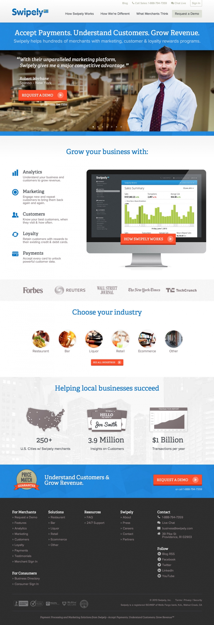
Swipely came to us with a great product and a pretty good website. But they wanted to take it up a notch. We refreshed their brand, designed a new responsive website and made it easy for them to update.
Visit the Live Site
At the rate Swipely is growing, we wanted to make sure their brand visually reflected where they were. Refined typography, unique background textures and a generous helping of whitespace helped make the difference while still not straying too much from the established brand they already had.
We then finished the look off with custom illustrations and icon font integration.

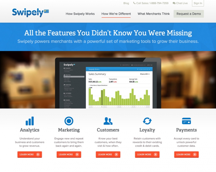
Kudos to Swipely for understanding how important clarity and simplicity is. They already had their feature set whittled down to 5 easy to understand benefits. So making pages like this effective was wonderfully easy.

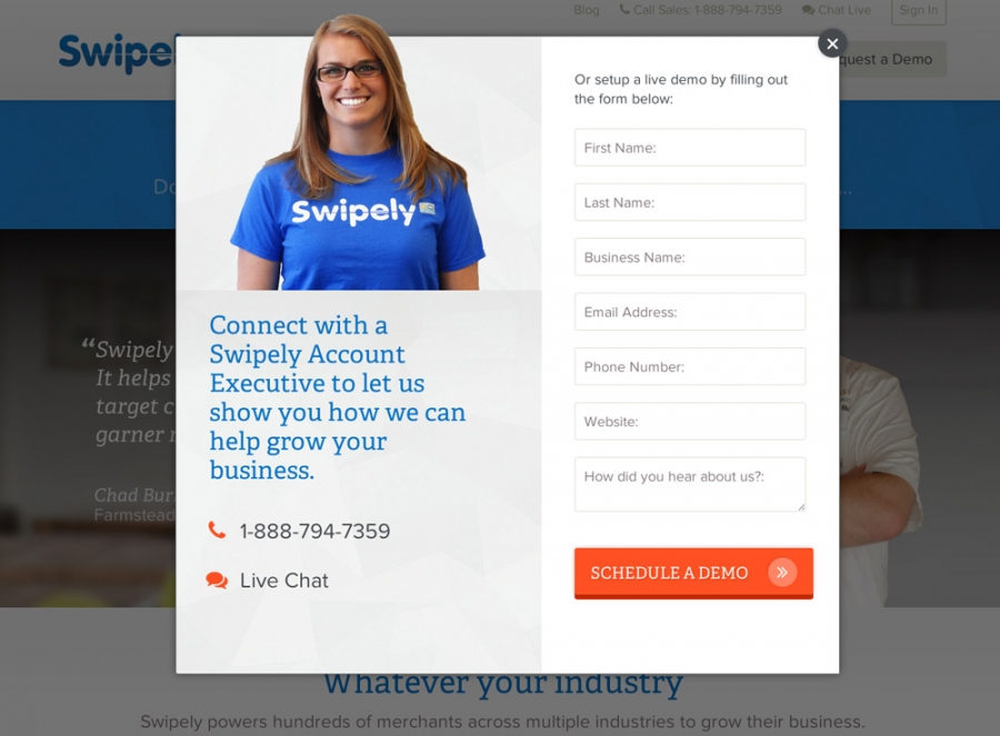
A request modal like this is a great reason we love working with ExpressionEngine. We were able to integrate a fully responsive lightbox solution, a competly custom design and integrate with a third party CRM form without any issues.
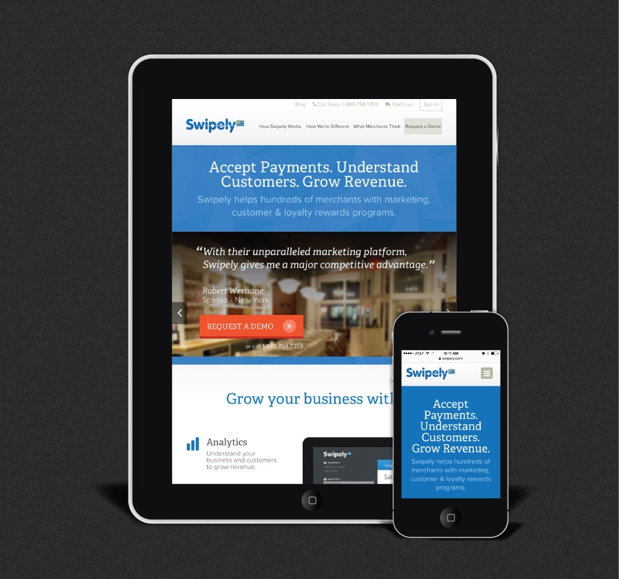
Oh, we also love the design and that it works on any device!

Because Swipely is so connected to mobile devices it was really important that thier marketing site adjusted to fit on any screen. There are multiple complex layouts, sliders and lots of loving hand tweaked goodness.