Redesigning the FortySeven Media Site - Part Uno
Note - I was going to have this all be one article, but it was too big and I don't want to bore you. So! Part Uno will focus on the design and stragegy while Part Dos will focus on the dirty technical details - from HTML5 & CSS3 to Responsive layouts and ExpressionEngine programming. Part Uno begins now:
Have you ever climbed to the top of a mountain, cooked a whole pound of bacon, ate it, hiked back down and built a mansion with your bare hands? That's what it felt like redesigning the FortySeven Media site.
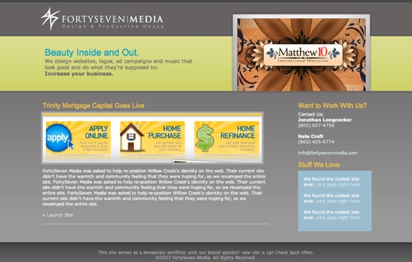
Version 1 of fortysevenmedia.com was super gray and boring (seriously, it was gray). We were afraid to be ourselves and thought that in order to make it as a design studio we needed to be stuffy, businessy and impersonal.
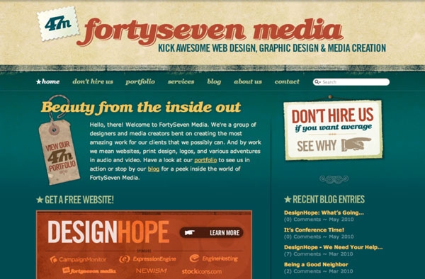
Next year we sat down and decided that if we were going to have our own company we should darn well act like it. With version 2 we overhauled the identity, made snarky pages like “Don't Hire Us,” created a blog and before we knew it, we were getting business from all over the place.
We had stumbled onto something, and quite frankly re-designing that kind of success is scary, especially when it provides for your family. The Lizard Brain was in full effect. We got talked about quite a bit when we launched the old site and we didn't want miss that magic this time around. Every time I sat down to work on it I just got overwhelmed. Could we make something nearly as iconic as the first go around? Turns out it didn't matter, because after waiting 4 years we were becoming obsolete. Don't get me wrong, the business was doing better than ever, but the jobs coming through the contact form were less interesting than they were a few years ago.
So we sucked it up and pushed through. And are we glad we did. Your kind words have quelled any fears I had and I count myself lucky to be part of such a great community. But hey, you're here to find out how we got from the 2008 site to the 2012 one, right? Let's dig in.
Branding
In my Basecamp project I had this listed as a “Rebrand and Realign,” and that's really a good description. We weren't starting over here in terms of the brand and feel of the company. We liked our logo, we liked the tone of the copy, and we generally liked the retro-ish typography.
Philosophically, we wanted to focus on the story aspect of what we do. Helping our clients tell their stories and their own clients' stories had become a huge priority for us and was allowing us to close bigger jobs by bringing on copywriters and doing photography/video. It takes a lot of work to tell the story the right way.
Finally, from a graphic standpoint we wanted to move away from the heaviness of the old site. The body area was way too dark to read comfortably and most of the graphics were just too heavy handed. In essence, we needed to keep the overall feel, but modernize it.
Researching What Worked
One upside of having a 4 year old site was that we had analytics and data to see what was working. Our Blog was generating quite a bit of traffic, with one article getting more views than the homepage some months. Also, people seemed to really like the Don't Hire Us thing and the Portfolio was popular, too. Really, the more we looked at it we didn't want to change the navigation much. We moved Services under About us and added a Process page. Oh, and the Projects page! We had been up to a lot since 2008 and wanted to share our side projects.
Designing
To help me get over my blockage I started breaking the design into chunks. We both knew what we wanted the site to feel like - we just needed to get the details right.
Typography
 Without a doubt, typography was the most important aspect of the design. Having done print for so many years we had always yearned to have really good, custom typography in the brand but it just wasn't possible 4 years ago.
Thankfully, with @fontface and services like Typekit this time we could make it happen. We went through 10-15 fonts, loading them up with Typekit and testing them in different browsers, operating systems and devices. We finally settled on Omnes Pro for much of the body copy and headers. The super chunky italics were reminiscent of the typeface in our old logo, but more modern, clean and fun. The regular weights and italics are also gorgeous at smaller sizes, especially on the retina display iPhone. We wanted the new site to feel good to read, and Omnes does a fantastic job. To offset that we threw back to the ol' Futura Bold all caps and kept League Gothic from the old design in key areas to tie it all together.
Moodboards
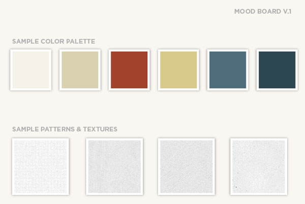
Once we had the typography nailed down we put together a quick moodboard with textures, patterns and colors. Like we said above, we both wanted textures to be subtle and colors to be lighter. Most of the new colors we eded up with were based on the old ones, just toned down a bit and tweaked to work better on a lighter background.
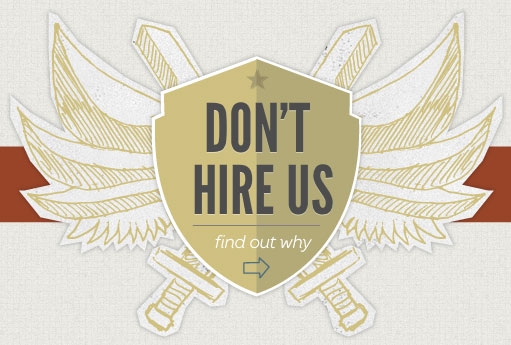
So once we had our typography, textures and colors it was just a matter of bringing it all together. Easy, right!? I wish. Some areas came together easily. Others, like the Don't Hire Us banner on the homepage I literally sketched the day we launched because we weren't happy with it yet. For us, it's all about the details and that takes time. We designed just about every major page you see in Illustrator before it went into HTML/CSS. Here's a few thoughts on the major ones:
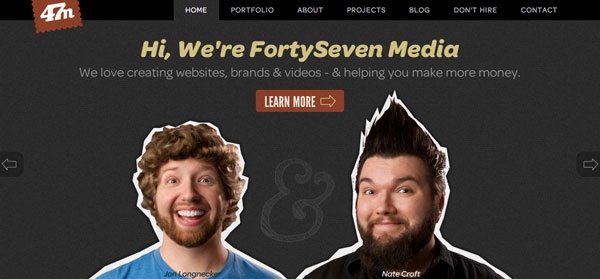
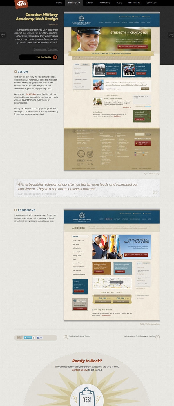
Homepage
This was the big one - and it took a lot of discussion and sketching, but we already knew where we were going with it when I started designing. We were going to have a slider and use it to tell our story - then a client's story - then tell people about our side projects. We also get to use that last one to pimp any new products we may or may not be working on (cough, Kicktastic, cough).
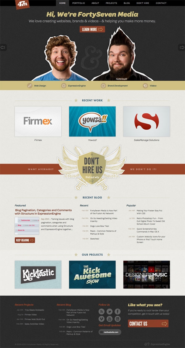
Right below that are quick links to the categories in our portfolio - just so people know what we do up front.
Tiny crops of websites aren't very inspiring so we decided to go with what we dubbed as “poster” images for each job - a cool version of the client's logo or a part of the design that really stood out. Client work on the old site wasn't very prominent and we needed to change it this time around.
The Don't Hire Us angle still gets tons of traffic so we continued to use it. It's a little more rock and roll this time around.
Because the blog gets so much traffic we wanted to beef up it's presence on the homepage a bit. Now we have a featured article as well as recent and popular entries. Finally, a grid of our side projects rounds it out.
Blog Article Page
This was probably the second more important design because of all the traffic we got. We knew that we weren't converting well from incoming searches. Most people would just leave after skimming the article. So worked hard making it easier to read, and removed most of the clutter in the sidebar. Then we added next/previous buttons and a recap box at the end of each article telling people about us and linking to other pages in the site and side projects. Simplifying sharing was important, too - our old ShareThis thing was janky and had way too many options. The new one is slimmed down to 3 and is much easier to get to.
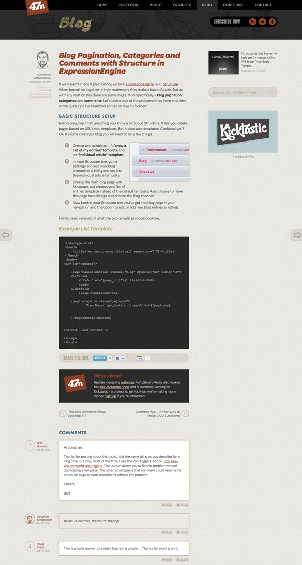
My initial design had the title of the article up in the dark header, but once we got the code implemented in to ExpressionEngine and started seeing other titles in there it just seemed disconnected. So Nate drew a bunch of illustrations, I did my best to re-draw the word Blog and we gave the blog header some more personality.
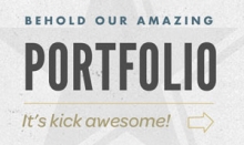
Portfolio
We knew going into the re-design that the portfolio section needed major help. It was awkward to navigate, laid out poorly and just generally not awesome. The poster images helped to create a portfolio listing page that actually made you want to click on something. Because that always helps.
The detail pages got a major revamp, too. We're now setup to walk through the story step by step and show potential clients exactly what we did. Here again, next/previous keeps people browsing and we added sharing so peeps can talk about us if they want.

About Page
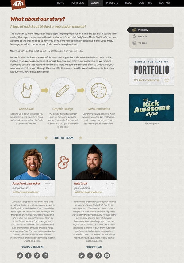
I'm going to mention the story again. Because I think it's really important. Most companies' about pages are 3 paragraphs dumped into a secondary page design. We've become pretty comfortable with who we are - and we believe that sharing that up front not only weeds out the clients you don't want to work with, but draws the right ones to you. In short, we needed a page that visually told our story and we think it turned out pretty well.
Contact
Ah yes, the money page. Our old contact page had good personality, but the form was a little complicated so we simplified it. At one point we had an entire pricing page, but scrapped it in favor of a much more compact version that is hidden unless you click the “Questions about pricing” link next to the budget dropdown. We get a lot of unrealistic budgets that come through the ol' contact form so this helps qualify leads a bit.
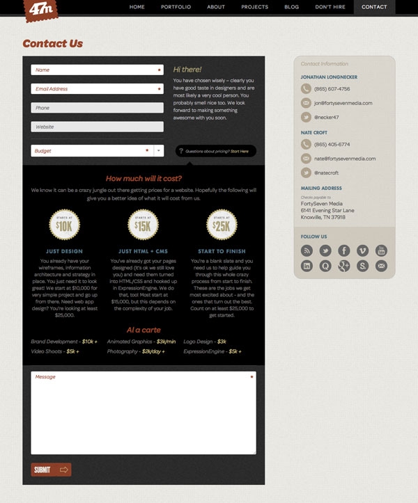
We also worked hard on the thank you page that you're directed to after filling out the form. It's much more conversational, has links to other areas in the site and an episode of the Kick Awesome Show embedded. Just in case they thought we weren't nuts already.
Illustration
Believe it or not, Nate and I both used to draw a lot. In fact, we worked on many an illustrated project together in High School. Not that we're going to show them to you. That would be embarrasing. But we thought it was time to take those old skills, dust them off and see if they were still any good. Nate drew a whole host of things that you probably see in the header of the blog if you look closely enough. To see them all, check the 404 page.
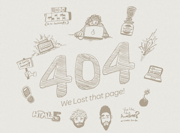
Me? I drew that nifty ampersand on the homepage, the “Blog” and “404” text and the wings/swords on the Don't Hire Us Banner on the homepage.
Design Specs
For all you design nerds out there, here are the gory details of what we used to bring the design together:
- TypeFaces: Omnes Pro (Regular, Italic, Bold & Bold Italic), Futura Bold and League Gothic. All served wonderfully by Typekit.
- Textures: Denim and grid patterns from SubtlePatterns, subtly slightly modified of course.
- Icons: We used Fred LeBlanc's Drawn Icon Set in some places, mixed it up with the Vector Social Icon set and hand drew the rest.
- Photography: Done in-house by the esteemed Mr. Croft.
Whew! I'm exhausted. I'm off to take a nap. Hope you enjoyed a peek inside our process. And don't forget to check out Part Dos in a few weeks for a rundown of all the technical gory details!
Comments
1
Mike Lohrman - Feb 17, 2012
Jonathan Longnecker - Feb 17, 2012
3
George Hammerton - Feb 17, 2012
4
Russell Heimlich - Feb 17, 2012
5
Rondal - Feb 20, 2012
6
Shine - Mar 03, 2012
7
Elizabeth - Mar 07, 2012
Jonathan Longnecker - Mar 07, 2012
9
Mike - Apr 27, 2012
Jonathan Longnecker - Apr 27, 2012
11
Emily Williams - May 16, 2012
Jonathan Longnecker - May 16, 2012
13
Jo - Jun 01, 2012
Jonathan Longnecker - Jun 01, 2012