Making Accessible CSS Buttons Look Awesome
 Buttons. They’re those little things that people really like to click and push. I personally think they’re pretty important to help guide a user through the actions they need to perform. But I’ll be the first to admit I’ve made my fair share of image buttons. Totally inaccessible; just an image with some alt text. Now depending on your site design and the type of site, that might be ok. For instance, if you’re dealing with a simple marketing site that’s kind of grungy; you’ll probably need to make that button look like it fits.
But there’s a problem if you’re dealing with a site or web application that will have 50 or 100+ buttons that all say different things. Now you’re looking at maintaining a ton of images and a lot of manual linking everywhere….not very ideal!
So what do we do? We can compromise. As long as we can use default web fonts for our buttons, we can wrap whatever graphics around them we want using CSS. Shoot, we can even make them grow or shrink to accommodate the text!
I’m going to cover both ways to style buttons (as a regular link or form button). Hopefully it’s not too complicated!
Link Buttons
So first we start off with the HTML. Make an link and add a class of button. Inside that put the text you want and wrap it in a span. You’ll notice I’ve even used an HTML arrow character for extra usability.
<a class="button" href="link"><span>Button →</span></a>
I’m going to add another small bit of code to this. We are going to want the button to “press” down when it’s clicked for user feedback, but IE has trouble returning the CSS background image to it’s original state once it’s been pressed. So you click it once and it looks like it’s clicked all the time. No good I say! Just add this simple bit on the link onclick="this.blur();". So our link becomes:
<a class="button" href="link" onclick="this.blur();">
<span>Look a Simple Button →</span></a>
Ok, images first. Decide what your longest button will be and make two versions. One normal, one depressed. For me I ended up with an image like this.
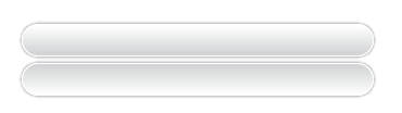
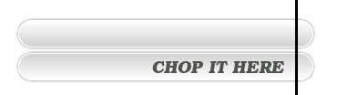
Then chop it in to two pieces. One tiny cap on the right end and one really long for the left end. The one on the left will help it grow and shrink as needed.
Now for the CSS. Basically your span will style the text inside the button. Your height, line-height and padding will depend on the size of your background images. Your global link and hover colors will apply here, or you can override it on the span element, it’s your call. I used a text shadow too, just for fun even though it only shows up in Safari and Opera. Looks really nice and degrades just fine for other browsers. Keep in mind that you do have to float the link and it may affect other parts of your layout. Adjust accordingly!
a.button {
    background: transparent url(images/capsule_right.png)
        no-repeat scroll right top;
    display: block;
    float: left;
    height: 36px;
    padding-right: 20px; /* sliding doors padding */
    text-decoration: none;
    text-shadow: #ffffff 1px 1px 0;
    font-weight: bold;
    line-height: 36px;
    font-size: 13px;
}
a.button span {
    background: transparent url(images/capsule_left.png) no-repeat;
    display: block;
    padding-left: 20px;
    white-space: nowrap;
    font: bold 13px/36px "Helvetica Neue", Arial, Helvetica,
        Geneva, sans-serif;
}
Looking good so far; now we need to add the styles for the :active state. I’ve left enough room in my image for a 1px shift down so that it adds to the effect of being pressed. So the background image doesn’t just change, but the text moves down with it, completing the effect.
a.button:active {
    background-position: right -35px;
    color: #000;
    outline: none; /* hide dotted outline in Firefox */
}
a.button:active span {
    background-position: bottom left;
    text-shadow: #ffffff -1px -1px 0;
    padding-top: 1px;
}
Also, if you want to add an icon to the button, just make another image of the left capsule with the icon on it and add a class to the span.
<a class="button" href="#" onclick="this.blur();">
    <span class="upload">You can add icons easily!</span></a>
With the CSS:
a.button span.upload {
    background-image: url(images/capsule_left_upload.png);
    padding-left: 40px;
}
And one more thing for our buddy IE6. It seems to have that horrible flicker problem with the background images, so just add this script to your header.
<script type="text/javascript"> try {
    document.execCommand("BackgroundImageCache", false, true);
    } catch(err) {}</script>
Score! Great looking buttons combined with perfectly accessible links! See them in action here.
Form Buttons
Form buttons are different in that we can’t wrap our span around the value of the button. So we have to reverse our thinking. We can use the same images, just invert our styles a bit. Let’s start with a span around the button and then add a class to the input itself. Thankfully, we’re adding very minimal markup here. We don’t need the onclick event because it’s not a link.
<span class="button2"><input name="submit" type="submit"
    class="form_but" value="Even style form buttons" /></span>
Before we go any further, I wanted to list a few compromises that have to be made with IE. They’re not terrible, but if you’re picky like me it’s good to know. First, the background images on :active state won’t change in IE. However, the text will still drop down a pixel so there is some feedback still there. Also, IE6 won’t respect your hover color or the cursor:pointer property. Not that form buttons make your cursor turn into a hand by default anyway, but it’s nice consistency if you have both types of buttons on the site. Also, you can add icons but, IE’s width on input buttons is kind of wonky so you may be doing some IE specific stylesheet work. So anyway, start with this:
pan.button2 {
    background: transparent url(images/capsule_right.png)
        no-repeat scroll right top;
    display: block;
    float: left;
    padding-right: 20px; /* sliding doors padding */
}
span.button2 input.form_but {
    background: transparent url(images/capsule_left.png) no-repeat;
    display: block;
    padding-right: 0;
    padding-left: 20px;
    white-space: nowrap;
    border: 0;
    margin: 0;
    height: 36px;
    line-height: 36px;
    text-decoration: none;
    text-shadow: #ffffff 1px 1px 0;
    font: bold 13px/36px "Helvetica Neue", Arial, Helvetica,
        Geneva, sans-serif;
    padding-top: 0;
    color: #b71216;
}
Add the hover and active states:
span.button2:hover, span.button2 input.form_but:hover {
    cursor: pointer;
    color: #333333;
}
span.button2:active {
    background-position: right -35px;
    color: #000;
    outline: none; /* hide dotted outline in Firefox */
}
span.button2 input.form_but:active {
    text-shadow: #ffffff -1px -1px 0;
    padding-top: 1px;
    background: url(images/capsule_left.png) left -35px;
    outline: none;
}
If you want to try icons, add your class to the input:
<span class="button2"><input name="submit" type="submit"
    class="form_but upload" value="Even style form buttons" />
Presto! Check them out here.
So there you go; accessible, good looking CSS buttons. Obviously it’s a bit of work to get it set up, but it’ll save you tons of time in the long run. No more saving a different image everytime the text changes. And it all degrades quite nicely without CSS or images. Enjoy!
Comments
1
Frank Jepsen - Feb 04, 2009
Jonathan Longnecker - Feb 04, 2009
3
Alex Velickyi - Feb 26, 2009
4
Frank Jepsen - Mar 01, 2009
Jonathan Longnecker - Mar 01, 2009
6
Alex Frolovski - Apr 29, 2009