Yowza!! Web Design
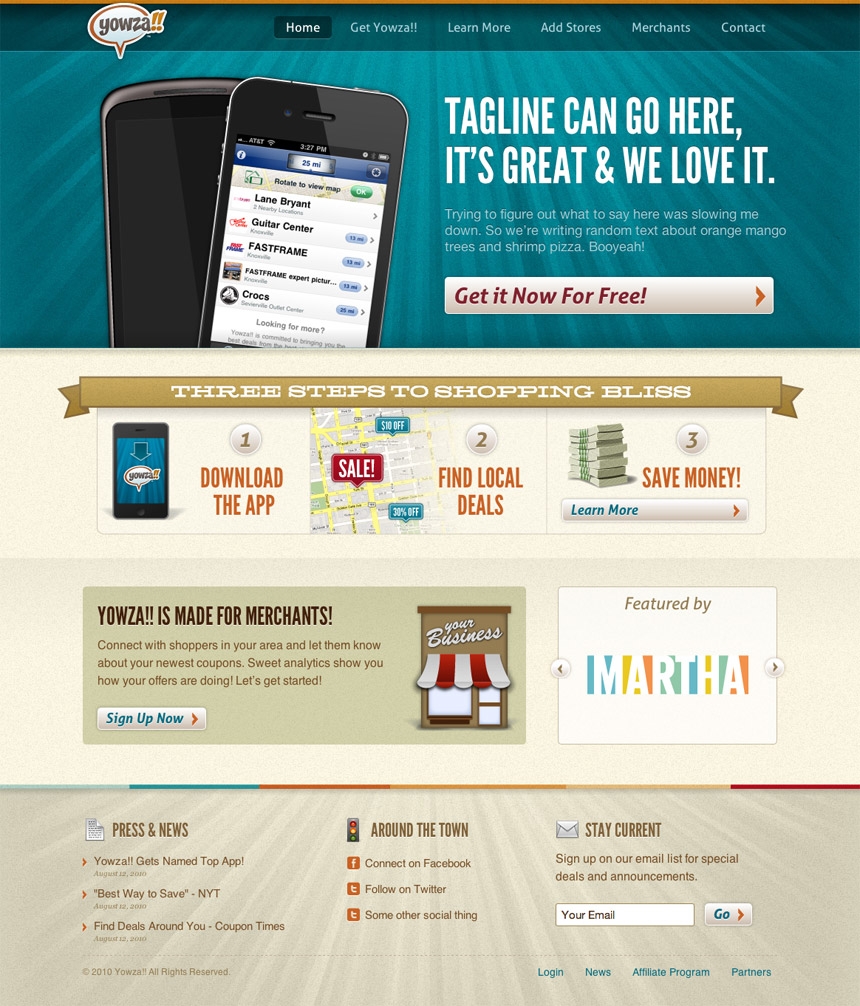
Yowza!! wanted to take their pretty good site and make it even better. We gave them some retro fun dashed with HTM5 & CSS3 - even some iPhone layouts!
Visit the Live Site
How can you resist a product with not one, but two exclamation points in it's name? While Yowza!!'s old site was in much better shape than most, they wanted to take it to the next level. We worked closely with them brining a bit of throwback fun to the brand. Needless to say, it was a ton of fun and turned out great. We even did a few iPhone layouts for key pages.
Rounding it out, we brought HTML5 and CSS3 love wherever we could and used @fontface to give it typographic chops. The guys at Yowza!! took our layouts and built the site out; scroll down to see what we gave them:

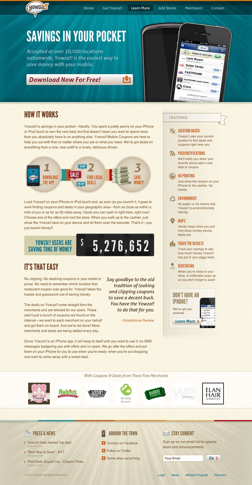
While we like pretty shells we like well-designed content even more. We worked hard to make the information easy to read and understand at a glance, but lets you dig deeper if you need to.

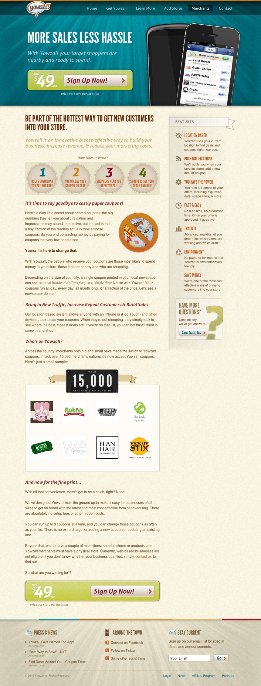
This is the money page. It's where Yowza!! gets merchants interested in adding deals to their service. Calls to action are important so we made it clear how much the service was and the benefits of doing so. Nice!

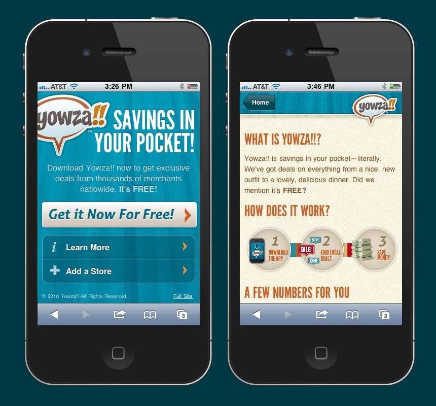
Seeing as Yowza!! is an iPhone app we wanted to make sure there were some mobile specific layouts for key pages. We delivered the HTML/CSS for this as well.