Redd’s Barbershop Branding
We were asked to help Redd's get their brand in shape before growing and expanding to other locations. We came up with a beautiful identity system and clear guidelines that they should be able to use for a long time.
We approached the Redd's project with lots of research and exploration. How could we create a memorable mark that would translate well to multiple mediums? How could we setup guidelines so that it would be used properly by lots of people? How could we convey the trustworthy aspect of a barbershop, but make it feel modern at the same time?
The new Redd's Barbershop visual identity is a mixture of classic and modern elements. Vintage typography combined with simple, but modern iconography creates an instantly recognizable mark that exudes class, sophistication and rugged charm. We like it.
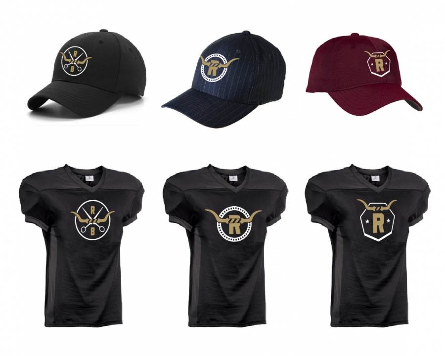
Redd's is owned by Cory Redding, defensive end for the Indanapolis Colts. So naturally we wanted to expand the logo mark into opportunities for some fun merchandising. We came up with three alternate marks that can be used on hats, jerseys, footballs or whatever. Awesome!
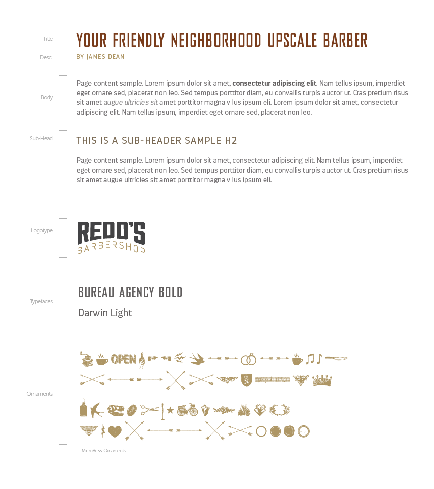
Like most of our projects, an enormous amount of time went into finding the righ typeface. Not only did it have to fit the brand like a glove, but it also had to be available for both print and web use. That is no easy task!
Thankfully we found our winners in Bureau Agency Bold and Darwin. Along with some Microbrew ornaments for extra fun.
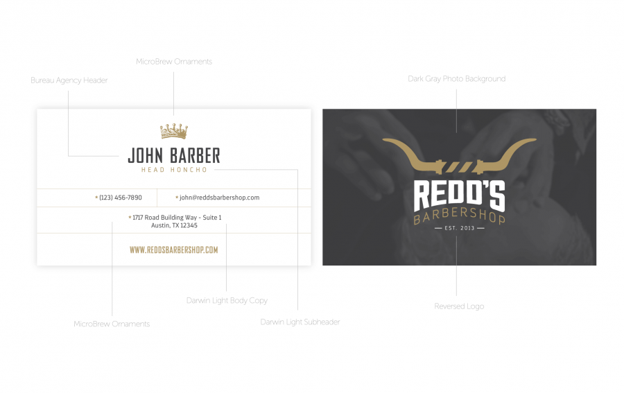
This is how it all comes together. Colors, typefaces, logo - everything converges into the visual identity. A great example of this is the business card. Check it out!
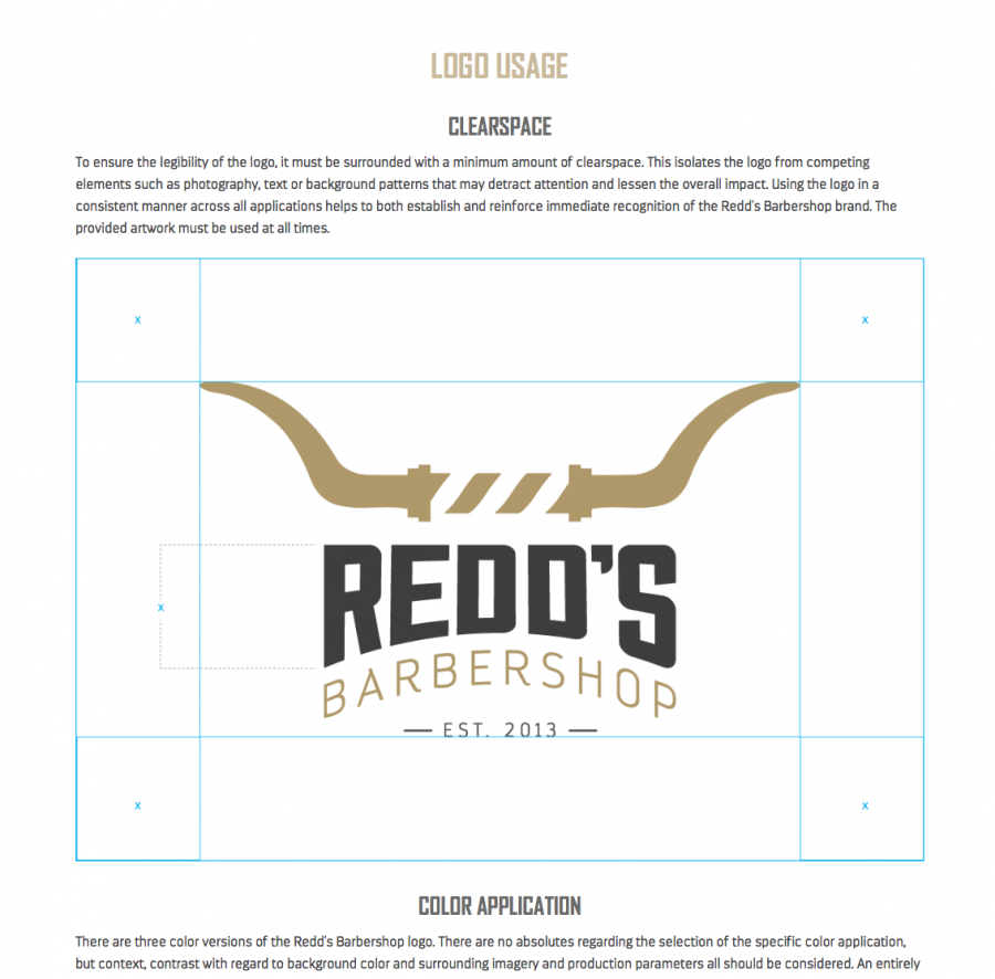
In order for Redd's to have clear guidelines on how to use the new identity we created, we put together a full online visual branding guideline for them and their vendors to follow. It's fully responsive, includes links to every possible file type and version of the logo you can think of as well as showing how to use and not use the marks appropriately.