Little Remedies Web Design
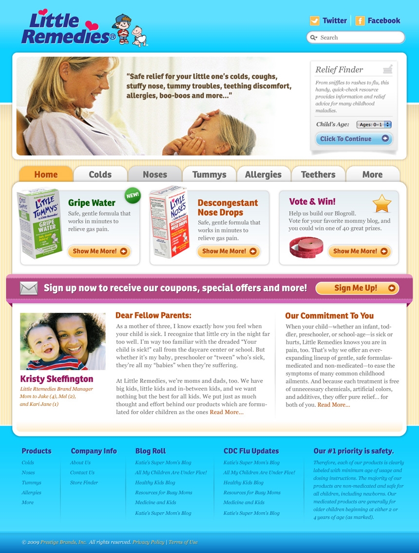
Little Remedies bravely let us replace their cold, unfriendly site with a much warmer and friendlier tone fitting for a successful line of children's products. They loved it!

That's where we come in. They gave us a great idea of the feel that they wanted and let us get to work. Typography played a big part in setting the tone of the site. The large rounded letterforms of the headlines are welcoming and playful, while the body text is clean and easy to read. Color was especially important to the look and feel of the site. Balancing Mom/Child friendly colors with a classic pinstripe background helps keep it light, but not cliché.

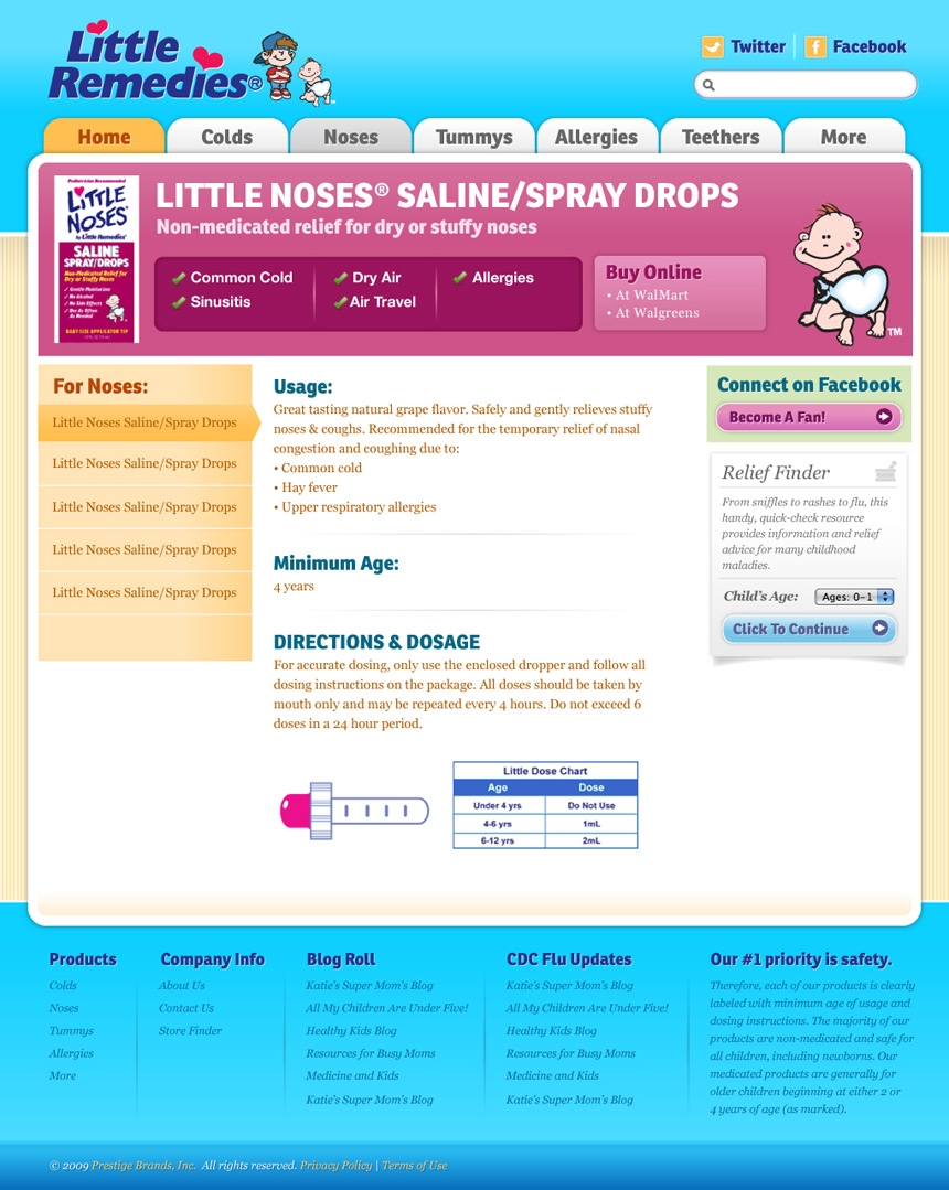
We also gave the product pages clear headers that showed exaclty that it was for and made sure that you didn't get lost drilling down into the nav.
We love the way it turned out and so did they. We were design only on this one so the actual site looks a bit different due to changes that happened once they started development, so we're putting up the final approved layouts here.