Hostelling International USA Website
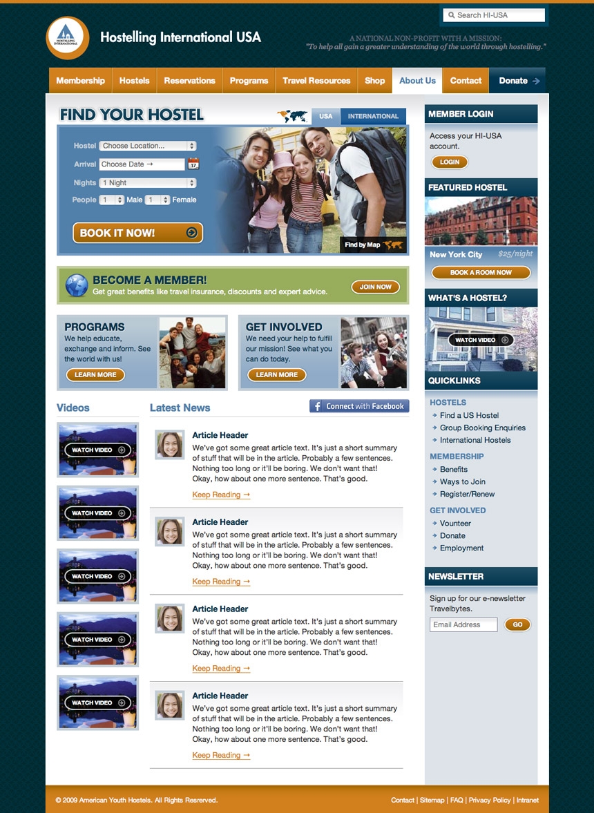
HI-USA was like most businesses: had a 3-4 year old site that things just kept getting added onto until the sitemap was disaster and styles weren't matching anymore. We came in to bring the awesome.

We meticulously setup all the HTML/CSS and Javascript so they could take these templates and put whatever content in they needed and it stay looking nice. Also, this design and code will be a boilerplate for all of their sub-sites to help them get up and running quickly and on brand. Even things like buttons and javascript tabbed content are easily added as the styles are already in place. Even more important, though is the clear and logical sitemap and navigation that helps the user find their way around the site. We had many discussions to make sure the flow of information made as much sense as possible. Add to that the semantic, text based information architecture and HI-USA should be seeing much much greater results from their new site. It was a long process, but we're all very proud of how it turned out.

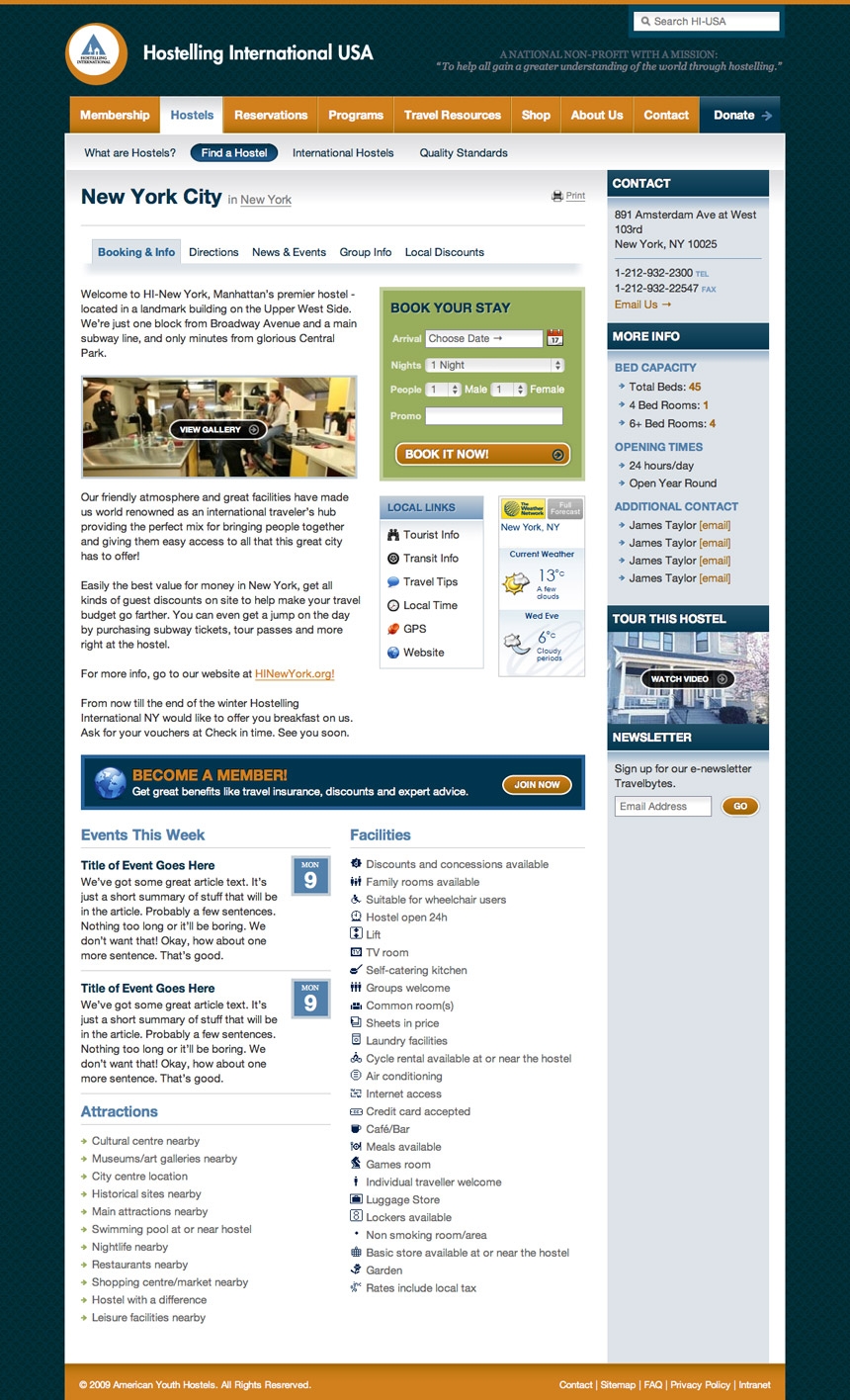
The Hosel pages were very important and needed a metric ton of information laid out in an easy to use fashion. We're glad it turned out well!

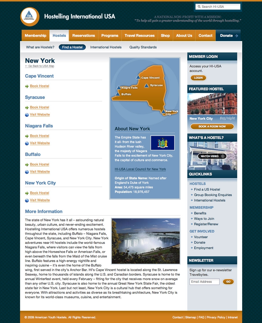
We also helped design state drilldowns to make it easier to find the hostel you're looking for.