FacilityDude Web Design
We were honored to be brought back to design FacilityDude's site a second time. A complete overhaul on the inside and outside, v.2 should serve them for a long time to come.
Visit the Live Site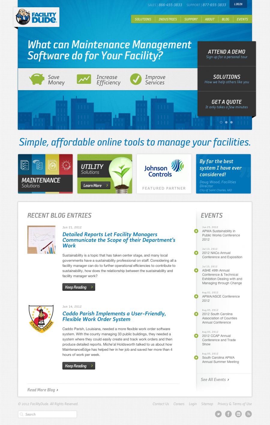
While FacilityDude loved their old site, they felt like it was time to mature their brand. They were looking to keep some of the mischief, but make larger prospective clients more comfortable in knowing that they weren't all fun and games. The Dude knows how to get some serious work done, and the new design tells the story.
For the homepage, we used the slider area to give key benefits of their service and help explain how it helped the customers coming to the site. Facility maintenance is still pretty old school, so we made sure we hit all the right pain points.
Just in case anyone missed it, there's a huge, meticulously thought out elevator pitch right below the slider to make sure people know exactly what FacilityDude does. Then we call out their most popular services, showcase partners and testimonials and used a blog/news section for further reading if people are interested.
Through close collaboration, we designed a website that truly differentiates us in the marketplace and has transformed our brand to represent who we are today and our vision for the future. 47M delivered 100% and we couldn’t be happier with the result. Our lead conversions have improved tenfold and now we’ve got measures in place to better qualify and follow up. Plus, we have a platform that is easy to use and gives us the flexibility we need. Thanks 47m!
Kelley Crawford / Marketing Director
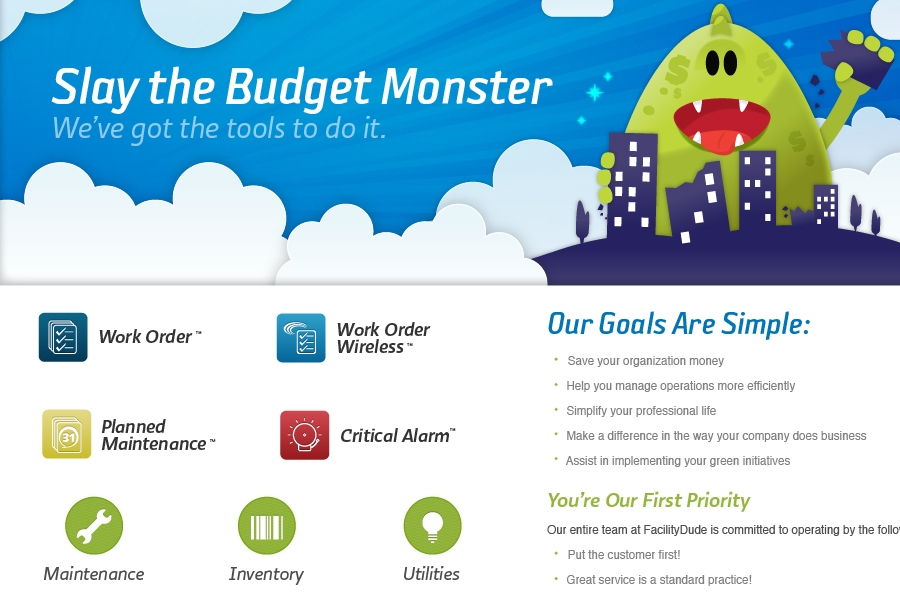
FacilityDude's new brand has a lot of the same elements. The budget monster is still there, and the blue rays in the background. But we used typography to spruce things up and give them a more professional look. Sophisto and Ratio fit the bill perfectly. We also simplified their product icons, created some new icons for industries and product types, and simplified their color palette from green, red and blue to just green and blue. Little bits of texture are sprinkled in to add dimension as well.
One very cool thing is that with the new typography we were able to re-create all their logos with HTML/CSS text. So the only image part of the logos on the site are their icons.
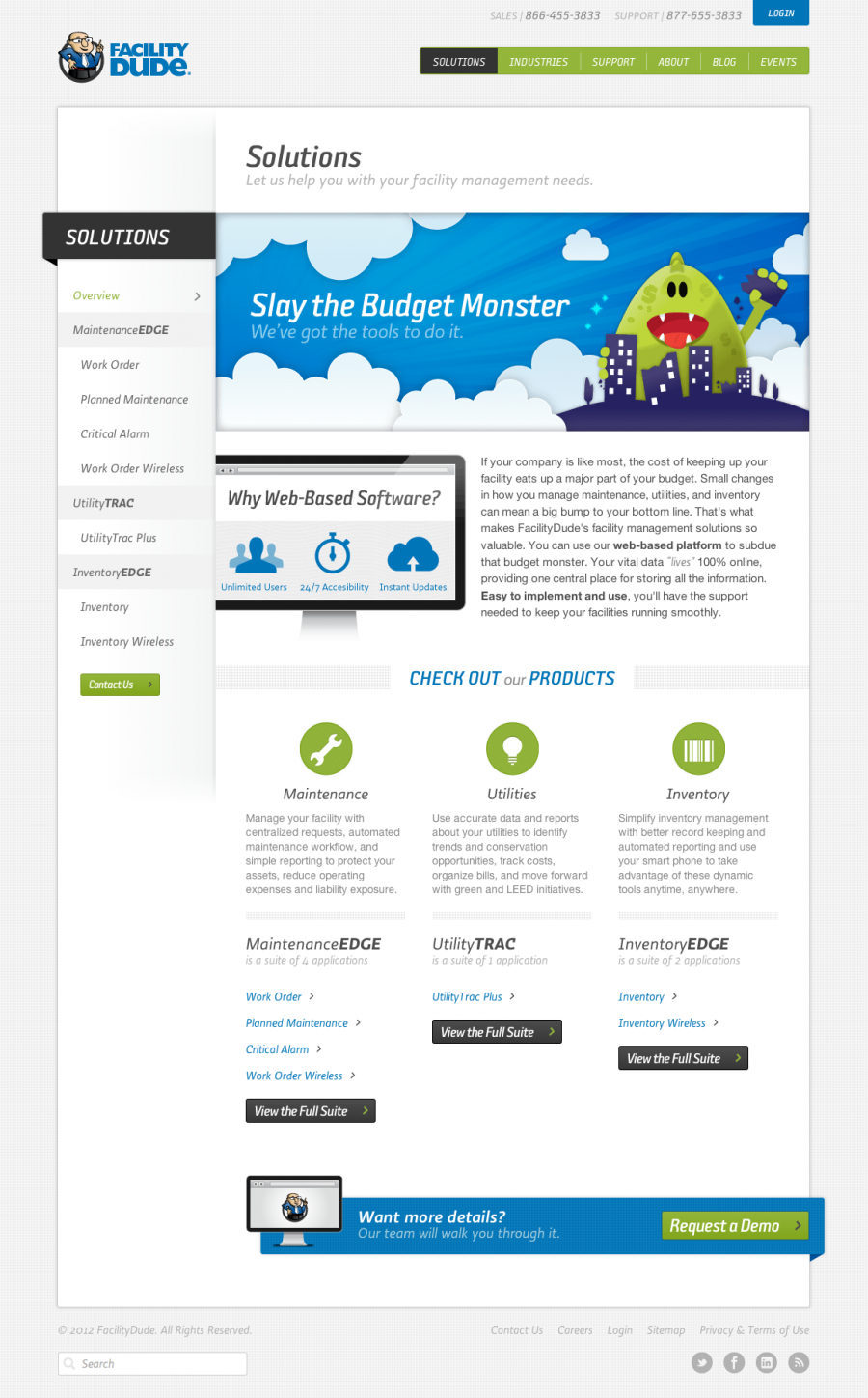
Like many in the SaaS industry, FacilityDude made the jump to describing their products as solutions rather than just well..products. This was a tricky page as we had to quickly describe the benefits of web based software itself, the different types of solutions they provided and then links to the individual products.
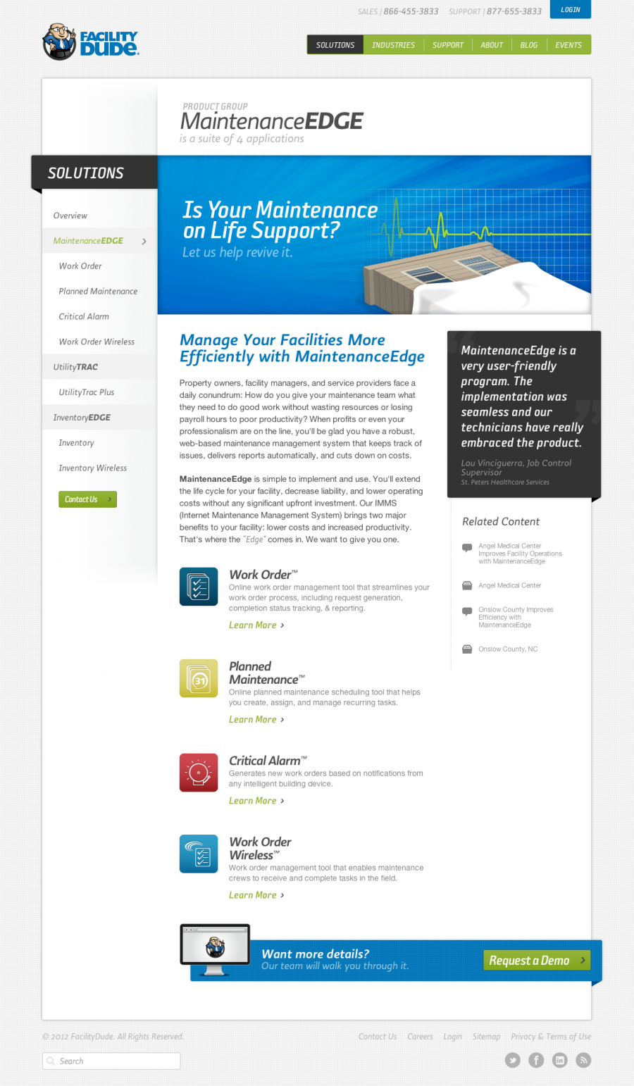
With a powerful ExpressionEngine backend we were able to give FacilityDude an easy way to build out custom pages on the fly. Pages like this product page have fully customizable headers, with options for quick links to files, the ability to pull relate multiple testimonials to a page and then have them pull randomly on load from the bank of chosen ones, add related content from their blog, case studies, events, documents, etc..., relate products for grouping, and choose from several action callout types at the bottom.
With every page managed by Structure they also have full access to change URL's, page order, browser titles and more.
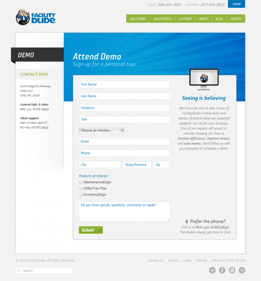
The main thing FacilityDude wanted potential customers to do was to fill out a form and sign up for a demo with one of their sales people. We had this form on the old site, but it was a little long and intimidating. By putting fields in the label and paring down everything except the exact info that was needed, we came up with a much friendlier form that looks easier to fill out.