Visual Recipes Design Process
After a long wait; we’re excited to be able to show you a really cool project we worked on several months ago. Visual Recipes is a site with a great idea: Take pictures for each step of your process when making a delicious dish and post it online. Great for visual learners (like myself) and great for the users who get to share their recipes.
The site already got quite a bit of traffic, but it’s age was starting to show. They were ready to overhaul it inside and out as well as add some new features.
Visual Recipes came to us with several requests:
- Create a new logo
- Re-design the site
- Create HTML/CSS
- Give advice the backend development as the site was transitioned to ExpressionEngine.
For time’s sake let’s look at the logo and design of the recipe page template:
Logo Design
Visual Recipes wanted the site and logo to be much more family friendly, fun, inviting, etc… We talked a lot about retro colors and rounded corners. You’ll see most of it made it’s way in, but not in the way we originally thought. The journey is always fascinating.
Nate went straight to work on the logo. The first round was very strong and actually has all the elements in place for the final. They liked the last one the most so we refined the letterforms and iconography. We thought v.2 was the winner, but they kept seeing a sea monster in the letter “v.” Fair enough ![]() So a small tweak and the final version is born. Retro and fun for sure. We dressed it up a bit with strokes and shadows.
So a small tweak and the final version is born. Retro and fun for sure. We dressed it up a bit with strokes and shadows.
![]()
Web Design
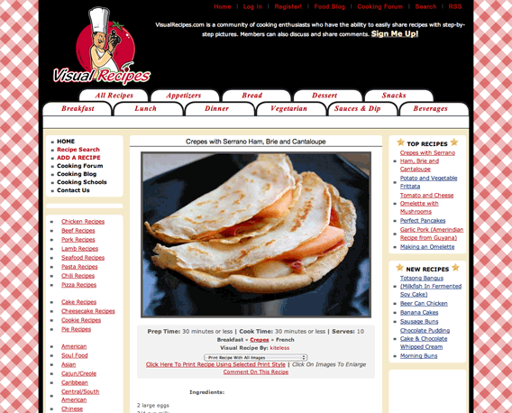
The web design proved to be quite a bit more difficult. I can’t detail the entire process here as there were quite a few pages, but we’re going to focus on the recipe page since it’s really the heart of the site. In addition to guiding visitors to read the info and participate more reliably, we were adding member profiles, sharing to social networking sites and dealing with ad placement considerations. In short, this was much more than putting a pretty face on what was already there. We were starting from scratch.
Sometimes a design comes together quickly and sometimes it’s hard work. This was definitely the latter.
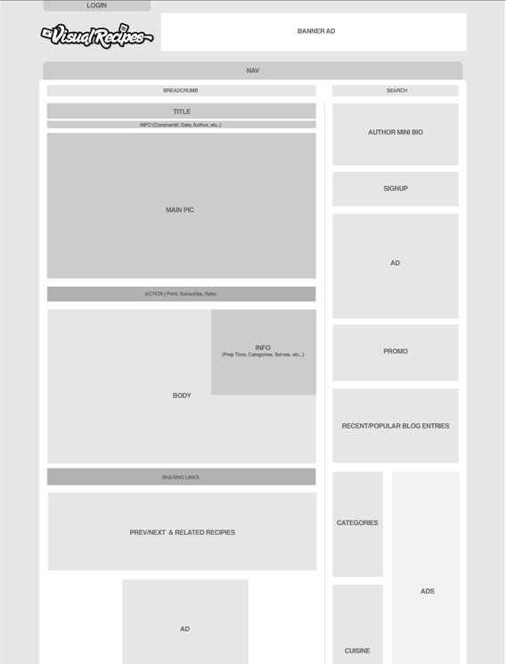
Wireframes were definitely the best place to start, so we got right to it. We tried a few layouts before settling on a wider 2 column design. This is where it gets interesting.
Looking at the first round; I’m not really sure what I was thinking. I know we were trying to get the rounded corners and retro colors thing but none of it felt right. Pretty sure I told them that when I sent it, too! Somewhere to start at least.
We both decided those retro colors weren’t happening. And it still looked too much like the wireframe, but with rounded corners. We needed to find some style and personality.
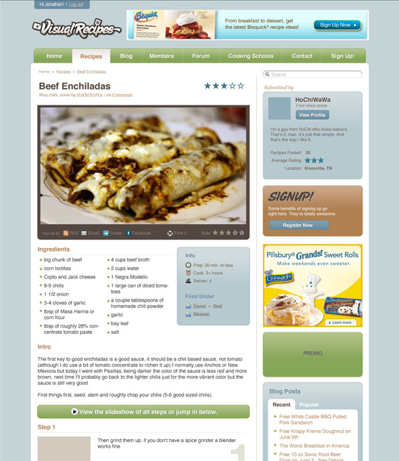
Round 2 was better. We found some great retro food illustrations and sprinkled them throughout the site. Made a fun background, too. The colors are happier, but it still felt really subdued.
Round 3 added most of the typography we see in the final, but mostly consisted of trying out different background colors. At this point, we both agreed that while it looked ok, the feel and details were sorely lacking. It wasn’t kick awesome yet. I decided to take some time and explore some other directions.
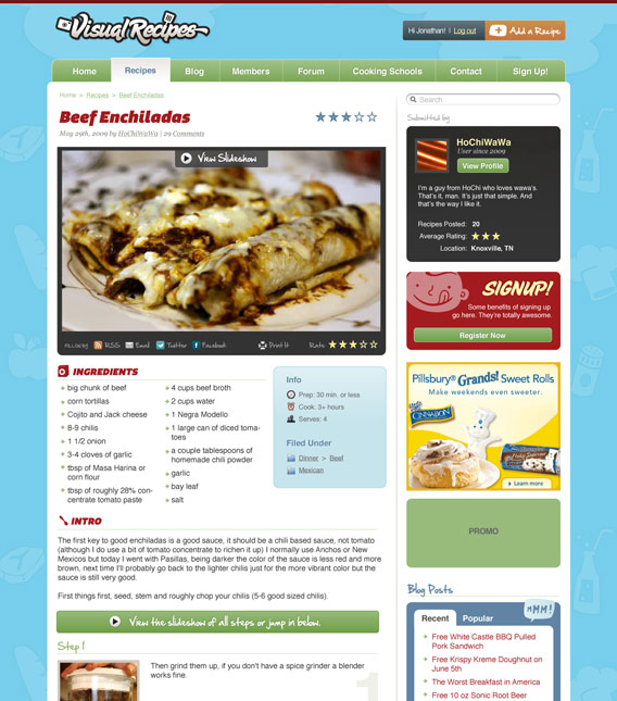
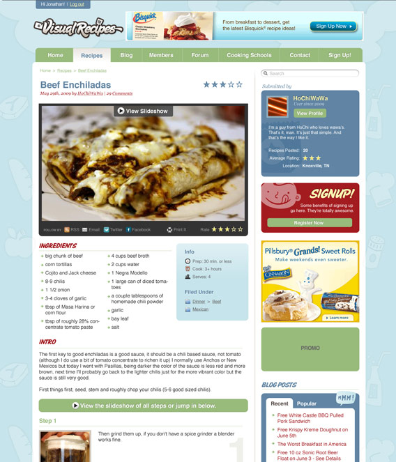
In round 4 something magical finally happened. It all started to come together. It began with the style of the photos. Nothing huge, but it was a square polaroid looking thing with curled shadows underneath to make it look like it was sitting on top of the page. That suddenly freed me from the rounded corners. I killed most of them immediately. We used various forms of the paper shadow on everything, even the ads. Then we realized the “sticky note” look worked really well with the handwritten font we were already using. All the buttons became scribbled blocks of color istead of rounded capsules. All the colors were intensified. Now it was starting to have some feel!
The final piece of the puzzle was the background. We had struggled with this from day one and I was determined to find just the right thing. Turns out it was really simple. Make it look like a kitchen, genius! A subtle repeated tile background was perfect. And for fun, a mini kitchen counter at the bottom.
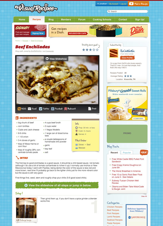
I can’t tell you how excited I was to show this version to Visual Recipes. We even found a way to put a top banner ad in tastefully! There were a few minor tweaks after this, but we both knew this was it when we saw it. Sometimes a design comes together quickly and sometimes it’s hard work. This was definitely the latter, but we’re both very happy with the results.
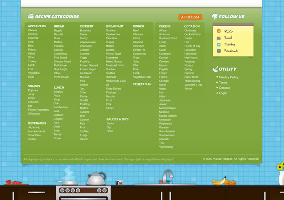
 From here we designed a ton of pages - The homepage, blog page, member page, and most importantly adding a new recipe page to name a few. We worked closely with Visual Recipes to make that whole process much easier. Did we mention the huge category dropdown? So many little details adds up to much awesomeness.
So here’s the deal. You like food? Yeah, that’s pretty much everyone. Go check it out. You’ll be hungry in no time. You like to cook? Go sign up and add some recipes. You’ll help more people learn to cook and the world will be a better place. Do it now. Visit Visual Recipes →.
Comments
1
Gene Crawford - Feb 19, 2010
Jonathan Longnecker - Feb 19, 2010
3
Martin Kulakowski - Feb 19, 2010
4
Marcus Neto - Feb 19, 2010
5
Mike - Feb 19, 2010
Jonathan Longnecker - Feb 19, 2010
7
Jeff Bridgforth - Feb 19, 2010
8
Jeph K. - Feb 19, 2010
Jonathan Longnecker - Feb 22, 2010
10
Rex Stevens - Feb 25, 2010
11
Scott - Feb 25, 2010
12
Matt - Mar 09, 2010
Jonathan Longnecker - Mar 09, 2010
14
Thomas Griffin - Jul 10, 2010
Jonathan Longnecker - Jul 11, 2010
16
Thomas Griffin - Jul 11, 2010
Jonathan Longnecker - Jul 12, 2010
18
Christian - Sep 09, 2010
Jonathan Longnecker - Sep 09, 2010
20
Ninoe Sie - Nov 05, 2010
21
Juha - Aug 24, 2013
22
tina - Nov 02, 2013