Designing the Kick Awesome Show Site: HTML5, CSS3, Fontface & Responsive Layouts
Funny story. Nate and I started the Kick Awesome Show mainly to pull the suck out of Mondays. I mentioned I was frustrated with spending the entire morning answering emails that came in over the weekend (seriously, enjoy your time off, people!) and not ever getting much done in the afternoon. We’d been talking about ways to post to the blog more regularly and somehow we came up with spending Monday afternoons shooting a web show. We tried it and we’ve been amazed to see something we started for fun become watched by so many of you so quickly.
After just a few episodes we realized it was time to move it to it’s own site. Fortunately this gave us an opportunity to invest in some serious HTML5, CSS3, Typekit and Responsive design. And a bit of iPad magic, too. Read on to find out more.
Design
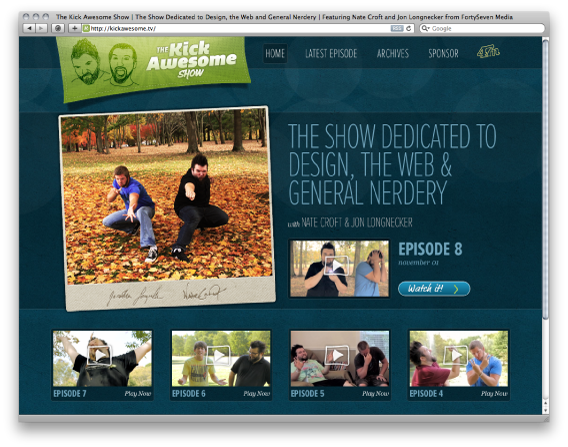
 I intentionally took some of the grungy texture cues from 47m in designing the new site, if for nothing more than a sub conscious connection. And honestly to save a bit of time. We love us some retro grunge so pioneering the next design fad wasn’t necessary.
The main title graphics for the show were a lime green, but trust me…you don’t want that for a background for your site! I tried it. I opted for a dark blue textured background with a lot of CSS3 transparent boxes overlaying to flesh out the grid.
Typekit
 We finally got on the Typekit bandwagon a couple of months ago but hadn’t really pushed it’s capabilities other than using it for a headline here and there. Needless to say I was pretty excited to be designing with some new fonts this time around. The print designer in me forgot how much fun it is!
The TKAS uses Proxima Nova Extra Condensed Thin and Bold and FF Market Web with a sprinkling of Helvetica and Georgia Italic. All in all I think they all work quite well together.
CSS3
 We’re only using images for icons, poster images and logos. Everything else is done with background transparency, gradients, rounded borders, and box shadows. At some point we might add some webkit transitions, but that’ll have to be later. Oh, and it doesn’t look nearly as good in Internet Explorer, but I don’t really care. Life’s too short, especially when it’s a side project.
Handmade Touches With the iPad
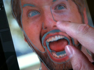 There was a bit of this in the last episode, but after putting the design together it was missing personality. So I took a ton of screenshots from the show and all my icons and re-drew them with Adobe Ideas for the iPad. Bringing them back in gave it just the right touch without painstakingly sketching in my notebook, scanning and re-tracing in Illustrator. Plus it was a ton of fun!
Responsive Design
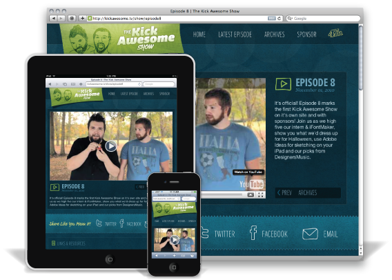
As soon as I started thinking about this project, I knew I wanted to build it so it would resize at different browser widths for smartphones and tablets. Turns out it’s not that difficult and quite enjoyable. In fact, I think it was my favorite part of the whole design. For now I’ve focused on an iPad layout (in portrait orientation) and an iPhone sized layout.
The only bump I ran into was resizing the video with CSS only. Because we were putting advertisements in we had to move away from Vimeo’s excellent HTML5 iframe embed (which was very easy to define a height and width with CSS).
Unfortunately, as we moved to YouTube it was apparent that while they had an HTML5 iframe in beta it was pretty rough. After a lot of testing I decided it was better to move back to the old embed/object tag. Boo. But how do you control the height and width via CSS when it’s hardcoded into the tag?
After playing around with it a bit I came up with an easy solution. Set the height and width to 100% on the embed/object tags and put it inside a div that you can control the dimensions with CSS. Clean and simple.
Details
 After going through the trouble of setting up the responsive design, it was only fitting to put a nice Apple touch icon together. I found a great template that let me spit out one in all sizes necessary.
ExpressionEngine
Of course, TKAS is running the shiny, new ExpressionEngine 2.1.1 so we can publish to our hearts content. It’s really a pretty simple install other than the cool reply/quote comments functionality that Veerle put on her blog. That and spitting out RSS feeds and iTunes podcast feeds, etc…
Wrap up
And finally, all this doesn’t matter if we’re not making some kick awesome Kick Awesome Shows. So if you’ll excuse me, now that the framework’s in place it’s time to make the show even better. Thanks for watching and enjoy the new site!
Comments
1
Jeff Bridgforth - Nov 04, 2010
2
Mike - Nov 05, 2010