FlowType.JS - Makin’ Responsive Type Easy

If you do a lot of Responsive Web Design you know how much of a pain it can be to change font sizes and line heights at all your different breakpoints. Thankfully the guys at SimpleFocus have come up with a really cool solution: FlowType.JS.
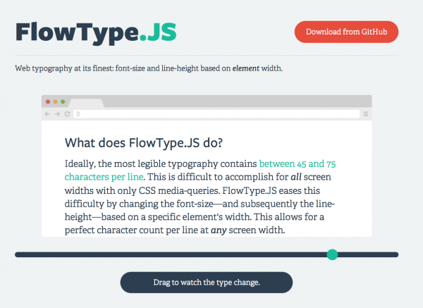
According to them: “FlowType.JS eases this difficulty by changing the font-size—and subsequently the line-height—based on a specific element's width. This allows for a perfect character count per line at any screen width.”
The performance is good, it's easy to setup and it works just fine with whatever font service you're already using like Typekit, Cloud.Typography or Google Webfonts.
If you want to give a spin you can download on GitHub.
Comments