Retro Photoshop Fun - From Dull Digital Photo To Sweet Old School Album Cover
I love having a digital camera, but it is definitely lacking in the vibe department. Old school film camera’s like the Holga and the Diana have a great feel to them, especially when they are cross processed. So I’m going to show you some ways to fake the funk and give your digital images a healthy dose of awesome sauce. (I’ve been listening to Fundamental Elements and I blame them for making me say things like “Fake the funk” and “awesome sauce.”)
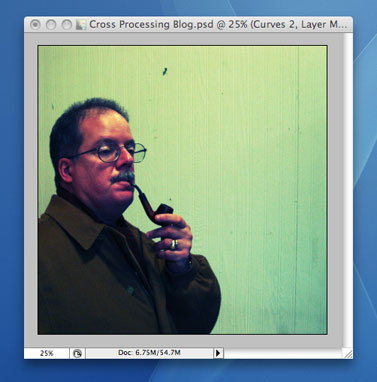
Let’s start with a picture I took of Mr. James.
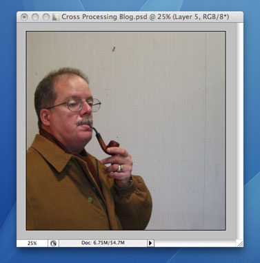
James had a pipe that day and I couldn’t resist a photo op like that. But in that particular building, the lighting is of the soul bleaching fluorescent variety. So let’s break out a Curves adjustment layer to fix that. We are going to mess with each channel separately here and that’s the magic of this pseudo cross processed method.
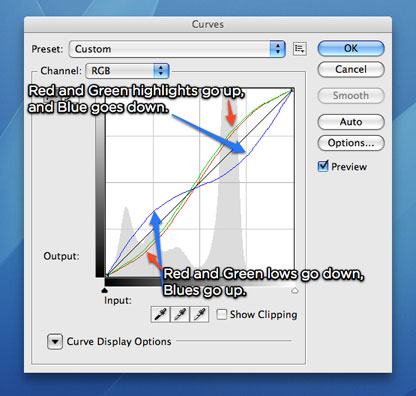
On the both the red and the green channels we’re going to raise the highlights, while dropping the blue highlights. Now to work on the lows. Make a point for both red and green channels and drop it pretty low, then raise the blues around that same point.
That gives us this:
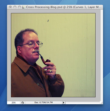
That’s a little better, but I’m looking for that really over the top look so let’s add another Curves adjustment layer. Only the red channel gets attention here. I’m dropping a point on both the mids and the lows.
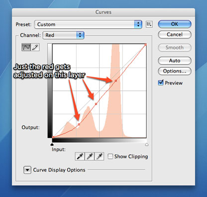
Now we’re getting somewhere. The color’s all wonky in this really interesting way.
We’ve got this old school looking photo now, so let’s do something with it. I’ve made some lines in Illustrator and imported them into Photoshop.
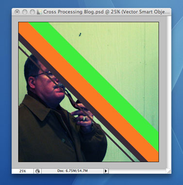
Not exactly what I was going for, so I changed the blending mode to “Difference” and dropped the opacity to 13%.
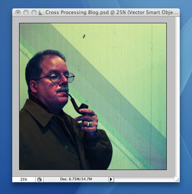
Much better. The lines are running over his face, but we’ll take care of that with a mask. I’m going to call my fictitious album “This is what we like to call Old School Smooth & Proper Jams.” We are going to need to set this title in an appropriate typographical treatment to really set off this cover. Shapes always help me work in type in ways that I normally wouldn’t so I’ve create a circle and chopped off the top. From there I selected it, contracted the selection by 20 pixels and filled it with a rust sort of color. Next, I set the blending modes to “Soft Light” for the outer white shape and “Color Burn” for the inner shape. I also added a nice decorative leaf-like element.
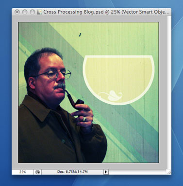
Our typography now has a place to live. I’m using ITC Bookman Italics for all the type in this design since the italics in this family have a really warm and inviting feeling to them. I am going to break up the title into a few chunks so I can style them differently. “This is what we like to call Old School” gets to site on top of our circle with a flattop, while “Smooth & Proper Jams” takes up residence inside the flattop circle with different color treatments. And no old school record cover is complete without some mention of it being in stereo to along with the record label’s name.
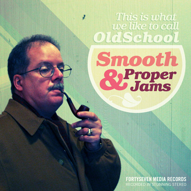
At this point, no one would believe that this isn’t a for real album of Smooth & Proper Jams. Look at that pipe, those crazy colors, and sweet, sweet typography. Now that’s proper!
Comments