Design Hope: Logo Design Round 3

by Jonathan Longnecker

Welcome back everybody! I have a good feeling about this round. Like we might just have a winner. Lots of great input from everyone on the last round. Except for that one guy. Sigh. There’s always one isn’t there? Thanks to those of you sticking up for us and keeping things positive. Moving on!

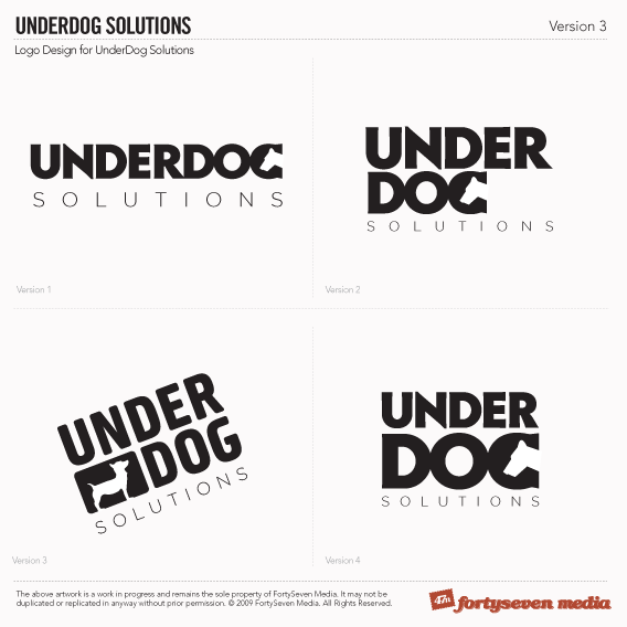
The first version was still the favorite, with some requests to stack it as to cleverly put the dog “under” the under. So I tried a few versions of that. Scott liked #2 from the last round as well, but not everyone was digging my lovingly handcrafted custom font. No my feelings aren’t hurt, I promise. Really. So I tried a different font and what do you know, I like it much much better! In a great twist of irony the font’s name is Mustardo. Mustard. Hot Dogs. Kind of sick and twisted but really funny. Anyway, it got nice and bubbly and friendly and has a much better feel.

Under Dog Solutions Round 3

That’s it! I’m keeping it short and sweet because we’re insanely busy. Let me know your thoughts in the comments.

September 11, 2009

Design, Design Hope

Comments

  1. I’ll keep it short too.  I like 1 and 3.  Nice job guys.

  2. It’s a tough call between #3 and #4, but I would have to vote for #3 in the end. I prefer the font and look of #4, but #3 seems to fit the best. The rounded font, the small dog and the cocked presentation really represent the “underdog” feel.

  3. Love 2 and three!!!

  4. I really like both 1 and 2.

  5. Still lovin’ #1! I prefer the wider footprint, and the subtle contrast between the words. (When I look at 4, all I see is DOG.)

  6. Number 3 is AWESOME!!!

    My only critique, however, is that the word “solutions” seems to thin. When it comes to size (like displaying it on an iphone, for example), you’d easily see the “Underdog” but “solutions” would nearly disappear. I think the font size is fine. But “beefing” up the font and its weight would probably do wonders!

    Still…number 3 ROCKS! wink

  7. Darn it! I meant “too thin”...not “to thin”. My bad.
    (And the Grammar Ninja strikes again!)

  8. Number 4 ~ hands down!

  9. Ok guys, let’s try to be a little more consistent smile You’re all over the map!

  10. Number 3 is certainly my favorite, tilted, flat, or otherwise.

  11. i like 1 & 4. i would like 3 if it wasn’t tilted

  12. Yup… 1 and 3 it is for me. I like them both equally for different reasons! Keep up the good work. I cannot wait to see some of the website design comps.

  13. I like number 1 the most, but number 2 even more than that. Also I think 3 and 4 are better than each other, but not as better as number 1 and 2 are.

    wink

  14. I like #3 most. Either rotated at a ~45deg angle like it is, or maybe horizontal. Not sure, but definitely #3. Second choice would be #4, because the creative use of the dog to form the G… but at first glance didn’t look like a dog to me.

  15. I’m declaring #3 as the winner! I think it will look sharp either tilted or flat depending on the application! Awesome job!

  16. I like #1 the best. It’s clean and simple and you could always use the G in dog for a stand alone logo. All 4 of them look great and I’m sure the client is going to love whatever you choose!

  17. Joining this a little late but I would have to go with #1 (and because everyone else had two choices, #3). I’m a little biased when it comes to horizontal logos as they are easier to work with on the web (more screen real estate).  #3 is a more unique than #1 though. All in all great work guys.

  18. Number 3 for sure (not crazy about the tilt), with a little weight love on the “Solutions” type. It seems too extreme of a difference from the main title mark. And with 3, you’ll have a cool little pooch icon to boot!

    Looking good, fellas.

  19. KISS, keep it simple *stupid* A good logo is distinctive, appropriate, practical, graphic and simple in form, and it conveys the owner’s intended message!, to me #1 fits the criteria , move on to the next round

  20. I know you guys are busy and stuff, but you’re getting link spammed by these guys.  Just thought you should know. 

    Oh and great idea with the giveaway.  Keep up the good stuff.

  21. Thanks Marc; unfortunately we get 15-20 link spams a day, even with Captcha and Typepad spam integration. I usually just let them build up and knock them out in chunks at a time. Sorry there were still a few hanging around wink.

  22. I think #4 is the strongest but I think the execution of the “G” needs some tweaking as it reads as “C” to me in spite of the negative space.  Perhaps a counter-clockwise rotate of a degree or two would help kill the serif created by the dog’s ear and neck?  Otherwise tight work.

Behold our Amazing Portfolio

Check it Out