Design Hope: First Logo Designs

by Jonathan Longnecker

Just as we promised, we’re putting this whole design process out for feedback (good and bad!). For those us you just finding us, Scott Schuster of Underdog Solutions, a startup iPhone development shop, won the contest a few months ago. Here’s the list of what he’s winning, but for now we’re finally jumping off here with some initial logo designs.

Scott had talked quite a bit about his dogs, and even went so far to reference them in his company name, so we thought that was a great place to start with his identity. We also tried to put in some references to the iPhone in a fun way. The goal was to make something simple and professional, but with a bit of character. We have a soft spot for the 8-bit version as well smile

Underdog Solutions Logo

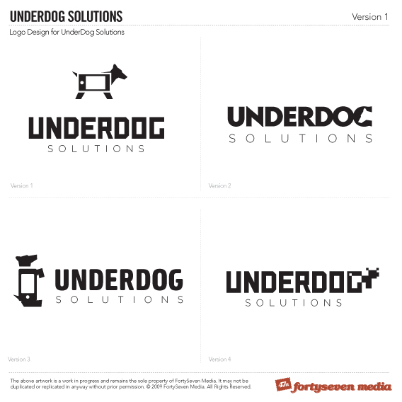
In case you didn’t know, we always start our logo design process with black and white, solid fill versions. If your logo won’t work in this form, then it’s not a good logo.

So once Scott saw these he started to wonder if we shouldn’t head in a different direction:

I really do like the concepts w/ the dog/iphone mix but seeing as how the company may change course sometime down the road, I’d hate to build a brand around that specifically.

And

I feel like the one w/ the dog’s face for the G looks cool, but could be confusing to people who have never seen the logo or heard of the company before.

He really liked the 8-bit version as well, but said his wife didn’t get it. Looks like we need to start defining a target market.

One last idea; Scott wondered if we had tried to visually represent an “underdog” or going against the odds. Any thoughts as to how that could translate into a simple icon of sorts would be greatly appreciated!

So what do you guys think? This is where we need your help as a community to get Scott a logo he loves. Chime in below!

August 03, 2009

Design, Business, Design Hope

Comments

  1. I am not an Iphone guy, so I initially thought the “iphone” was a TV.  But I see it now.
    I like the overall simple concept.  Looks good and sharp.
    How about….instead of just using the dog head in the G, use a silhouette of a dog with the letters “DOG” in white after the “under”.

    So you would see “UNDER[pic]” with the letter d-o-g in white superimposed on the [pic]

    Nice job.  Looking forward to watching this progress and learning from you guys.

  2. It’s just awesome that you’re being this transparent!  I’m really digging Version 2.  I think perhaps the “G” could be slighly more “G” looking.  Maybe just a little bit more emphasis on the neck of the dog to really make that “G” pop out.  I’m really looking forward to following this process along - great work!

  3. I like the dog sitting up with the iphone body.

  4. wait, i like that dog but the font from the top right one.

  5. My vote is for the dog in the G. Clean, simple, and readable to me seeing this for the first time. The G could look a little more like a “g” if the dog’s neck was a little skinnier. Good job.

  6. I like the logo with the dog face in the ‘G’.  I think it’s the cleanest, and most original.

  7. I would go with version 2. I can’t wait to see what you do with the favicon.

  8. Hey Jonathan, could you explain a bit more why you guys always start out using black and white for your logos? I’m working on a logo now and any advice would be greatly appreciated. That seems to be one of the most difficult things for me to do when working on a design. Thanks!!

  9. Version 4 is the only one that feels inspired to me.  1 and 2 are okay but not earth shattering.  3 is no bueno.  I really like 4 though.  I think I’d like the mark even more seeing it without the lines being fuzzed from scaling.

  10. I had Scott’s exact first reaction (“but seeing as how the company may change course sometime down the road, I’d hate to build a brand around that specifically”), so I don’t agree with Allan Branch (this time; usually I do). Well, OK, Allan, I agree with you on the font from #2.

    I really like Shawn Van Dyke’s suggestion with a slight twist: “Under[pic]” where the pic is the dog from #1 minus the iPhone body. The alt text can just be “dog” so it reads fine without the image, but I wouldn’t overlay any text on the dog. The animal speaks for herself.

  11. @Jason We start out black and white because the fundamental shape and form of it should be unique and convey your message without all the “dancing monkeys” (shadows, gradients, colors, effects). If you can get your feel and message across in stark black and white, then you’ve done an excellent job.

    Also, you have to remember that most logos will be used in multiple forms. Embroidery and promotional products will need something simple, strong and one color to work well.

  12. Wait… no target market was defined BEFORE you started on the logo??

  13. Howdy everyone smile I just wanted to say how cool it is to see so much feedback from the design community. It’s really exciting to see how this whole process unfolds from a non-designer perspective.

    After reading over the comments that have been made thus far and giving the first logo designs another inspection, I had a few additional comments I’d like to add.

    First of all, I think it would be hard to narrow down a target market at this point in time. I say that because the applications I currently have planned vary as far as their individual target markets are concerned. Additionally, my current game plan is to start the company off with two or three applications geared towards niche markets before trying my hand at game development, which has a very large and dynamic market. Furthermore, it is possible that I will eventually need to change my business model from creating my own application offerings to one in which I offer my development services to others.  If that were the case, then I guess my target market would be people looking for developers for hire.  However, keep in mind too that while I plan on developing for the iPhone for the foreseeable future, a significant shift in the mobile market place due to either a change in platform popularity or changes in the way we communicate due to unforeseeable changes in technology, this may not be the case a few years from now.

    As far as imagery goes, while I love dogs, I don’t necessarily think of them when I think of underdogs.  When I think of underdogs, I typically think of a team coming out of nowhere to take down the defending National champs or something smile Unfortunately, underdogs usually don’t come out on top and so I think there is sometimes a negative connotation associated with the term from that perspective. In fact, my brother in-law was the one who told me at one point that he personally wouldn’t buy a product from a company who considered itself the underdog.

    On the other hand, stories of underdogs who have successfully come out on top are not only loved and remembered, but in many instances they become legendary. Granted… I don’t think you can compare a successful company to a legendary sports team, but I do believe that a small company who proves itself by releasing quality products in a competitive market will stand out and be ever more successful because of it.

    So, while I’m not opposed to having dog imagery, I’d really like to find a way to portray the company as one that can come out on top. I’m not exactly sure how well this can be accomplished, but I’ve brainstormed a few ideas that I thought might be possibilities. Keep in mind, I’m not a designer, so please try not to make too much fun of me if my ideas are ridiculous smile

    The first idea I had came to mind after thinking about a scene from my favorite movie Brave Heart and an incident w/ my dogs at the vet a few weeks ago. In Brave Heart there is a scene where William Wallace has some of his men lure a few enemy into a narrow canyon with a dead end. In this scene, the enemy horsemen appear confident that they have these mere foot soldiers trapped and at their mercy… that is until they were pelted on the head with rocks from above. I have two small dogs (both around 25lbs.). A few weeks ago when I took them to the vet, we were in the waiting room whenever someone brought in a Grate Dane. The littler of my two dogs instantly tried to pick a fight with this dog that was probably 7-10 times his size. The thought of such a small dog taking on such a large one was quite entertaining and I thought this might be something that could be portrayed without the logo getting too busy. I thought that this might be portrayed by writing “under” using a smaller font size followed by “dog” using a larger font size. I then figured a small dog could be on top of the “dog” word looking down at the larger dog standing on the “under” word. I’m not a designer or anything so feel free to knock this idea as much as you want b/c it really won’t hurt my feelings. 

    The second idea I had was to somehow hang a 1st place medal around the dogs neck or something. I thought that it might be possible to represent the dog from a front perspective above the word “dog” w/ the medal hanging around his neck, which would then replace the second “O” or “I” in SOLUTIONS. Once again, feel free to knock it smile

    I look forward to reading more of your commens smile

    Take Care
    Scott

  14. I’m sorry Scott, but I disagree with your comment about not narrowing a target market. While your apps themselves will have much more focused audiences, your company needs to have a defined target audience. This could be as simple as defining the demographics of the audience, or you can get much more detailed than that. Either way, it’ll help narrow the focus of your overarching marketing endeavors from a company perspective (rather than an app perspective).

    How much you wanna bet EA has a target market despite their incredibly diverse video game line up?

    I really encourage you to read up more on what it means to define a target market and how to go about it. I’ve no doubt that you’ll do well, but it will be much easier if you know who you’re trying to communicate with.

    Looking forward to seeing more as this develops! wink

  15. No need to apologize Angie. You make a good point in regards to EA and being able to narrow the focus down for marketing purposes.

    When I have time to do so, I probably should take your advice and read more about how to do define a target market properly, however I would say based on the demographics I expect to be purchasing my applications (at least initially),  that my target market is primarily composed of males, ages 15 - 40 and females ages 15 - 30.

  16. Well see? You’re already headed on the right path! smile

    I should’ve added that your target audience will change - that’s inevitable as you start to run your company and people start to form a relationship with it. It doesn’t need to be permanent.

  17. On second thought, that is probably way too broad. I think to that I would have to add that I’d be targeting primarily middle class individuals w/ at least a high school education who are fairly social, at least somewhat trendy (i think having an iPhone places everyone of my possible users in this category), open to new experiences, and who generally desire quality over quantity (aka… are willing to pay more than $0.99 for a better product). That might narrow it down a bit smile

  18. I like version two. I am not a strong advocate for a logo that necessarily needs to reflect all that the particular business does. Version two is simple, clean and can be modified with colors to help it stand out best. Remember to consider the content that will surround the logo in the website design and advertising, those things will help to strengthen the logo.

    Example: LinkedIn logo is just a blue box with IN, I didn’t see anything to do with a link? smile

  19. Joshua, thats a good point as well. I’m really not opposed to a simple logo and I do like version 2 but at the same time, I am still concerned about the G being a bit inconspicuous.

  20. Totally agree with Jon!  Really digging the possibilities with version 2.  It’s simple but distinct. If you could make the G more “G like,” otherwise I’d like it.

  21. Option 1: The iPhone looks like a tv.
    Option 2: This is the nicest to me but the “G” has to be reworked.
    Option 3: There is potential with the icon itself. I think you can probably mix the text from option 2 and combine it with this option.
    Option 4: I like the 8-bit look but not for iPhone development.

    Did you guys do any other preliminary designs?  Maybe you can take another look at them and post some of those options.  Also, a type solution for the logo can stand on its own for development outside of the iPhone.  The dog icon can be used to support iPhone development.

    That’s my $.o2!  wink

    Great work fellas I am looking forward to the revisions.

  22. Maybe my opinions don’t count but I like two!

  23. Killer designs.  I think that the dog shape is great.  The 8-bit looks a little like an alien, but I can appreciate the effort.  But I, too, thought the iphone was a tv.  We love the fight, though, right?  It is really tough to find the balance between the literal and the implied.  But when the solution is complete, it makes it all worth it.

    I really like Scott’s idea of bringing this “underdog” concept to the forefront.  When I think of an underdog, it makes me think of our inordinate and inexplicable faith that an obviously losing battle will actually result in victory.  David & Goliath.  Nelson Mandela.  Rocky.  (Well, actually, every sports movie I’ve ever seen.)  It might make the concept resonate more clearly without aligning it so closely with the aptly-named superhero of animated television history.  I hope that helps.  I’ll leave the concrete ideas to you.  Can’t wait to see the next round.

  24. Neat work. Here are my comments Jon:
    Version 1 is a bit too spaced for my liking. I like the top image, but it just feels too… tall? Something about having those three lines that reduces my interest in it.

    I really like version 2. It is slick. The font used for Underdog is probably the best choice of the four - however, the sharp points on the letter ‘N’ don’t seem to fit - maybe I’m critiquing the font family now? That font would look great if the ‘N’ looked more like the other characters. The image of the dog is cleverly worked in - I like it.

    Version 3 troubles me a bit in that it the vertical alignment of the dog image seems a bit arbitrary - though it may not actually be. The gap near the dog’s behind and tail looks a little strange too. Again - I am just picking at it, there are good things about this one too.

    Version 4 is neat. I can definitely appreciate it, but the image of the dog is a bit difficult to pick up on in the first second you see the image (though this is hard to replicate as once you have seen it, you can’t really trick yourself into rediscovering it). It creates a bit of a different alignment as well having the image stem out.

    Anyway, my final choice would be version 2, my advice would be to try to change the points on the ‘N’ so that it looks like the other characters in the rest of the title. Best of luck, looking forward to seeing the next revision.

  25. Scott,

    Just my 2¢, but Avis rental cars came up with a campaign back in the 1960’s that essentially said “we may not be number 1, but we try harder.”. They were the #2 Rental Car company. I say this to emphasize that you can effectively capitalize on being the underdog, or #2, #3, etc., regardless of what your brother in law says, by highlighting how hard your company will work, etc., to I also would encourage you to venture out beyond family members for feedback. They generally always sway people out of any rational decisions and more often than not confuse things based on emotional ones.

  26. Honestly, if all we are worried about is the G for option two - consider this. Your customers and potential clients are not stupid - they will know it is a G. This is the least of your worries… smile

  27. Option 2 gets my vote. Next!

    grin

  28. I like version 2 but the “G” looks more like “C”.. yeah it’s true that the dog already speaks for itself so no need to put the word dog on it, but I think it would also be great to create contrast out of it.  For me, i would like to modify number 2 by retaining the word UNDER then an image of a dogs upper half body then a white text DOG on the the dog’s body so it still reads as UNDERDOG.
    []=black dog image

    UNDER[DOG]

    Hope this make sense..  cheese

  29. Version #2 gets my vote as well! Maybe you could “cleverly” make use of a collar going partly around the dog’s “neck” to make the “G” stand out.

    Maybe.

    This is a really neat project you guys are working on. And the fact that I can comment and add suggestions? Even cooler! You guys are AWESOME! Keep up the good work.

    <><

  30. hi there..

    really like version 2 (top right)..  the G is a nice touch!

    I was playing around with the whole idea of “underdog” and came up with having a logo that doesnt neccesarily have the name in the logo..

    my idea was a play on the word “underdog”- so you have a picture of a dog and then the word solutions underneath it.. -> solutions under a dog -> “underdog solutions”

    as to how you would relate this to it being something to do with an iphone i have no idea.. but this gives you another idea to play with wink

    hope you come up with something..

    Jonathan

Behold our Amazing Portfolio

Check it Out