What’s Up With the Twitter for Mac Icon?
Here’s the thing. I really try not to gripe about things like an application icon. If it’s horrible you can always go make one yourself, right? But the Twitter for Mac icon saga warrants some kind of discussion.
In case you didn’t know, Twitter for Mac is actually sort of Tweetie for Mac 2. The difference being that Twitter hired the creator, Loren Brichter and so version 2 was aptly re-named. In fact, the original Tweetie for Mac was so good that many people kept using it long after it went months without updates and no promise of a new version.
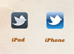 Now don’t get me wrong, Twitter for Mac is still really good. But there’s a serious identity problem going on over at Twitter with their icons. If your a total nerd and still reading you probably remember when Tweetie 2 for iPhone was rebranded Twitter for iPhone and they changed the icon. Adding the bird was inevitable, but the execution and colors just seemed sloppy. Everyone whined, lots of “suggestions” were created and then we apparently got over it. Then Twitter for iPad came out with a really nice black textured version of the blue icon. But why was it different from the iPhone version?
And that brings us to the final saga. Twitter for Mac sported a new icon..sort of a combination of the iPhone and iPad versions but with some subtle brushed metal stuff going on. But with a totally new shape. I actually liked it quite a bit and even mustered up the energy to tweet: “It’d be great if Twitter went back and fixed their iPhone icon. iPad and new desktop icons are much better.”
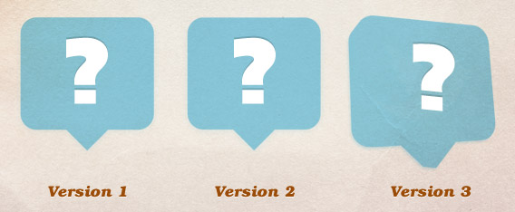
If only I knew that the next update to the app would change the icon back to that nasty blue! But wait, a third update changed the color, added a 3d effect and a…wait for it…map of the earth? And this is all the span of maybe 3 weeks.
![]()
Just so you know, I’m not complaining so much about the style of the icon, but more about the inconsistency. Why in the world would you change your icon that many times? Why don’t all the icons look (mostly) the same across all platforms? Who knows. I’m just curious what you think. What’s going on over in Twitterland?
Comments
Nate Croft - Jan 24, 2011
2
Jeremy Mansfield - Jan 24, 2011
Jonathan Longnecker - Jan 25, 2011
4
Anonymous - Feb 19, 2011
5
submitcore - Jun 02, 2012
6
Vieux - Oct 28, 2012