We’ve had a few people ask us how in the world we built Kicktastic, our video business training project, so we thought we’d tell you.
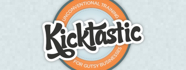
Real quick - what is Kicktastic?
Kicktastic is unconventional video training for gutsy businesses. Every month you'll get fresh content in the form of a main topic video, transcript and resources, and related video tips. We'll be interviewing the smartest minds in the business and refining it down into info packed, entertaining videos that don't waste your time. Plus, each video has its own discussion thread below so members can ask questions, share their stories and help each other out.
Pretty straightforward, right? Well, not so much. If you’ve ever tried to build a video training platform that takes recurring payments, and do this for under $1,000 in expenses (minus the time to build/design of course) things get a little nutty. Let’s look at each piece.
Frustration is part of many of our lives. We can't get what we want, or get it when we want it. We blame anything and everything but it remains. There's something else at work.
It seems that there's always something between me and a goal I've set. The road to my goal is often laid out as a one laned road and inevitably, some large and slow moving thing gets in my way. I fuss and fume and make a stink but nothing changes. That gigantic thing ahead of me just keeps chugging along at 1 mile per hour.
Everyone is scared of the mob. So all you need to do is devour a bunch of garlic-y food and you'll smell like a mob boss. Add a bad Godfather accent and your client will do whatever you say. Or else.
Kicktastic brings you another great tip: Make sure you punch your clients in the face the first time you meet with them. This wil give you the upperhand and show them who's boss. Feel free to followup with a snarky “yeah!” or “that's what I thought!” to seal the deal.
Inpiring talk by Adam Savage's talk at Maker Faire Bay Area 2012. He tells a great story about his Indiana Jones hat, how he got started building his obsessions, and why makers should embrace the things that they have no choice but to make.
Have you ever wanted to turn Play Doh into an old school NES controller? Or use your stairs as a piano? MaKey MaKey is for you. It's a simple circut board that plugs into your Computer via USB and uses alligator clips to pass the signal to your keyboard keys. Not only do I want one, but I think it opens up a world of possiblities for my kids to learn, make and create.
Currently MaKey MaKey is on Kickstarter and has blown way past their initial pledge goal so if you want one of these I'd suggest you do it fast before they have to cut it off. But seriously - banana piano!!
Nate and I had the pleasure of attending (and speaking) at ConvergeSE a few weeks ago, and while it's a little late for one of those “I take meticulous notes from every speaker and put them in one massive blog post” deals, I had to let everyone know what a great time we had.
Let's get this out of the way: ConvergeSE was by far the best conference we've been to. The talks were great, the workshops covered all sorts of interesting topics, but that paled in comparison to the people we met and the conversations that were had throughout the conference.
If you're tired of going all analog on your Moleskine notebook and want to embrace the new hotness, check out Paper for iPad. It's a free app with several brush types availble for in-app purchase, and it looks like it's a ton of fun to use. I have a lowly iPad 1, but if you managed to snag an iPad 3 with the massively hi-res display Paper will be sure to please. Oh, you might want to pick up a stylus, too.
While working on the new 47m site we decided that we wanted our portfolio images to look like they were in a browser. Easy enough, right? But I didn't want to save out every image with some fake browser thing at the top. That would be a huge pain if we ever wanted to change the style in the future. CSS to the rescue!
I've opted for a pretty simple browser design, but you could totally get crazy with url fields, back/forward buttons. That would probably require an image, though and I was trying to avoid that. To get the browser are at the top we need the containing div to use the :before CSS selector.
Do webkit transforms make your head spin? Wish that cool thing you just did in CSS3 actually worked in more than 2 browsers? Hype to the rescue! It slaps a GUI on what you want to do and spits out CSS and Javascript code for those browsers that aren't in the cool club yet. Did we mention it supports mobile browsers, too?
Note - I was going to have this all be one article, but it was too big and I don't want to bore you. So! Part Uno will focus on the design and stragegy while Part Dos will focus on the dirty technical details - from HTML5 & CSS3 to Responsive layouts and ExpressionEngine programming. Part Uno begins now:
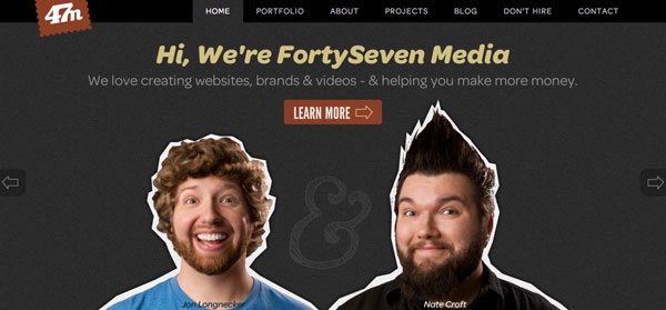
Have you ever climbed to the top of a mountain, cooked a whole pound of bacon, ate it, hiked back down and built a mansion with your bare hands? That's what it felt like redesigning the FortySeven Media site.
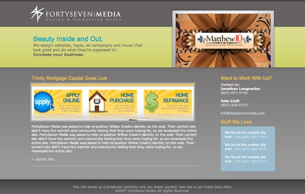
Version 1 of fortysevenmedia.com was super gray and boring (seriously, it was gray). We were afraid to be ourselves and thought that in order to make it as a design studio we needed to be stuffy, businessy and impersonal.
2007 - So much grey. Why oh why?
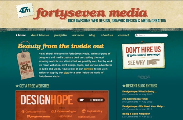
Next year we sat down and decided that if we were going to have our own company we should darn well act like it. With version 2 we overhauled the identity, made snarky pages like “Don't Hire Us,” created a blog and before we knew it, we were getting business from all over the place.
2008 - The retro was strong with this one.
We had stumbled onto something, and quite frankly re-designing that kind of success is scary, especially when it provides for your family. The Lizard Brain was in full effect. We got talked about quite a bit when we launched the old site and we didn't want miss that magic this time around. Every time I sat down to work on it I just got overwhelmed. Could we make something nearly as iconic as the first go around? Turns out it didn't matter, because after waiting 4 years we were becoming obsolete. Don't get me wrong, the business was doing better than ever, but the jobs coming through the contact form were less interesting than they were a few years ago.
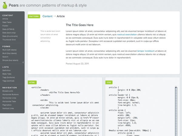
They're not juicy fruit, but they're still pretty cool.
Pears is a great idea from the Simplebits and Dribbble mastermind Dan Cedarholm - Create common UI patterns with the HTML and corresponding CSS for basic styling for a quick reference too. I think we all do this to an extent with snippets in our code editors, but this goes a bit further “pearing” them together (see what I did there?).
Even more interesting, it's also an open source Wordpress theme so you can use the framework to make your own pears.
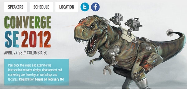
Those ConvergeSE guys have great timing! Right on the heels of our brand new site they've launched the conference site. Besides the awesome scrolling design and robotic battle dinosaurs (scroll down and see what happens to him!) the conference itself looks amazing.
Nate and I will be doing a workshop based on the Kicktastic project we're working on, so if you want to find out our secrets in person, register on February 16th. We'll try not to ruin the otherwise great list of speakers.
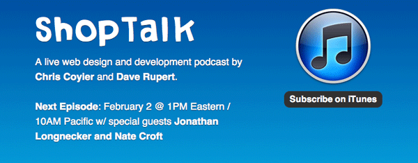
The ShopTalk show is a live podcast by CSS Tricks/Wufoo master Chris Coyier and Paravel pointman Dave Rupert. Chances are we'll talk about the Kick Awesome Show and maybe even this new website! Send in your questions now or join us live to pick our brains.
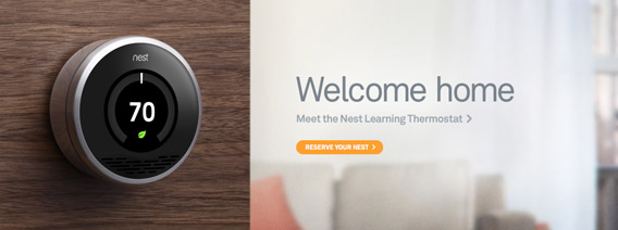
I never thought I’d be looking for a way to scrounge up the extra money to buy a thermostat, and yet here we are. Nest looks like a fantastic product from former Apple employees Tony Fadell and Matt Rogers. Packed with all kinds of sensors, gorgeous industrial design and intelligent software that learns your routines, you can tell the details have been sweated over for a long time. Take a look at the installation guide to see what I mean.
Long story short, these guys are tackling a huge problem with current iterations of thermostats and helping us to save energy and money, all while making it fun. Go check it out →
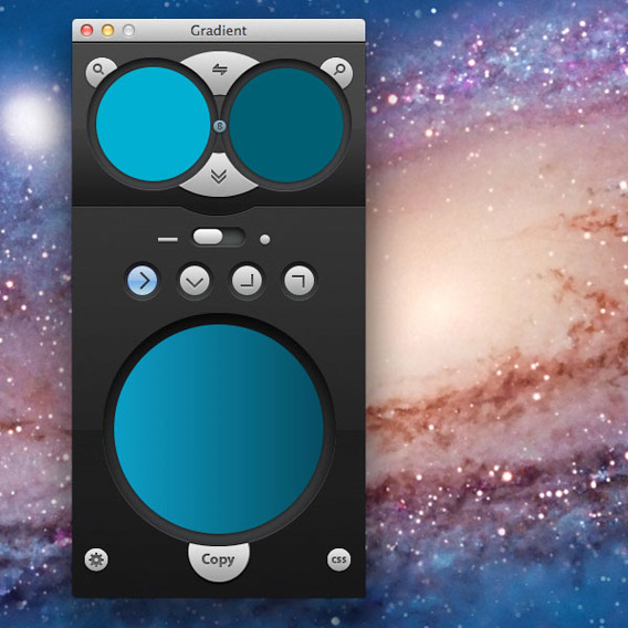
Background gradients in CSS3 are a pain. Multiple syntaxes, color stops all over the place. And that’s just for a linear gradient. Anything other than that makes my head hurt. Thankfully Jumpzero has just released the beta of their Gradient App.
It’s a beautiful, simple app that makes it easy to select the exact colors you need, the direction and type of gradient, and then it spits out all the vendor prefixes you could possibly imagine. It will even do RGB and RGBA in addition to HEX codes. The UI is really great and I find myself actually enjoying making gradients. Who’d have thought?
I have no idea what Gradient will eventually cost, but you can grab it for free while it’s in beta. So go do it. Now!
Created by John Kelly for Chipotle and featuring a Willie Nelson cover of Coldplay song “The Scientist” this awesome stop motion short film hits all the right notes.
As we’re working on a new version of the ol’ FortySeven Media site, we’re looking at putting together one of those fancy adaptive/responsive layouts. The one thing that has always seemed difficult was images. Even if you can scale an image down, you’re still probably loading the full size image on mobile which defeats the whole purpose.