Cherokee Mills Logo Design Process
 In case you hadn’t noticed, we’ve recently completed a couple of projects for Cherokee Mills. They’ve been a great client to work with and they’ve given us the opportunity to do some amazing design work for them (check out the website, pocket folder and logo).
I wanted to take a few minutes and give you a glimpse into the process of designing the logo. Like we’ve said before, design is all about solving problems and communicating your client’s needs in a way that is elegant, simple and straightforward. Not to mention kick-awesome!
So first up, a little research. The building and property we’re designing the logo for are right around a hundred years old. It’s original name was actually Cherokee Mills because it was a textile mill back in the early 1900’s. It was also a potato chip factory for Tom’s Potato Chips in the 1950’s and even housed an Atlantic Mills department store which many consider to be the predecessor to mega-stores like Wal-Mart and Target today. So lots of history here. Much of the original brick and hardwood floors are being used while combining with current technologies like solar panels and energy efficient hvac systems. You can check out their website if you want to learn more; it’s actually pretty cool.
It’s already pretty established that we’re looking at a mix of retro and modern; a call back to the building’s history and looking forward to it’s future.
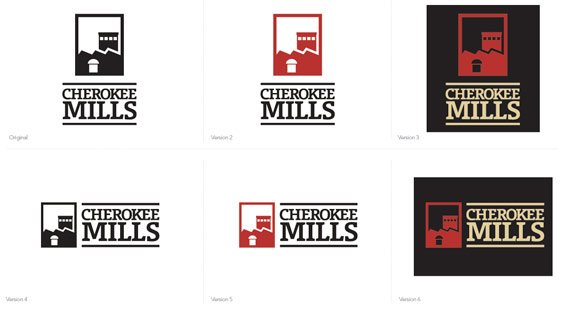
Keep it Simple
We always start in black and white. If your logo can’t work in one color, then it’s not good enough. Logos get used in hundreds of different applications and you’ve got to have that flexibility built in. If you have to have a full color, gradiented, 3d version that’s fine, but make sure it works in one color first!
First Round:
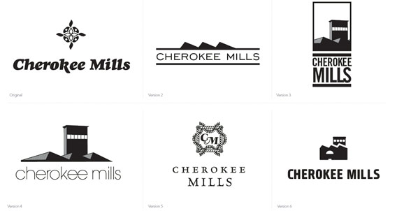
This is always the most scattered, more a collection of thoughts, direction, and feel than anything else. As you can se the styles are pretty wildly varied; from nasty 80’s department store to oldschool elegant subdivision. But you’ll also notice that most of the final elements are already in place (versions 3 and 6). Those icons were based off of a prominent architectural feature of the original building. The ridges on the top of the building would collect air flow from outside, funnel it down underneath the building where it could be cooled, and then blown up through the floor to help cool the plant workers in the hot summer months. They didn’t have air conditioners back then!
Second Round:
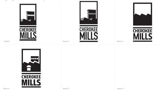
They really like icon the vertical feel of #3 so they asked us to expand on that. Here we have some minor variations in type, but you’ll notice that we stopped and #4 here. That was it, we both agreed. No need to go any further.
Third Round:
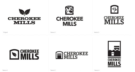
At this point, some other people in the process got involved and didn’t like the way we were headed. They wanted something more timeless and classic; with leaves or arches or something like that. Fair enough, we’ll try it. This is probably the strongest overall collection, but the original still stands the strongest.
Fourth and Final Round:
The deeper we dig, we realize that the other people don’t like the architectural feature we’ve used in the logo. And they don’t like all the rounded corners on everything. So at this point we’ve done a lot of pretty good logos, and our client knows that. And he sides with us on the icon, because we designed what he originally wanted: something unique and retro and modern at the same time. But of course it is a little “fun” to be a business complex. Compromise time! We shave off all the rounded corners and find a font that’s not so retro. Thankfully, in the last version we had run across the Union typeface and it fit very nicely with the new icon. The architects had requested regal colors like red, gold and black and it all came together really nicely.
This is a great example of criticism from the client actually producing a better final logo than we even originally intended. It has served as a great building block for the identity of the Cherokee Mills; and they even made some awesome wood-carved signs at the entrances. What more can you ask for?

Comments